10 Trends for Inspiration for Web Design in 2025
Discover top inspiration for web design with 2025 trends like minimalism and dark mode. Spark your creativity today!
Last updated:
September 9, 2025

Discover top inspiration for web design with 2025 trends like minimalism and dark mode. Spark your creativity today!
Last updated:
September 9, 2025
Looking for inspiration for web design? This list reveals 10 key trends shaping web design in 2025. From minimalist layouts and dark mode to 3D elements and voice integration, explore these concepts to enhance user experience and create impactful websites. These trends range from established techniques like bold typography to emerging technologies such as WebGL integration and offer valuable inspiration for web design for any project. Dive in and discover what's next in web design.
Minimalist and clean design is a powerful approach in web design that prioritizes simplicity and user experience. It's a philosophy that strips away unnecessary elements, leaving only the essential content and functionality. This results in elegant, user-friendly interfaces that are easy to navigate and understand. By focusing on clarity and purpose, minimalist design allows the content to shine and encourages visitors to engage with the core message of the website. This approach leverages the strategic use of white space, a limited color palette, and clear, hierarchical typography to create a visually appealing and highly functional website. It’s a style that caters to the modern user's preference for streamlined experiences and quick access to information. In a world saturated with visual noise, minimalism offers a refreshing breath of fresh air, making it a highly sought-after design style for websites of all kinds.

Minimalist design is built on several key features. Abundant white space isn't just empty space; it's a crucial design element that gives content room to breathe and guides the user's eye across the page. A limited color palette, usually consisting of two to three carefully chosen colors, creates a cohesive and harmonious visual experience. Clean typography with a clear hierarchy ensures that information is presented in a logical and easy-to-digest manner. Simplified navigation makes it effortless for users to find what they're looking for, reducing bounce rates and enhancing user satisfaction. Finally, a grid-based layout provides structure and consistency, making the website feel organized and professional.
The benefits of embracing minimalist design are numerous. Faster loading times are a direct result of minimizing unnecessary design elements and code, leading to improved SEO and a better user experience. The clean and uncluttered interfaces improve navigation and overall usability, particularly on mobile devices. This inherent mobile-friendliness and responsiveness ensure a seamless experience across different screen sizes. Minimalist websites also tend to have a timeless aesthetic, aging gracefully and requiring fewer redesigns compared to trend-driven websites. Furthermore, the focus on clear typography and visual hierarchy greatly improves accessibility for users with disabilities. Finally, by reducing distractions and focusing on clear calls to action, minimalist design can contribute to higher conversion rates.
However, minimalist design also presents some challenges. Striking the right balance between simplicity and visual interest is crucial, as overly minimalist designs can appear bland or generic. It can also be challenging to convey a distinct brand personality through minimalism, potentially making it difficult to differentiate from competitors. The limited creative expression can sometimes feel restrictive for designers accustomed to more elaborate styles.
Websites like Apple, Google, Medium, Stripe, and Airbnb exemplify the power of minimalist design. They demonstrate how simplicity can be used to create elegant and highly effective online experiences. Learn more about Minimalist and Clean Design for a deeper dive into successful implementations.
So, when should you consider using a minimalist approach for your web design inspiration? It's an excellent choice for businesses that prioritize content, functionality, and user experience. It's particularly well-suited for websites that need to convey complex information in a clear and concise manner. If your target audience values efficiency and ease of use, minimalist design is a strong contender.
To effectively implement minimalist design, consider these tips: use white space strategically to guide user attention and create visual breathing room, limit fonts to a maximum of two or three for a cohesive look, ensure sufficient color contrast for accessibility and readability, test your designs with real users to avoid over-simplification and ensure usability, and consider using subtle animations to add a touch of engagement without compromising the clean aesthetic. The design principles of Dieter Rams, the work of Jonathan Ive at Apple, and the Google Material Design team have all contributed to the popularization of this enduring design trend and can serve as excellent sources of inspiration. Minimalist design, when executed effectively, is a powerful tool that can elevate your website and create a truly memorable user experience.
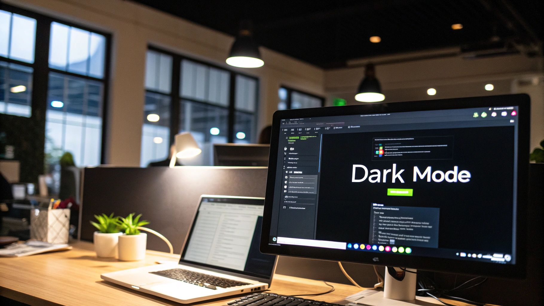
Dark mode, or dark UI, has quickly transitioned from a niche preference to a mainstream design trend. This approach utilizes a predominantly dark color palette for backgrounds, typically ranging from pure black (#000000) to dark grays (#1a1a1a), contrasted with lighter text and UI elements. It initially gained traction for its practical benefits like reducing eye strain in low-light conditions and conserving battery life on devices with OLED screens. However, dark mode has evolved into a significant aesthetic choice, imbuing websites and applications with a modern, sophisticated, and often premium feel. This makes it a valuable source of inspiration for web design, allowing designers to create visually striking and user-friendly interfaces.
The core principle of dark mode is the inversion of traditional light-on-dark UI. By using a dark background, the overall light emission from the screen is reduced, minimizing the strain on users' eyes, especially in dimly lit environments. This is particularly beneficial for users who spend extended periods interacting with digital interfaces. On OLED displays, dark pixels are effectively turned off, leading to significant power savings, extending battery life.
Beyond the practical advantages, dark mode carries a distinct aesthetic appeal. It can create a sense of elegance, modernity, and even luxury. The high contrast between the dark background and light content allows bright accent colors to truly "pop," making them more vibrant and noticeable. This creates opportunities for bold visual statements and enhances the overall user experience. Dark mode is particularly popular amongst developers and tech-savvy users, contributing to its trendy status and making it a relevant choice for modern web design.
Numerous successful implementations of dark mode can be found across popular platforms. Twitter's dark theme offers a sleek alternative to the traditional white interface. Discord's predominantly dark UI has become synonymous with its brand identity. GitHub, YouTube, and Spotify also showcase effective dark mode integrations, demonstrating its versatility across different types of applications. These examples serve as excellent inspiration for web design, illustrating how dark mode can be seamlessly incorporated into various platforms while maintaining brand consistency.
While dark mode offers compelling advantages, it's crucial to consider its limitations. In brightly lit environments, dark mode can sometimes reduce readability, making light text appear to bleed into the dark background. For some users, dark mode may actually increase eye strain, particularly those with astigmatism. Achieving appropriate contrast ratios between background and foreground elements is vital for accessibility and requires careful consideration. Furthermore, dark mode may not be suitable for all brand identities, especially those associated with light, airy, or playful themes.
For web designers looking to incorporate dark mode into their projects, here are some actionable tips:
Dark mode's popularization can be largely attributed to major tech companies like Apple, with the introduction of system-wide dark mode in iOS 13, and Google, with its Android dark theme. The Discord development team also played a significant role in showcasing the aesthetic and functional appeal of dark UI.
In conclusion, dark mode has cemented its place as a significant design trend, offering a potent combination of functionality and aesthetics. By understanding its benefits, limitations, and best practices, web designers can leverage dark mode to create engaging, user-friendly interfaces that are both visually striking and aligned with modern design sensibilities. Its presence in this list of web design inspiration highlights its enduring relevance and its potential to elevate the user experience.
Glassmorphism is a modern design trend that adds a touch of elegance and depth to web interfaces. It mimics the look of frosted glass, creating translucent elements that allow background content to subtly shine through. This effect is achieved by using blur effects, subtle borders, and layered transparency, giving the interface a clean, almost ethereal aesthetic. It's a great way to add visual hierarchy and interest without resorting to heavy shadows or complex graphics, making it a popular choice for everything from landing pages to mobile app designs. This innovative approach elevates the visual experience, making it a worthy addition to any web designer's inspiration toolkit.
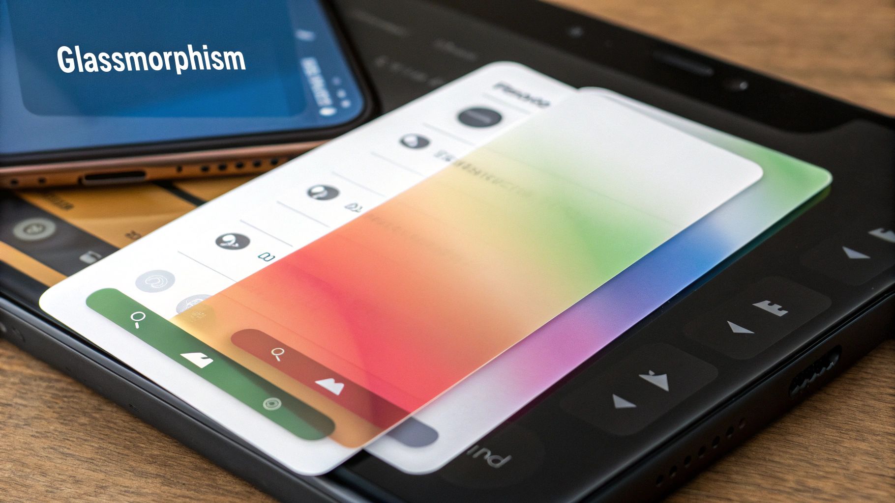
So, how does glassmorphism work? The core components are semi-transparent backgrounds, typically with an opacity between 10% and 30%, combined with a backdrop-filter blur effect. This blur softens the background content that shows through the glass-like element, creating the frosted glass look. A subtle border, also with low opacity, further enhances the illusion of depth. The layered approach inherent in glassmorphism allows designers to establish a clear visual hierarchy, guiding the user's eye through the interface. Soft shadows and glows can be added to further emphasize the depth and create a more three-dimensional feel. Glassmorphism particularly shines when paired with vibrant background colors or gradients, allowing the translucency to showcase the underlying hues and create a captivating visual interplay.
Glassmorphism offers several advantages for web designers seeking inspiration for web design. It creates a modern and elegant appearance that instantly elevates the overall aesthetic. It allows for the creation of depth and dimension without relying on heavy shadows, which can sometimes feel clunky or outdated. Furthermore, glassmorphism works exceptionally well with colorful backgrounds, providing a canvas for creative color combinations and gradient effects. The inherent layering capabilities of this design trend make it easy to establish a clear visual hierarchy, improving user experience and navigation. Finally, glassmorphism is adaptable to both light and dark themes, making it a versatile choice for a variety of website designs.
Examples of successful glassmorphism implementation can be found in several prominent interfaces. Apple leveraged this aesthetic in its Big Sur operating system, lending a fresh and modern feel to its interface elements. Windows 11's Fluent Design System also incorporates glassmorphic principles, creating a cohesive and visually appealing experience. Spotify’s desktop app uses glassmorphism for its artist and playlist cards, creating a visually engaging browsing experience. You can also find glassmorphism used effectively in various modern mobile app interfaces and contemporary dashboard designs.
However, like any design trend, glassmorphism comes with its own set of considerations. One potential drawback is its impact on performance, particularly on older or less powerful devices. The blur effects can be resource-intensive, leading to potential lag or slowdowns. Another concern is text readability. If not implemented carefully, the translucency of glassmorphic elements can make text difficult to read, especially if there isn't sufficient contrast between the text and the background. The backdrop-filter CSS property, crucial for achieving the blur effect, also has limited browser support, which can present challenges for cross-browser compatibility. Finally, like any design trend, overuse can lead to a tired and clichéd look. Applying glassmorphism everywhere can diminish its impact and make the interface feel visually cluttered.
For designers inspired by glassmorphism and eager to incorporate it into their work, here are some actionable tips. Utilize the backdrop-filter: blur() property in your CSS to create the frosted glass effect. Pay close attention to text readability and ensure sufficient contrast between text and background elements. Apply glassmorphism selectively to key interface elements rather than saturating the entire design. Test the performance of your glassmorphic elements on different devices to ensure a smooth user experience. Finally, consider combining glassmorphism with subtle animations to further enhance the visual appeal and create a more engaging interface. These subtle animations can bring the glass-like elements to life, adding a touch of interactivity and dynamism.
Glassmorphism, popularized by Apple's macOS Big Sur design language, Microsoft's Fluent Design System, and influential designers like Michal Malewicz, offers a compelling blend of modernity, elegance, and depth. By understanding its features, benefits, and potential drawbacks, designers can effectively harness its power to create visually stunning and engaging web experiences. When used thoughtfully and strategically, glassmorphism can be a powerful tool for elevating web design and bringing a touch of sophistication to any project.
In the ever-evolving landscape of web design, finding fresh sources of inspiration is crucial. One powerful approach that's taking center stage is the use of bold typography and custom fonts. This design trend elevates typography to the primary visual element, utilizing large, impactful fonts, creative text layouts, and custom typefaces to inject personality and establish clear visual hierarchy. It's a technique that treats text as both content and a core component of the visual design, often blending multiple font weights, sizes, and styles to create dynamic and engaging compositions.
This method works by capturing attention immediately. Large, distinctive headlines draw the user's eye, while carefully chosen font pairings guide them through the content. Imagine landing on a website where the typography alone communicates the brand's essence – its playfulness, sophistication, or cutting-edge innovation. That's the power of bold typography and custom fonts. It allows designers to move beyond simply conveying information and create a truly immersive brand experience. This approach is particularly effective for websites that prioritize content, such as blogs, news sites, and portfolio websites, where clear communication and visual appeal are paramount.
Think of the clean, impactful typography of Medium's article layouts, or the bold brand typography employed by Mailchimp. These websites leverage typography to enhance readability and reinforce their brand identity. The New York Times' digital layout demonstrates how considered typography can organize complex information while remaining visually engaging. Similarly, Spotify's playlist interfaces and Nike's marketing pages demonstrate how custom fonts contribute to a distinctive brand experience. These examples highlight how effective bold typography can be as a core element of web design, contributing significantly to both aesthetics and user experience.
Typography is a powerful tool for creating visual hierarchy and enhancing the overall aesthetic of your website. To delve deeper into the art and technique of arranging type, explore this comprehensive guide on Design in Typography. Understanding the nuances of typography will enable you to craft truly impactful and visually appealing websites. This resource, Master Design in Typography for Stunning Visuals from Bulby, provides a valuable deep dive into the subject.
This trend offers numerous advantages for web designers looking for innovative ways to enhance their projects. It allows for the creation of a strong, recognizable brand personality through distinctive typographic choices. It also significantly improves content hierarchy and readability by guiding the user's eye through the page with varying font sizes and weights. Compared to image-heavy designs, typography-focused websites often load faster, leading to a better user experience. Moreover, text-based content is excellent for SEO and accessibility, making your website more discoverable and inclusive. Finally, well-implemented typography is highly responsive across various devices, ensuring a consistent user experience.
However, there are potential drawbacks to consider. Custom fonts can sometimes slow down loading times, especially if not optimized properly. They may also not display consistently across all devices or browsers, requiring careful testing and fallback options. Overusing bold typography can also lead to poor readability if not balanced with sufficient white space and thoughtful font pairings. Finally, it's crucial to be mindful of font licensing to ensure you're using fonts legally and ethically.
For those eager to experiment with this powerful design trend, here are a few practical tips:
font-display: swap to ensure faster loading times and prevent layout shifts.Bold typography and custom fonts have rightfully earned their place as a key source of inspiration for web design. This approach empowers designers to create visually striking websites that are both engaging and accessible. By understanding the principles of typography and implementing these practical tips, you can harness the power of bold typography to elevate your web design projects and create truly memorable user experiences. Pioneering figures in the field, such as typographer Erik Spiekermann, creative director Jessica Walsh, and typeface designer Tobias Frere-Jones, have significantly influenced and popularized the use of bold and expressive typography in contemporary design, demonstrating its potential to transform digital landscapes.
Micro-interactions and subtle animations are key ingredients for creating engaging and delightful web experiences. These small, purposeful animations and interactive elements respond to user actions, providing feedback and enhancing the overall user experience. They are the subtle details that elevate a website from functional to truly enjoyable. If you're looking for inspiration for web design, look no further than the power of these nuanced movements. They can breathe life into your designs, making them more intuitive and user-friendly.
These subtle movements guide users through interfaces, confirm actions, and inject personality into digital products without overwhelming the primary content or functionality. Think of the satisfying "pop" of a like button animation or the smooth transition of a menu expanding on hover. These seemingly small details contribute significantly to a positive user experience. They act as visual cues, acknowledging user input and guiding their journey through the website. This is a powerful tool for any web designer looking to enhance user engagement and create a memorable online experience.
Micro-interactions can manifest in a variety of ways, including:
Implementing micro-interactions offers numerous advantages:
However, it’s crucial to be mindful of potential downsides:
Looking for some inspiration? Check out these examples of successful micro-interaction implementation:
To effectively integrate micro-interactions into your web designs, consider these tips:
Pioneers like Dan Saffer (interaction design expert), Rachel Nabors (web animations specialist), and Val Head (web animation consultant) have popularized the effective use of micro-interactions in web design. Their work demonstrates the power of these subtle details in creating engaging and user-friendly interfaces. Learn more about Micro-interactions and Subtle Animations By understanding the principles and best practices behind micro-interactions, you can elevate your web designs and create truly memorable user experiences. Utilizing these techniques strategically will ensure your website stands out, providing users with a delightful and intuitive journey. Micro-interactions are a testament to the fact that even the smallest details can make a big difference in the world of web design inspiration.
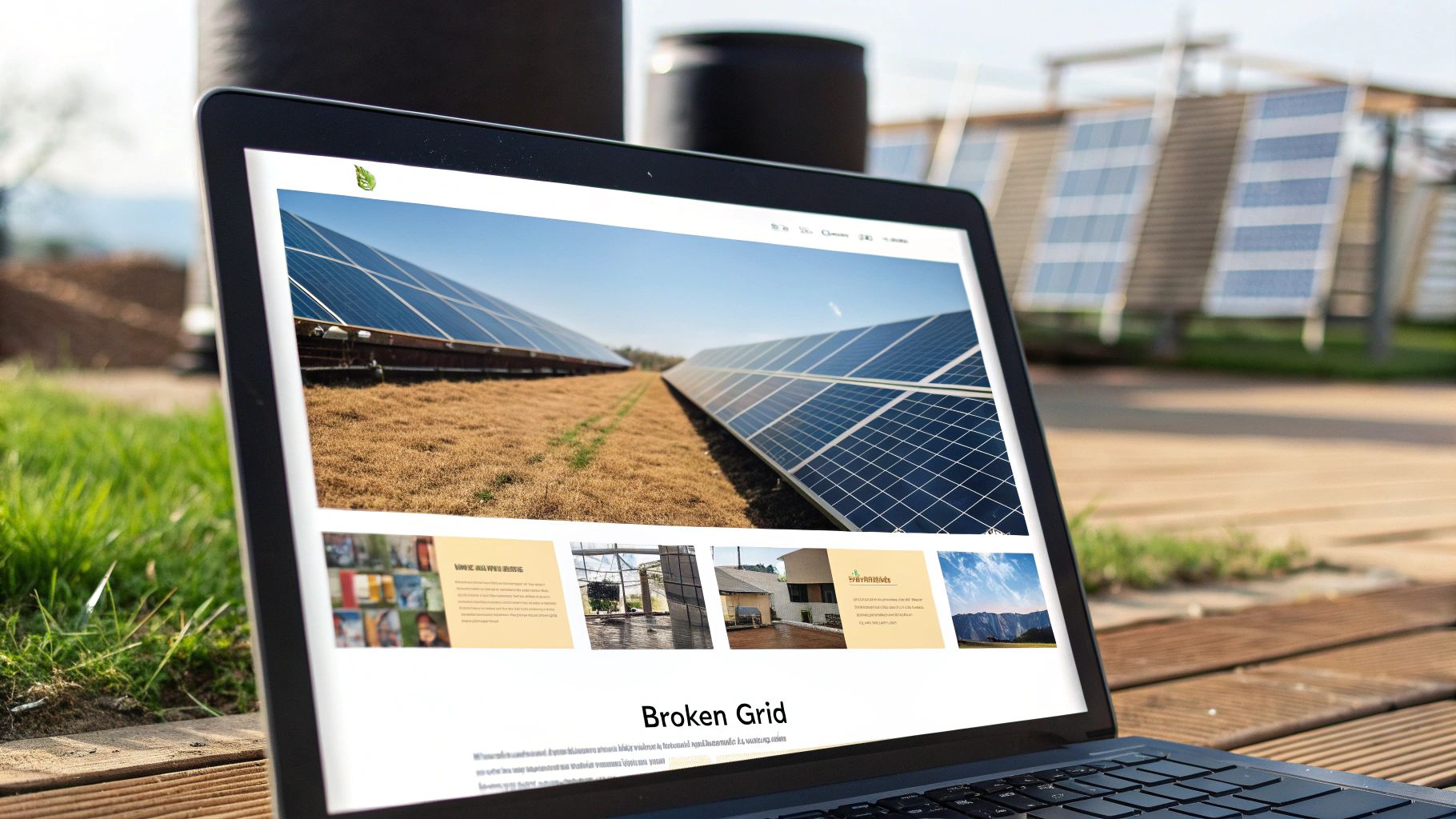
Asymmetrical and broken grid layouts represent a bold departure from traditional web design, offering a powerful way to inject dynamism and visual interest into your projects. This approach deliberately disrupts the predictable structure of standard grids, creating layouts that feel fresh, unexpected, and engaging. For web designers seeking inspiration for web design, exploring asymmetrical layouts can unlock a world of creative possibilities and help establish a unique online presence. This technique deserves a place on this list because it pushes the boundaries of conventional web design, encouraging experimentation and leading to memorable user experiences.
Instead of adhering to rigid column structures, asymmetrical layouts leverage strategically placed elements, overlapping sections, and varied sizing to create visual hierarchy and guide the user's eye. Imagine a website where images bleed off the edge of the screen, text blocks overlap photos in dynamic ways, and diagonal lines introduce a sense of movement. This controlled chaos can be incredibly effective in capturing attention and conveying a sense of creativity and modernity.
How it Works:
Asymmetrical design relies on the interplay of balance and tension. While it breaks the grid, it doesn't abandon structure entirely. The key is to create a sense of visual equilibrium even within the asymmetry. This is achieved through careful consideration of:
Examples of Successful Implementation:
Several websites demonstrate the power of asymmetrical layouts:
Pros and Cons of Asymmetrical Layouts:
Pros:
Cons:
Tips for Implementing Asymmetrical Layouts:
Asymmetrical layouts offer a powerful tool for web designers seeking to create unique and engaging online experiences. By understanding the principles of balance, visual hierarchy, and responsive design, you can harness the power of asymmetry to create websites that are both beautiful and functional, inspiring visitors and setting your work apart.
In today's digitally-driven world, websites consume a significant amount of energy, contributing to the growing digital carbon footprint. As web designers, UI/UX designers, and developers, we have a responsibility to minimize this impact. Sustainable and eco-friendly web design, therefore, isn't just a trend; it's a necessary evolution in our approach to crafting online experiences. This design philosophy focuses on minimizing the environmental impact of websites through optimized performance, efficient coding, and mindful resource usage. It offers a powerful way to blend beautiful design with environmental responsibility, proving that aesthetics and ethics can go hand-in-hand. This approach earns its place on this list because it addresses a critical issue facing our industry and offers a path towards a more sustainable digital future.
Sustainable web design prioritizes a few key elements: fast loading times, minimal data transfer, and green hosting solutions, all while maintaining an excellent user experience and visual appeal. It's about creating websites that are both visually engaging and environmentally responsible. How does it work? Essentially, it involves trimming the excess fat from your website’s code and assets, streamlining its performance to reduce the energy required to load and operate.
This philosophy is built on several key features:
There are numerous benefits to embracing sustainable web design:
However, there are some potential drawbacks to consider:
Several organizations and individuals have championed this movement. Tom Greenwood of Wholegrain Digital, a leading sustainable web design agency, is a prominent advocate. The Sustainable Web Manifesto, signed by numerous web professionals, outlines key principles for building a more sustainable internet. The Green Web Foundation provides resources and tools for identifying and supporting green web hosting providers.
Examples of websites successfully implementing sustainable design principles include:
To implement sustainable design principles in your projects, consider these actionable tips:
By embracing sustainable and eco-friendly web design, we can create a more responsible and sustainable digital landscape. It's a powerful way to contribute to a greener future, one website at a time.
Looking for inspiration for web design that truly pushes the boundaries of the online experience? Look no further than the immersive world of 3D elements and WebGL integration. This cutting-edge approach leverages the power of web technologies like WebGL and Three.js to bring three-dimensional graphics, models, and interactive experiences directly into web browsers. This opens up a whole new dimension for web design, moving beyond flat, two-dimensional interfaces and creating engaging, interactive experiences that were once confined to dedicated applications. This innovative technique is revolutionizing how we interact with websites, making it a powerful source of inspiration for web design.
So how does it work? WebGL (Web Graphics Library) is a JavaScript API that renders interactive 2D and 3D graphics within any compatible web browser without the need for plug-ins. Libraries like Three.js simplify the process of creating and animating 3D scenes using WebGL, providing a more user-friendly interface for developers. This combination allows designers to embed complex 3D models, create interactive environments, and implement dynamic animations directly onto a webpage. From subtle parallax scrolling effects that add depth and dynamism to full-blown interactive product configurators, the possibilities are vast.
The benefits of incorporating 3D elements are compelling. It creates highly engaging user experiences that capture attention and encourage interaction. In a digital landscape saturated with flat design, 3D elements offer a powerful way to differentiate your website and create a memorable impression. They are particularly effective for product showcases, allowing users to explore products from all angles and even customize them in real-time. Imagine exploring the interior of a new car model from the comfort of your home, or virtually trying on a pair of sneakers before making a purchase. This level of interactivity enhances storytelling and brand experience, forging a deeper connection with the user.
Examples of successful implementations abound, further highlighting why 3D elements deserve a spot on any list of web design inspiration. Apple consistently uses 3D models on their iPhone product pages, showcasing the devices' design and features in stunning detail. Tesla's website features a car configurator that allows users to build their dream car in 3D, selecting colors, trims, and other options. Nike uses similar technology for their shoe customization tools, enabling customers to personalize their footwear with unique designs and colors. Even news outlets like Polygon are leveraging 3D graphics in their interactive articles, enhancing storytelling with engaging visuals. Architecture firms are also adopting this technology to create immersive virtual tours of their projects, allowing potential clients to explore spaces before they are even built.
While the advantages are significant, it's crucial to be aware of the potential drawbacks. 3D graphics can be demanding on system resources, leading to high performance requirements and longer loading times, especially on lower-end devices. Mobile device support can also be limited, particularly for complex 3D environments. Developing these experiences requires specialized development skills in WebGL and related technologies. Furthermore, ensuring accessibility for users with disabilities can present challenges and requires careful consideration.
If you're considering incorporating 3D elements into your web design, here are some actionable tips:
The popularity of 3D elements in web design can be attributed to innovators like Apple's web design team, the vibrant Three.js community, and the pioneering efforts of early WebGL adopters. Their work has paved the way for a new era of immersive web experiences, inspiring countless designers to explore the creative potential of 3D. As technology continues to evolve, expect 3D elements and WebGL integration to become even more prevalent in web design, shaping the future of online interaction and providing endless inspiration for web design.
Voice User Interface (VUI) integration is revolutionizing how users interact with websites. It represents a significant leap forward in web design, offering a hands-free, intuitive, and accessible way to navigate and engage with online content. This innovative approach uses voice commands and audio interactions, allowing users to control websites using spoken language, much like interacting with a voice assistant. For web designers seeking inspiration for web design, VUI offers a fresh perspective on user experience and opens up a world of possibilities.
The core of VUI lies in its ability to translate spoken words into actionable commands. This is achieved through sophisticated speech recognition technology that interprets user utterances and triggers corresponding actions within the website. For instance, a user might say "Search for red running shoes," and the website would automatically display relevant search results. Beyond simple searches, VUI facilitates complex interactions, including navigation, form filling, and content playback. This makes it a powerful tool for enhancing user engagement and creating more dynamic and intuitive web experiences.
Here are some key features that make VUI integration possible:
VUI offers several compelling advantages, making it a worthy contender in the realm of innovative web design:
However, VUI integration also presents some challenges:
Several websites have successfully implemented VUI, demonstrating its potential:
For web designers looking to integrate VUI, these tips are essential:
The rise of VUI has been driven by industry giants like Amazon Alexa web services and Google Assistant integration, as well as the continuous efforts of accessibility advocacy groups. By incorporating VUI, web designers can create more engaging, accessible, and future-proof websites that cater to a wider audience. VUI offers a unique blend of innovation and practicality, solidifying its place as a key source of inspiration for web design.
Data visualization and interactive charts are transforming how we consume information online, offering a powerful source of inspiration for web design. No longer are we limited to static charts and graphs; instead, we can immerse users in dynamic experiences that unveil the stories hidden within complex datasets. This approach elevates web design from simply presenting information to fostering understanding and engagement, securing its well-deserved spot on this list of web design inspirations.
In essence, data visualization is the art and science of translating raw data into visual, interactive elements. This involves designing compelling charts, graphs, and dashboards that reveal patterns, trends, and insights, making information accessible and actionable. Modern web data visualization leverages a blend of aesthetic design and functional interactivity, often employing specialized libraries and tools. It's about transforming numbers and statistics into a captivating narrative that resonates with users.
The power of data visualization lies in its ability to simplify complex information. Imagine trying to decipher thousands of data points in a spreadsheet versus exploring those same data points through an interactive chart that highlights key trends and allows users to drill down for more detail. The difference is stark. Interactive charts bring data to life, making it easier to grasp and ultimately more impactful.
Several features contribute to the effectiveness of interactive charts:
The benefits of incorporating data visualization into web design are numerous:
However, there are some potential drawbacks to consider:
We can find inspiring examples of data visualization across the web: the Google Analytics dashboard, which provides a comprehensive overview of website traffic; The New York Times election results maps, which visually represent voting patterns; Spotify Wrapped annual summaries, which personalize listening data; financial trading platforms, which display real-time market data; and COVID-19 tracking websites, which monitor the spread of the virus. These examples demonstrate the versatility and power of data visualization in conveying complex information effectively.
Learn more about Data Visualization and Interactive Charts
For web designers seeking to incorporate data visualization, consider these tips:
Pioneers like D3.js creator Mike Bostock, data visualization expert Edward Tufte, and The New York Times graphics team have significantly influenced the field, pushing the boundaries of what’s possible with online data visualization. Their work serves as a testament to the transformative potential of this approach and continues to inspire web designers seeking innovative ways to present information. By embracing data visualization as a source of inspiration for web design, we can create more engaging, informative, and impactful online experiences.
From minimalist aesthetics to cutting-edge 3D integration, finding inspiration for web design is crucial for staying ahead of the curve. We've explored a diverse range of trends, including dark mode UI, the resurgence of glassmorphism, the power of bold typography, and the subtle delight of micro-interactions. Mastering these concepts, along with understanding asymmetrical layouts, sustainable design practices, and the potential of VUI and interactive data visualization, empowers you to create truly exceptional and engaging online experiences. By embracing these approaches, you're not just following trends; you're contributing to the evolution of the digital landscape and shaping how users interact with the online world.
Keeping track of all this incredible inspiration for web design can be a challenge. That's where Bookmarkify comes in. As you discover exciting examples of minimalist design, bold typography, or innovative WebGL integration, Bookmarkify helps you organize and revisit your favorite sites effortlessly. Its intuitive interface and tagging system make curating your inspiration seamless, fostering a more efficient and inspired design process. Ready to transform how you gather and manage your web design inspiration? Start your free trial with Bookmarkify today and keep your creative flow going strong in 2025 and beyond!

Ivan S
Lead Marketing Designer @Scribe, Founder @bookmarkify
Effortlessly Save time and stay Inspired: Streamline your workflow with Bookmarkify. No more juggling 10 tabs and screenshots.