Top Responsive Design Best Practices for 2025

Discover effective responsive design best practices to create adaptable, user-friendly websites that enhance user experience in 2025 and beyond.

Top Responsive Design Best Practices for 2025Top Responsive Design Best Practices for 2025
Bookmarkify Logo
Try Bookmarkify for free

Effortlessly Save Time and Stay Inspired: Streamline your workflow with Bookmarkify. No more juggling 10 tabs.

Get Started
Bookmarkify Logo
Try Bookmarkify for free

Effortlessly Save Time and Stay Inspired: Streamline your workflow with Bookmarkify. No more juggling 10 tabs.

Get Started

Creating Seamless Web Experiences: A Guide to Responsive Design

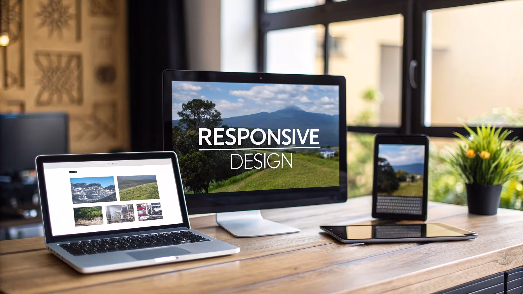
Users expect websites to work perfectly on any device. This listicle presents eight responsive design best practices to help you create websites that look great and function seamlessly. Learn how to implement a mobile-first approach, fluid grids, flexible images, strategic breakpoints, performance optimization, touch-friendly interfaces, progressive enhancement, and consistent navigation. Applying these responsive design best practices will ensure your websites provide an optimal user experience across all devices.

1. Mobile-First Approach

In the world of responsive design best practices, the mobile-first approach reigns supreme. This method involves designing for the smallest screen first, such as a smartphone, and then progressively enhancing the design and adding features for larger screens like tablets and desktops. This ensures that the core content and functionality are optimized for mobile users, often leading to cleaner, more efficient designs across all devices. This approach recognizes the reality of today's web usage where mobile browsing often surpasses desktop.

Mobile-First Approach

The mobile-first approach prioritizes core content and functionality. By starting with the limited screen real estate of a mobile device, designers are forced to make critical decisions about what content is truly essential. This process naturally streamlines the user experience and often results in leaner code and faster loading times. As screen sizes increase, designers progressively enhance the experience, adding more complex features and layouts. This β€œadditive” approach is a key differentiator of mobile-first design. Creating a website with a mobile-first approach is crucial for reaching users across various devices. For more information on why responsive design is essential for SEO and user experience, check out this article on the importance of responsive web design.

Several well-known websites exemplify successful mobile-first implementations. Twitter's responsive interface, for example, prioritizes content visibility on mobile, ensuring tweets are easily readable and accessible. Google's Material Design framework is built on mobile-first principles, providing a consistent and user-friendly experience across devices. The Boston Globe's website redesign was one of the early pioneers of this methodology, showcasing the effectiveness of mobile-first in a major publication.

Pros:

  • Forces focus on essential content and features: Eliminates clutter and improves user experience.
  • Typically results in faster-loading websites: Leaner code and optimized assets contribute to better performance.
  • Aligns with current mobile usage trends and statistics: Caters to the growing number of mobile users.
  • Better accommodates the constraints of mobile devices: Designs are inherently optimized for touch interaction and smaller screens.

Cons:

  • May limit creative options initially: Starting with a minimalist approach can feel restrictive.
  • Can be challenging for complex desktop interfaces: Translating intricate desktop functionalities to mobile can be complex.
  • Requires more planning and forethought: Careful consideration of progressive enhancement is necessary.
  • May not be ideal for desktop-primary audiences: While rare, some websites still cater primarily to desktop users.

Tips for Implementing Mobile-First:

  • Start with a content inventory: Identify the most important elements for your mobile users.
  • Use CSS media queries with min-width rather than max-width: This allows you to progressively add styles for larger screens.
  • Test on actual mobile devices during development: Emulators are helpful, but real-world testing is crucial.
  • Consider performance implications from the beginning: Optimize images and other assets to minimize loading times.

The concept of "Mobile First" was popularized by Luke Wroblewski who coined the term in 2009, and Ethan Marcotte, a responsive design pioneer. Google's adoption of mobile-first indexing further cemented the importance of this approach for SEO and user experience. By adopting a mobile-first approach, you can ensure your website is optimized for today's mobile-centric world, delivering a superior user experience and improving your site's performance in search engine rankings.

2. Fluid Grid Layouts

Fluid grid layouts are a cornerstone of responsive design best practices. Instead of using fixed units like pixels to define the dimensions of elements on a webpage, fluid grids utilize relative units such as percentages, ems, or rems. This allows the layout to dynamically resize and adapt to different screen sizes, ensuring a consistent and user-friendly experience across devices. This approach creates a flexible foundation for responsive designs, allowing them to smoothly adjust to the viewport's width, from the smallest mobile screens to the largest desktop monitors.

Fluid Grid Layouts

Typically, a fluid grid involves a parent container set to a percentage width (often 100%) and child elements within it, also sized using percentages. This proportional approach ensures that elements maintain their relative size to each other and to the container, regardless of the screen size. For instance, a sidebar that occupies 30% of the container will always occupy 30%, whether the screen is 375px wide (mobile) or 1920px wide (desktop).

Fluid grids earn their place among responsive design best practices due to several key advantages. They provide smooth and consistent scaling across various screen sizes, reducing the need for extensive media queries and breakpoints. This proportional scaling maintains harmonious relationships between elements, preventing awkward resizing issues. Fluid grids are also inherently adaptable to unusual or non-standard screen sizes, future-proofing your designs for emerging devices.

Features of Fluid Grid Layouts:

  • Relative Units: Uses percentages (%), ems, and rems for sizing.
  • Proportional Scaling: Elements scale proportionally to the viewport.
  • Flexible Layouts: Adapts seamlessly to different screen dimensions.
  • Parent-Child Structure: Employs a parent container with percentage-based child elements.

Pros:

  • Smooth Scaling: Consistent experience across devices.
  • Fewer Breakpoints: Simplifies development and maintenance.
  • Proportional Relationships: Elements maintain visual harmony.
  • Adaptability: Works well with non-standard screen sizes.

Cons:

  • Complexity: Can be initially challenging to implement.
  • Breakpoint Adjustments: May require tweaks at specific breakpoints.
  • Nested Element Calculations: Calculations can become complex with nested elements.
  • Design Limitations: Not all designs are suitable for purely fluid approaches.

Examples of Fluid Grids in Action:

  • Bootstrap's 12-column grid system: A widely used framework that simplifies responsive design.
  • The Guardian's responsive news layout: A practical example of fluid grids in a real-world application.
  • Shopify Themes: Many Shopify themes leverage fluid grids for adaptable product displays.

Tips for Implementing Fluid Grid Layouts:

  • CSS Frameworks: Utilize frameworks like Bootstrap or Tailwind CSS for pre-built grid systems.
  • Max-Width Constraints: Combine percentage widths with max-width to control maximum element sizes.
  • CSS Grid and Flexbox: Explore CSS Grid and Flexbox for more advanced and flexible layouts.
  • calc() Function: Use the calc() function for complex width calculations involving mixed units.
  • Thorough Testing: Test your fluid grid layout across a wide range of devices and viewport sizes.

Popularized By:

  • Ethan Marcotte: Coined the term "responsive web design" and advocated for fluid grids.
  • Bootstrap Framework: Popularized the 12-column grid system, making fluid layouts more accessible.
  • CSS Working Group: Developed and standardized Flexbox and Grid, powerful tools for fluid layouts.

By understanding and implementing fluid grid layouts, web designers, UI/UX designers, and developers can create truly responsive websites that provide an optimal viewing experience across all devices. This crucial aspect of responsive design contributes significantly to user satisfaction and accessibility, making it an essential best practice for modern web development.

3. Flexible Images and Media

Flexible images and media are crucial for responsive design best practices. This technique ensures your visual content adapts seamlessly to various screen sizes, from the smallest mobile phones to large desktop monitors. It involves using a combination of CSS and HTML attributes to control how images and other media scale within their containers, maintaining aspect ratios and optimizing loading performance for a smooth user experience. This is essential for any website aiming to provide a consistent and high-quality experience across all devices.

Flexible Images and Media

At its core, flexible images leverage the max-width: 100% and height: auto CSS properties. This combination constrains images within their parent containers, preventing them from overflowing and breaking the layout on smaller screens. Simultaneously, it maintains the image's aspect ratio, preventing distortion. More advanced techniques, like art direction, allow you to serve different images or cropped versions optimized for specific screen sizes, further enhancing the visual experience. This might involve showing a close-up image on a mobile device and a wider shot on a desktop.

Examples of successful implementation abound on the web. Medium, for instance, dynamically scales article images to fit the reader's screen. Netflix's video player interface adapts seamlessly to different devices, providing an optimal viewing experience regardless of screen size. National Geographic's online photo galleries showcase stunning imagery that adjusts beautifully to various displays. These sites demonstrate how flexible images contribute to a polished and professional online presence.

Pros:

  • Prevents layout breaks: Images won't overflow their containers on small screens.
  • Maintains visual quality: Aspect ratios are preserved, avoiding distortion.
  • Reduces bandwidth usage (when implemented properly): Serving appropriately sized images to different devices conserves bandwidth.
  • Improves user experience: Content is presented in an optimal format for each device.

Cons:

  • High-resolution images can consume bandwidth: Even with scaling, large images can be heavy on smaller devices if not optimized further.
  • Added complexity: Implementing responsive images can add complexity to HTML markup.
  • Multiple image versions: Art direction requires creating multiple image versions.
  • Browser support: Advanced techniques may have varying levels of support across older browsers.

Tips for Implementing Flexible Images:

  • srcset attribute: Use the srcset attribute in the <img> tag to provide different image sizes for the browser to choose from based on the viewport.
  • <picture> element: Implement the <picture> element for more complex art direction scenarios.
  • Modern image formats: Consider using WebP for better compression and quality, with fallbacks for older browsers.
  • width and height attributes: Always specify these attributes to prevent layout shifts during image loading.
  • Lazy loading: Implement lazy loading for images below the fold to improve initial page load performance.

Flexible images and media, popularized by responsive web design pioneers like Ethan Marcotte and Mat Marquis, and championed by the Responsive Images Community Group (RICG), have become a cornerstone of modern web development. By following these responsive design best practices, you can ensure a consistent and engaging user experience for all your visitors.

4. Strategic Breakpoints

Strategic breakpoints are a crucial element of responsive design best practices. They are specific viewport widths at which your website's layout adjusts to provide an optimal viewing experience across different screen sizes. Unlike older, device-specific approaches, modern responsive design focuses on the content itself. Breakpoints are chosen based on where the content naturally starts to look cramped, overcrowded, or otherwise needs a change in layout to maintain readability and usability. This ensures your design remains effective on a wide range of devices, from tiny smartphones to large desktop monitors.

Strategic Breakpoints

This content-driven approach utilizes CSS media queries to apply different styles at varying viewport widths. Instead of saying "this style is for an iPhone," you're saying "this style is for when the screen is narrower than 600px," which is where your content might start to look cramped. For most designs, 3-5 major breakpoints are sufficient to handle the majority of screen sizes.

Features and Benefits:

  • Content-focused: Breakpoints are based on content needs, not specific devices.
  • CSS Media Queries: Different styles are triggered at different viewport widths using media queries.
  • Future-proof: Works on current and future devices as it's not tied to specific device models.
  • Enhanced User Experience: Prioritizes content readability and usability across all screen sizes.
  • Reduced Maintenance: Easier to manage than device-specific approaches.

Pros and Cons:

Pros:

  • Creates adaptable designs for any screen size.
  • Improves user experience by prioritizing content clarity.
  • Simplifies maintenance compared to device-focused methods.
  • Adapts to the evolving device landscape.

Cons:

  • Requires careful planning, testing, and refinement.
  • Complex layouts may necessitate additional breakpoints.
  • Optimizing for various scenarios can be time-consuming.
  • Demands a solid understanding of CSS media queries.

Examples of Successful Implementation:

  • The New York Times: Adjusts layout complexity at strategic breakpoints, providing a seamless reading experience across devices.
  • Airbnb: Maintains usability across breakpoints, ensuring users can easily browse and book accommodations regardless of screen size.
  • Mailchimp: Adapts its dashboard navigation at logical content breakpoints, optimizing workflow for different screen sizes.

Tips for Implementing Strategic Breakpoints:

  • Start Simple: Begin with major breakpoints (e.g., mobile, tablet, desktop) and refine as needed.
  • Thorough Testing: Test your designs at various viewport widths, not just at your defined breakpoints. Use browser developer tools to simulate different screen sizes.
  • Identify Breaking Points: Use developer tools to pinpoint where your design starts to break down visually or functionally.
  • Consider Orientation: Remember to account for both landscape and portrait orientations.
  • Consistent User Experience: Ensure a consistent user experience across all breakpoints. Navigation, functionality, and branding should remain consistent.

Influential Figures and Frameworks:

  • Brad Frost: Known for his atomic design methodology, which emphasizes modular design and facilitates responsive design implementation.
  • Stephen Hay: A strong advocate for responsive design workflows and best practices.
  • Bootstrap Framework: Popularized the use of common breakpoints, providing a solid starting point for many developers.

Strategic breakpoints are essential for responsive design best practices because they shift the focus from specific devices to the content itself. This approach ensures a more adaptable, user-friendly, and future-proof website that caters to the ever-evolving digital landscape. By focusing on where your content naturally requires adjustments, you can deliver an optimal experience for every user, regardless of their device.

5. Performance Optimization

Performance optimization is a crucial aspect of responsive design best practices. It focuses on delivering a fast and smooth user experience across all devices, especially on mobile where slower connections and limited processing power are common. A responsive site that looks great but loads slowly will frustrate users and drive them away. This is why performance optimization deserves its place among the top responsive design best practices.

In essence, performance optimization is about minimizing the time it takes for a webpage to load and become interactive. This involves a variety of techniques that streamline resource delivery and rendering. By implementing these techniques, we ensure that users on any device can access and enjoy the content quickly and efficiently.

How Performance Optimization Works

Performance optimization tackles several key areas:

  • Image Optimization and Compression: Images often constitute a significant portion of a webpage's size. Optimizing them through compression (using formats like WebP) and resizing based on device screen size significantly reduces loading time.
  • Code Minification and Bundling: Removing unnecessary characters from code (minification) and combining multiple files into fewer bundles (bundling) reduces file sizes and the number of HTTP requests, leading to faster downloads.
  • Resource Prioritization and Critical Path Rendering: Prioritizing the loading of critical resources needed for initial display (like above-the-fold content) ensures users see something quickly, improving perceived performance. Critical path rendering focuses on optimizing the sequence of loading resources to display the main content as fast as possible.
  • Lazy Loading of Off-screen Content: Delaying the loading of images and other content until they are about to scroll into view saves bandwidth and improves initial load times.
  • Server-Side Considerations: Techniques like GZIP/Brotli compression reduce the size of files sent from the server, speeding up data transfer.

Examples of Successful Implementation:

  • Google.com: Google exemplifies minimalist design paired with meticulous performance optimization. Their homepage loads incredibly fast, even on low-bandwidth connections.
  • Amazon.com: Amazon uses progressive loading for product images, displaying a lower-resolution version first and then replacing it with a higher-resolution image as it loads. This provides a faster perceived loading experience.
  • Financial Times (ft.com): The Financial Times prioritizes performance metrics across devices, ensuring a consistent and fast experience for all users.

Actionable Tips for Readers:

  • Use modern image formats like WebP: WebP offers superior compression compared to JPEG and PNG, resulting in smaller file sizes. Provide fallback images (JPEG/PNG) for browsers that don't support WebP.
  • Implement lazy loading for below-the-fold content: This is a simple yet effective way to improve initial load times.
  • Consider a critical CSS approach for above-the-fold content: Inline critical CSS in the <head> of your HTML to render the top portion of the page quickly.
  • Enable browser caching and use CDNs when possible: Caching reduces the number of requests to the server, and CDNs deliver content faster from servers closer to the user.
  • Test performance regularly using tools like Lighthouse and WebPageTest: These tools provide valuable insights into performance bottlenecks and areas for improvement.
  • Adopt a performance budget for your project: Setting clear performance goals helps maintain focus throughout the development process.

Pros and Cons:

Pros:

  • Improves user experience and satisfaction
  • Reduces bounce rates and increases engagement
  • Positively impacts SEO rankings
  • Reduces bandwidth usage for users
  • Accommodates users on slower connections

Cons:

  • Adds development complexity and time
  • Requires ongoing maintenance and testing
  • May involve technical compromises for certain features
  • Needs specialized knowledge or tools

Popularized By:

Performance optimization techniques have been championed by figures like Steve Souders (former Google performance engineer), Ilya Grigorik (web performance advocate at Google), and Addy Osmani (engineering manager at Google Chrome).

By focusing on performance optimization as part of your responsive design best practices, you'll create websites that not only look good but also provide a delightful and efficient experience for all users.

6. Touch-Friendly Interfaces

Creating a truly responsive design means thinking beyond just screen size. It requires considering how users interact with your website. For many users, that interaction happens through touch, not a mouse. This is why touch-friendly interfaces are a crucial best practice in responsive design. They ensure your website is optimized for the swipes, taps, and pinches of mobile and tablet users, creating a seamless and enjoyable experience regardless of the device.

This approach recognizes the fundamental difference between touch and mouse interactions. Mouse pointers offer precision, while fingers require larger targets and are prone to accidental taps. Hover states, a staple of desktop navigation, simply don't exist in a touch environment. A touch-friendly interface addresses these differences head-on.

Key Features of a Touch-Friendly Interface:

  • Appropriately Sized Touch Targets: A minimum size of 44x44 pixels is recommended for all clickable elements. This provides a comfortable target area for fingertips, reducing frustration and mis-clicks.
  • Finger-Friendly Spacing: Adequate spacing (at least 8px) between interactive elements prevents accidental taps on adjacent buttons or links.
  • Support for Common Touch Gestures: Integrating familiar gestures like swiping, pinching, and double-tapping creates a more intuitive and engaging user experience.
  • Alternatives for Hover-Dependent Interactions: Hover-based menus or tooltips need alternative activation methods, such as taps or long presses, for touch devices.
  • Visual Feedback for Touch Interactions: Visual cues, such as button color changes upon touch, provide confirmation of user input and enhance the sense of interactivity.

Pros:

  • Improved Usability on Mobile and Tablet Devices: Touch-optimized interfaces make it significantly easier for users to navigate and interact with your site on touchscreens.
  • Reduced User Frustration and Input Errors: Larger tap targets and ample spacing minimize accidental clicks and improve accuracy.
  • Accommodates Users with Larger Fingers or Motor Impairments: Larger touch targets benefit all users, but are particularly helpful for those with dexterity challenges.
  • Creates More Intuitive Interaction Patterns: Leveraging familiar touch gestures creates a more natural and intuitive user experience.
  • Works Well Across Both Touch and Pointer Devices: Well-designed touch-friendly interfaces often translate seamlessly to mouse-based interactions, creating a consistent experience across all devices.

Cons:

  • May Require More Vertical Space: Larger touch targets can increase the overall height of page elements.
  • Can Limit Design Density Compared to Mouse-Optimized Interfaces: The need for larger targets and spacing can sometimes reduce the amount of content that can be displayed on a single screen.
  • Requires Additional Testing on Actual Touch Devices: Testing on real devices, rather than just simulators, is crucial to identify and resolve touch-related issues.
  • May Necessitate Different Interaction Patterns Across Breakpoints: Optimizing for both touch and mouse might require different interaction models at different screen sizes.

Examples of Successful Implementation:

  • Apple: Apple's websites consistently exemplify best practices in touch-friendly design, reflecting the principles outlined in their iOS Human Interface Guidelines.
  • Google Maps: The touch-optimized controls in Google Maps work seamlessly across various devices, allowing for easy navigation and interaction.
  • Starbucks: Starbucks provides a touch-friendly ecommerce experience that simplifies browsing and ordering on mobile devices.

Actionable Tips:

  • Implement a minimum size of 44x44px for all clickable elements.
  • Provide at least 8px spacing between touch targets.
  • Replace hover-dependent interactions with tap or press actions.
  • Test on actual touch devices, not just simulators.
  • Use visual feedback (like button state changes) for touch interactions.
  • Consider implementing 'pull to refresh' and other familiar touch patterns.

Popularized By:

  • Josh Clark (author of 'Designing for Touch')
  • Luke Wroblewski (mobile design pioneer)
  • Apple (through their iOS Human Interface Guidelines)

Touch-friendly interfaces are essential for responsive design because they address the specific needs and behaviors of touch-based users. By following these best practices, you can create websites that are not only visually appealing but also highly usable and accessible on any device. This directly contributes to a positive user experience, encouraging engagement and ultimately achieving your website's goals. Ignoring touch optimization, in contrast, can lead to frustration, abandonment, and a negative perception of your brand. Therefore, prioritizing touch-friendly design is a critical investment in the success of any responsive website.

7. Progressive Enhancement: Building a Solid Foundation for Responsive Design

Progressive enhancement is a crucial best practice in responsive design that prioritizes core content and functionality for all users, regardless of their browser or device. Instead of designing for the latest and greatest technology first, then working backward to accommodate older browsers, progressive enhancement starts with a universally accessible baseline and then progressively layers on richer experiences for users with more capable browsers and devices. This approach ensures a functional and usable experience for everyone, while still allowing for innovation and advanced features where possible. This deserves its place on the list because it is foundational to creating truly resilient and inclusive web experiences.

How it Works:

Progressive enhancement builds upon a core experience using widely-supported technologies like semantic HTML. This ensures the content is accessible even if CSS or JavaScript fail to load or are not supported. From this base, developers gradually add layers of enhancement, such as styling with CSS and interactivity with JavaScript, for browsers that can handle them. This layered approach focuses on feature detection, using tools like Modernizr or native CSS @supports, rather than relying on potentially inaccurate browser detection.

Features of Progressive Enhancement:

  • Core Functionality First: Begins with essential content structured with semantic HTML, guaranteeing access for all users.
  • Enhanced Experiences: Layers on advanced features, like animations and complex interactions, for more capable browsers.
  • Separation of Concerns: Keeps content (HTML), presentation (CSS), and behavior (JavaScript) separate for greater maintainability and flexibility.
  • Feature Detection: Uses techniques to determine browser capabilities, ensuring appropriate enhancements are applied.
  • Resilience: Maintains core functionality even when CSS or JavaScript fail to load.

Pros:

  • Resilient and Future-Friendly Websites: Adapts to future browser technologies and remains accessible regardless of technological advancements.
  • Improved Accessibility: Ensures a usable experience for users with disabilities or those using older technologies.
  • Usable Experience for All: Provides a baseline level of functionality to everyone, regardless of their browsing environment.
  • Partial Loading Functionality: Even if parts of the site fail to load completely, the core functionality remains available.
  • Web Standards Alignment: Promotes the use of web standards and best practices, leading to more maintainable and interoperable code.

Cons:

  • Increased Planning and Development Time: Requires more upfront planning and thoughtful development to layer enhancements effectively.
  • Varying Experiences: Can lead to different user experiences across browsers and devices, although all users will have access to the core content.
  • Framework Challenges: Implementing progressive enhancement can be challenging with certain JavaScript frameworks that assume JavaScript is always enabled.
  • Pixel-Perfect Design: Strict adherence to pixel-perfect design across all browsers and devices can be more difficult to achieve.

Examples of Successful Implementation:

  • GOV.UK: UK government websites are strong proponents of progressive enhancement, ensuring accessibility and functionality across a wide range of devices and browsers.
  • Amazon: Even with JavaScript disabled, Amazon's product pages remain functional, allowing users to add items to their cart and complete purchases.
  • Wikipedia: The baseline functionality of Wikipedia works across virtually all browsers, providing access to information regardless of technological limitations.

Tips for Implementing Progressive Enhancement:

  • Start with Semantic HTML: Structure content logically using semantic HTML elements that convey meaning without relying on CSS or JavaScript.
  • Use Feature Detection: Leverage libraries like Modernizr or native CSS @supports to identify browser capabilities.
  • Non-Essential JavaScript: Treat JavaScript as an enhancement, not a requirement, for core functionality.
  • Regular Testing: Periodically test your site with CSS and JavaScript disabled to ensure core functionality remains intact.
  • Consider Polyfills: Use polyfills to provide missing functionality in older browsers for critical features.
  • Documentation: Clearly document which features are considered core versus enhanced for better maintainability.

Popularized By:

Progressive enhancement has been championed by figures like Aaron Gustafson (author of "Adaptive Web Design"), Jeremy Keith (web standards advocate), and A List Apart (web design publication). Their work has helped establish progressive enhancement as a vital best practice for building robust and accessible web experiences.

When and Why to Use This Approach:

Progressive enhancement is particularly valuable when:

  • Accessibility is a priority: Ensuring everyone can access your content, regardless of their browser or device.
  • Performance is critical: Providing a fast-loading core experience, even on slow connections or less powerful devices.
  • Future-proofing is desired: Building a site that remains functional and accessible as technology evolves.

By prioritizing a robust core experience and progressively adding enhancements, you can create websites that are not only visually appealing and interactive but also inclusive and resilient in the face of technological change.

8. Consistent Navigation Patterns

Consistent navigation patterns are crucial for effective responsive design best practices. They ensure users can easily find and access content regardless of whether they're viewing your website on a desktop computer, tablet, or smartphone. This means creating a navigation system that adapts smoothly to different screen sizes while maintaining a predictable and user-friendly experience. This often involves transforming from a full, expanded menu on larger screens to more compact patterns, like the ubiquitous "hamburger" menu, on smaller devices.

This best practice deserves its place on the list because navigation is the cornerstone of user experience. A confusing or inconsistent navigation system can lead to user frustration and ultimately drive them away from your site. By prioritizing consistent navigation, you ensure a positive user experience across all devices, contributing to higher engagement and conversion rates.

How it Works:

Responsive navigation adapts the presentation of your website's navigation based on the available screen space. While the visual presentation might change, the underlying information architecture – the way your content is organized and linked – should remain consistent across all breakpoints. This provides a sense of familiarity and predictability for the user, no matter what device they're using. On smaller screens, commonly used patterns like hamburger menus, along with clear visual cues for the current location within the site, help users orient themselves. It's also critical to ensure touch-friendly targets on mobile devices for easy interaction.

Features of Consistent Navigation:

  • Adaptive Presentation: Changes layout based on screen size.
  • Consistent Information Architecture: Maintains the same underlying site structure across devices.
  • Recognizable Patterns: Utilizes familiar patterns like hamburger menus.
  • Clear Visual Feedback: Highlights the user's current location within the site.
  • Touch-Friendly Targets: Ensures easy interaction on mobile.

Pros:

  • Improved User Orientation: Easier for users to find their way around the site.
  • Reduced Cognitive Load: Familiar patterns require less mental effort.
  • Predictable Interaction: Creates a consistent user experience.
  • Brand Consistency: Maintains a unified brand identity across all devices.
  • Improved Conversion Rates: Better usability leads to higher user engagement.

Cons:

  • Reduced Discoverability: Hidden navigation (like hamburger menus) can sometimes obscure less prominent sections.
  • Complexity: Complex site structures may require more sophisticated navigation solutions.
  • Space Constraints: Balancing visibility with limited screen space can be challenging.
  • Implementation: May require different navigation implementations for different breakpoints.

Examples of Successful Implementation:

  • Apple.com: Apple seamlessly transitions from a horizontal navigation bar on desktop to a hamburger menu on mobile, maintaining a clean and consistent look.
  • BBC: The BBC's responsive navigation prioritizes key news categories on mobile while still providing access to the full site structure.
  • Shopify: Shopify uses adaptable ecommerce navigation patterns to showcase product categories and facilitate browsing on various devices.

Actionable Tips:

  • Prioritize: Identify key navigation items that should remain visible at all screen sizes.
  • A/B Test: Use A/B testing to validate the effectiveness of different navigation patterns.
  • Progressive Disclosure: Consider "progressive disclosure" to reveal more complex navigation options as needed.
  • Consistent Ordering: Maintain the same order of navigation items across all breakpoints.
  • Back Button Functionality: Ensure the back button works consistently across all navigation states.
  • Visual Indicators: Use visual cues to indicate the current section or page on all devices.

Popularized By:

  • Nielsen Norman Group: Extensive usability research on navigation patterns. (www.nngroup.com)
  • Brad Frost: Documented navigation patterns in his book, Atomic Design. (bradfrost.com)
  • Material Design & iOS Human Interface Guidelines: Provide guidelines and best practices for mobile navigation.

By implementing consistent navigation patterns, you're investing in a positive user experience that translates to better engagement, higher conversion rates, and ultimately, a more successful website. This is a core tenet of responsive design best practices and essential for any modern website.

Responsive Design Best Practices Comparison

PracticeImplementation Complexity πŸ”„Resource Requirements ⚑Expected Outcomes πŸ“ŠIdeal Use Cases πŸ’‘Key Advantages ⭐
Mobile-First ApproachMedium – requires planning for smallest screens firstModerate – testing on multiple devices neededFaster loading, leaner code, core content focusSites with high mobile traffic, content-centricPrioritizes essential content, aligns with mobile trends
Fluid Grid LayoutsMedium to High – relative units and calculationsModerate – may use CSS frameworks or customSmooth scaling, proportional layoutsResponsive sites with varied screen sizesFlexible layouts, reduces breakpoints needed
Flexible Images and MediaMedium – needs multiple image versions and markupHigher – image preparation and responsive attributesMaintained aspect ratios, optimized media deliveryMedia-rich sites, galleries, video platformsPrevents layout breakage, bandwidth efficient
Strategic BreakpointsMedium – requires content-driven breakpoint planningModerate – thorough testing across viewportsOptimal layout adjustments, adaptable UXComplex designs needing exact layout controlSustainable designs, future-proof for new devices
Performance OptimizationHigh – involves multiple advanced techniquesHigh – requires specialized tools and ongoing effortFaster load times, better SEO, reduced bounceAll sites, especially mobile and slow networksImproves UX, reduces bandwidth, boosts SEO
Touch-Friendly InterfacesMedium – needs design adaptations and testingModerate – testing on actual touch devicesImproved usability on touch devicesMobile/tablet-first designsEnhances usability, reduces input errors
Progressive EnhancementMedium to High – layered development approachModerate – requires careful coding and testingResilient, accessible, functional for all usersSites needing broad browser/device supportFuture-proof, accessible, standards-compliant
Consistent Navigation PatternsMedium – design and code for adaptive navsModerate – may need multiple navigation variantsPredictable, user-friendly navigationAll responsive sites requiring easy navigationImproves orientation, brand consistency, usability

Bookmark Your Brilliance: Responsive Design for the Future

By now, you should have a solid grasp of responsive design best practices, from adopting a mobile-first approach and utilizing fluid grids to optimizing performance and ensuring touch-friendly navigation. Remember, strategic breakpoints, flexible images and media, and consistent navigation patterns are all key components of crafting a seamless user experience across devices. Implementing progressive enhancement ensures your website remains accessible to everyone, regardless of their browser or device capabilities.

Mastering these responsive design best practices is more than just a trend; it's a necessity for staying competitive in today’s digital landscape. By prioritizing these techniques, you're not just building websites that adapt to different screen sizes, you're building experiences that resonate with users, boost engagement, and ultimately drive success. This empowers you to create user-centered websites that meet the diverse needs of your audience in 2025 and beyond.

As you continue exploring and implementing these principles, remember the power of inspiration. Want to curate and organize your responsive design inspirations, ensuring you have a readily available library of best-in-class examples? Check out Bookmarkify – a powerful tool for collecting and categorizing design inspiration, helping you streamline your workflow and elevate your responsive design projects. Start building exceptional digital experiences today!