Top UI Component Library Examples to Boost Your Projects
Discover 8 UI component library examples, including Material-UI and Primer React, to streamline development. Explore the best options now!
Last updated:
February 21, 2026

Discover 8 UI component library examples, including Material-UI and Primer React, to streamline development. Explore the best options now!
Last updated:
February 21, 2026
Stop reinventing the wheel. UI component libraries provide pre-built, customizable components to accelerate your design process. This list showcases 8 excellent UI component library examples to help you choose the perfect fit for your next project. Discover key features and strengths of popular options like Material-UI (MUI), Chakra UI, Ant Design, and more. Whether you need a robust solution like Bootstrap or a customizable framework like Tailwind UI, this guide provides the insights you need. Streamline your workflow and build better user interfaces faster with these powerful tools.
Material-UI (MUI) is a prominent and widely-used React UI component library that stands out as an excellent example for developers seeking pre-built components for their projects. It leverages Google's Material Design principles, offering a comprehensive suite of ready-to-use components that adhere to a consistent and modern design language. This allows developers to quickly build visually appealing and functional user interfaces, saving valuable time and effort. MUI caters to projects of all sizes, providing a free version under the MIT license alongside a pro version with additional advanced components and features. Its robust documentation, active community support, and regular updates further solidify its position as a top choice among UI component libraries. For developers looking to implement a polished, professional look and feel consistent with Material Design, MUI provides an efficient and reliable solution.

One of MUI's key strengths lies in its comprehensive set of React components. From basic elements like buttons, inputs, and typography to more complex structures like data grids, date pickers, and dialog boxes, MUI offers a wide range of building blocks for creating rich and interactive user interfaces. This breadth of components reduces the need for developers to build common UI elements from scratch, facilitating faster development cycles. The customization system, through its theme provider and styled API, allows for extensive tailoring of the components' visual appearance to match specific branding requirements. Furthermore, MUI's support for server-side rendering, responsive layouts, and built-in dark mode support ensures a seamless and adaptable user experience across different devices and browsing preferences.
MUI’s extensive documentation makes it easy to get started, even for developers new to React or UI component libraries. Clear explanations, practical examples, and a dedicated community forum contribute to a smoother learning experience. Strong TypeScript support enhances developer productivity and code maintainability. The active community and regular updates provide assurance of ongoing support and the incorporation of new features and improvements.
However, developers should be mindful of the potential for a large bundle size if the library is not properly tree-shaken. Optimizing imports to include only necessary components is crucial for minimizing the impact on application performance. While MUI excels at implementing Material Design, customizing components to deviate significantly from this aesthetic can be challenging. The theming system, while powerful, has a learning curve, and mastering its intricacies may require some investment of time. Finally, while the core components are available under the MIT license, access to advanced components necessitates a paid subscription to the pro version.
Key Features & Benefits:
Pros:
Cons:
Website: https://mui.com/
MUI deserves its place in this list of UI component library examples due to its popularity, comprehensive features, and active community support. It provides a robust and efficient solution for developers seeking to implement a polished, professional user interface based on Material Design principles. Its flexibility and customizability make it suitable for a wide range of projects, from small personal projects to large-scale enterprise applications. Developers can leverage MUI to significantly streamline their UI development process, focusing on application logic rather than building UI elements from the ground up.
Chakra UI is a popular choice among React developers seeking a modular and accessible UI component library. It simplifies the process of building user interfaces by providing a set of pre-built, customizable, and importantly, accessible components. This makes it a strong contender in the landscape of UI component library examples, offering a compelling blend of ease of use and robust functionality. You can quickly create consistent and visually appealing interfaces with Chakra UI, accelerating your development workflow.
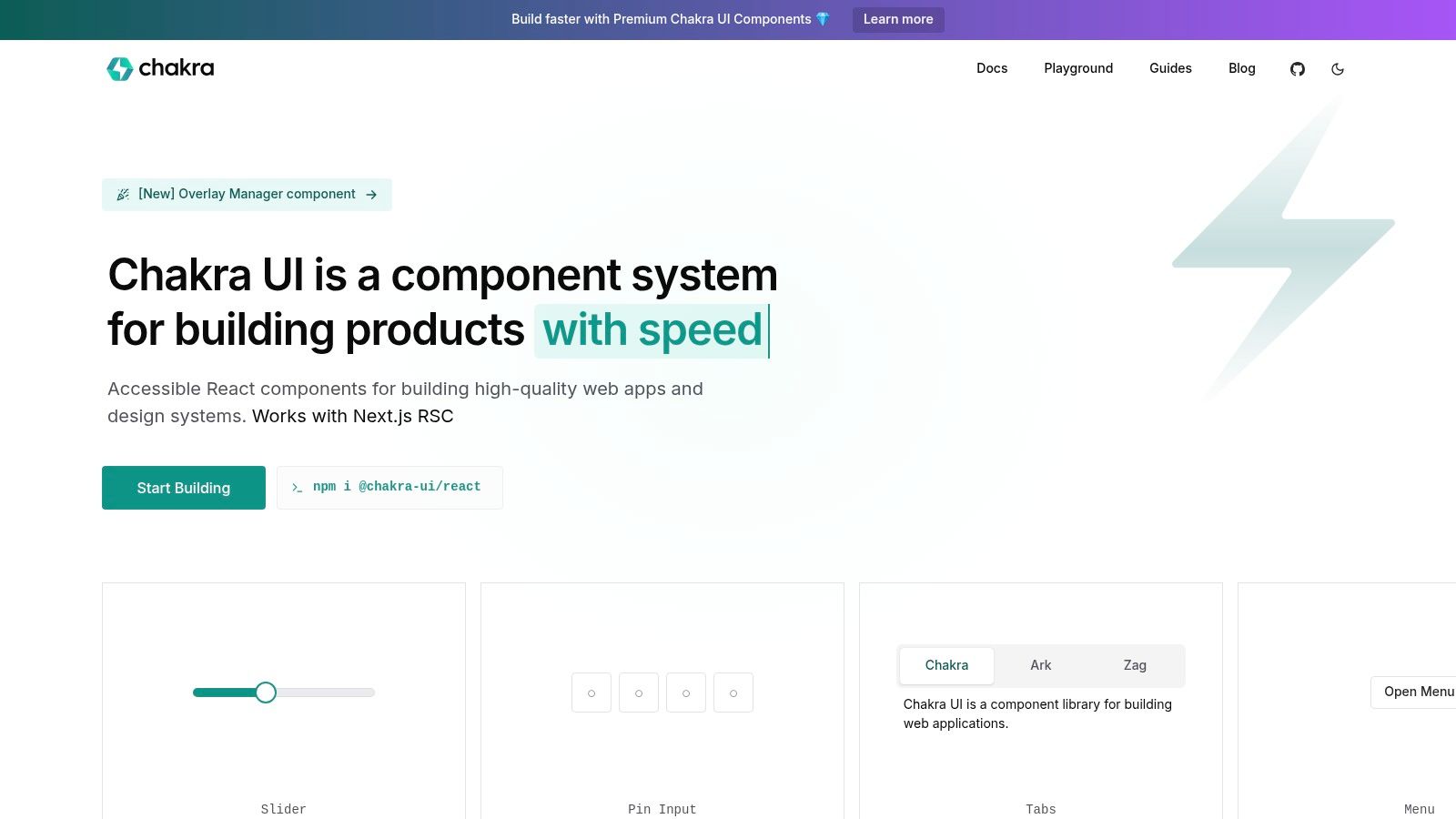
Chakra UI's strength lies in its thoughtful design. Built with accessibility in mind, it adheres to WAI-ARIA standards, ensuring your applications are usable by everyone. Its theme-based styling system, powered by styled-system, enables easy customization and supports both light and dark modes. This allows developers to maintain visual consistency and easily adapt to different user preferences. Furthermore, its "style props" feature allows for quick inline styling adjustments, giving developers fine-grained control over the appearance of their components. The responsive design utilities simplify the process of creating interfaces that adapt seamlessly to different screen sizes, a crucial requirement in today's multi-device world.
One of Chakra UI's key advantages is its composable component architecture. This allows developers to combine and extend existing components to create new, custom UI elements without reinventing the wheel. This modularity also helps keep bundle sizes down, contributing to improved application performance. Compared to larger, more monolithic UI component libraries, Chakra UI offers a lightweight and more focused approach.
Features:
Pros:
Cons:
Implementation/Setup Tips:
Installing Chakra UI is straightforward using npm or yarn:
npm i @chakra-ui/react @emotion/react@^11 @emotion/styled@^11 framer-motion@^4
Then, you'll need to wrap your application with the ChakraProvider:
import { ChakraProvider } from '@chakra-ui/react'
function App() {return (
Pricing: Chakra UI is completely open-source and free to use.
Website: https://chakra-ui.com/
Chakra UI earns its spot on this list of UI component library examples due to its impressive balance of accessibility, customizability, and ease of use. It's a particularly good choice for React developers who value a streamlined and efficient development experience, especially those working on projects where accessibility is a priority. While it might not have the breadth of components offered by larger libraries, its focused approach and excellent developer experience make it a powerful tool for building modern and inclusive web applications.
Ant Design provides a comprehensive, enterprise-grade UI design language and React UI library, making it an excellent example of a robust UI component library. It offers a rich set of high-quality, pre-built React components that significantly streamline the process of building interactive and complex user interfaces. Developed by Alibaba, Ant Design is particularly well-suited for business and enterprise applications, offering a consistent and professional look and feel. Its popularity within the enterprise world speaks to its effectiveness and reliability as a UI solution. This library shines when dealing with data-heavy applications or complex workflows, thanks to its specialized components. If you're looking for UI component library examples, Ant Design is definitely worth exploring.

Ant Design offers over 50 customizable components, all adhering to the Ant Design specification and optimized for enterprise use cases. Features like advanced filtering, sorting, and pagination in its Table component, coupled with robust form handling, make it ideal for managing large datasets and intricate user interactions. This focus on practical application within a business context is what truly sets Ant Design apart.
Features:
Pros:
Cons:
Website: https://ant.design/
Ant Design distinguishes itself among UI component library examples through its comprehensive set of enterprise-ready components, detailed documentation, and thriving community. While the bundle size and opinionated design might be drawbacks for some projects, its strengths make it a compelling choice for developers building complex, data-driven business applications. The readily available documentation and strong TypeScript support further contribute to its value as a robust and reliable UI solution.
Tailwind UI offers a unique approach to UI component libraries. Instead of providing ready-made React or Vue components, it provides a vast collection of pre-designed, fully responsive HTML templates built with Tailwind CSS. This allows developers to quickly copy and paste these templates directly into their projects, regardless of the underlying JavaScript framework (or even if they're using vanilla HTML). This makes it a powerful option for building interfaces rapidly, particularly for those already familiar with the Tailwind CSS ecosystem. Tailwind UI stands out as a strong example of a UI component resource because of its focus on speed, flexibility, and high-quality design. It's a valuable tool for anyone seeking UI component library examples that prioritize customization and a utility-first approach.

Tailwind UI offers hundreds of professionally designed components and templates, covering everything from marketing landing pages to complex application dashboards. These designs are fully responsive and adaptable to various screen sizes. Key features include:
Pros:
Cons:
Implementation Tips:
Tailwind UI offers a different approach compared to traditional UI component libraries like Material UI or Ant Design. While those libraries offer pre-built React components, Tailwind UI focuses on providing HTML templates styled with Tailwind CSS. This allows for greater flexibility and control over the final output but requires more manual integration. If you're already comfortable with Tailwind CSS and prioritize design and speed, Tailwind UI can be a highly effective tool for building beautiful and responsive user interfaces.
Bootstrap is a stalwart in the world of front-end development, earning its place on this list of UI component library examples due to its maturity, extensive features, and massive community support. It offers a comprehensive suite of pre-built CSS classes and JavaScript components that streamline the process of building responsive and visually appealing web interfaces. While initially just a CSS framework, Bootstrap 5 has evolved to include JavaScript components that work seamlessly with vanilla JavaScript or any JavaScript framework. This flexibility makes it a versatile tool for developers of all levels, seeking to accelerate their workflow when building everything from landing pages to complex web applications.

Bootstrap's robust grid system is a cornerstone of its layout capabilities. This system facilitates the creation of responsive designs that adapt seamlessly to different screen sizes, crucial for providing optimal user experiences across desktops, tablets, and mobile devices. Furthermore, its extensive library of pre-built components, covering everything from navigation bars and forms to modals and carousels, significantly reduces development time. Features like built-in form validation and responsive navigation components further enhance its practical value. For React developers, React-Bootstrap provides a convenient way to integrate Bootstrap components into their React projects.
Features:
Pros:
Cons:
Website: https://getbootstrap.com/
Pricing: Free and open-source.
Technical Requirements: Basic understanding of HTML, CSS, and JavaScript. For using JavaScript components, knowledge of JavaScript frameworks or vanilla JavaScript is necessary.
Bootstrap is a powerful and versatile UI component library, particularly suitable for projects requiring rapid prototyping and cross-browser compatibility. While it may not be the most cutting-edge option in terms of styling, its vast ecosystem and well-established nature make it a reliable choice for many web development projects. If you prioritize speed, stability, and a wealth of readily available resources, Bootstrap is undoubtedly worth considering. It deserves its place in this list because it provides a practical and accessible solution for developers seeking to efficiently build responsive and visually appealing user interfaces.
Shadcn UI offers a refreshing approach to UI component libraries. Instead of installing a package, you copy and paste the individual components directly into your project. This provides unparalleled control over your codebase and eliminates the overhead of external dependencies. This approach makes it a compelling example in the landscape of UI component library examples, particularly for projects prioritizing customization and performance. This makes it ideal for developers who want complete control over their UI and prefer a lean, dependency-free approach.

Built on the foundation of Radix UI and styled with Tailwind CSS, Shadcn UI ensures both accessibility and design flexibility. Radix UI handles the complex accessibility implementations, allowing you to focus on styling and customization through Tailwind CSS. Dark mode support is included out of the box, simplifying the development process further. A convenient CLI tool streamlines the process of adding specific components to your project, avoiding unnecessary code bloat.
One of the key advantages of Shadcn UI is its performance. With no external runtime dependencies, your application remains lightweight and fast. This direct control over the component code also simplifies debugging and maintenance. Furthermore, the use of Radix UI guarantees accessible components, adhering to best practices for inclusive design. The clean, modern aesthetic provided by the default styling is also a plus.
However, this copy-and-paste methodology does have its drawbacks. Unlike traditional package updates, keeping your components up-to-date with Shadcn UI requires manual implementation. This can be time-consuming. You’ll also need to have Tailwind CSS already integrated into your project, and the current component selection is smaller compared to more mature UI libraries.
If you're looking for a UI component library example that prioritizes code ownership, performance, and deep customization, then Shadcn UI is a worthy contender. While it requires a different workflow than traditional component libraries, the benefits of a dependency-free, highly customizable codebase can be significant. It’s a great choice for developers comfortable working directly within their component code and who appreciate the flexibility and control this approach offers.
Key Features:
Pros:
Cons:
Website: https://ui.shadcn.com/
Mantine is a robust React component library offering over 100 customizable components and 40+ hooks, making it a strong contender among UI component library examples. It's designed to streamline the development process while prioritizing accessibility, customization, and a smooth developer experience. Whether you're building a simple landing page or a complex web application, Mantine provides the tools to bring your vision to life. Its compatibility with modern React frameworks like Next.js, Remix, Create React App, and Vite makes it a versatile choice for various project setups.

Mantine shines in its dedication to providing a comprehensive yet performant solution. Features like built-in dark mode support with automatic color generation and a rich theming system with global style overriding allow for extensive design flexibility. Its TypeScript-first approach ensures type safety and improved code maintainability, a boon for larger projects. For developers seeking a UI component library that balances features with performance, Mantine is definitely worth considering.
Practical Applications and Use Cases:
Comparison with Similar Tools:
While newer than established libraries like Material UI (MUI) or Ant Design, Mantine offers a modern design aesthetic and excellent TypeScript support, often surpassing its older counterparts in these areas. However, MUI and Ant Design boast larger communities and a wider range of enterprise-focused components, potentially making them a better fit for large-scale projects with specific enterprise requirements.
Implementation/Setup Tips:
Getting started with Mantine is straightforward. Install the package using npm or yarn:
npm install @mantine/core @mantine/hooks @emotion/react @emotion/styled// oryarn add @mantine/core @mantine/hooks @emotion/react @emotion/styled
Then, import the necessary components and styles into your React project. The comprehensive documentation on the Mantine website (https://mantine.dev/) provides detailed guides and examples for various use cases.
Pros:
Cons:
Mantine earns its spot on this list of UI component library examples because of its developer-friendly approach, modern design, and commitment to accessibility. It’s a powerful tool for developers looking for a performant and customizable React component library that prioritizes a great developer experience. While its community is still growing, Mantine's robust features and active development make it a promising choice for a wide range of projects.
Primer React is a powerful UI component library example, offering a comprehensive collection of ready-made React components based on GitHub's own design system. This means you get access to the same building blocks that power GitHub's interface, allowing you to seamlessly create web experiences that align with GitHub's established look and feel. This makes it an excellent choice for developers working on projects related to GitHub or those wanting a robust, well-maintained, and accessible component library. If you're searching for ui component library examples that prioritize accessibility and consistent design, Primer React is definitely worth considering.

Primer React shines with its focus on accessibility, consistency, and performance. Its system props facilitate theme-based styling, making it easy to switch between light and dark modes or implement custom themes. The composition-based component architecture encourages reusability and flexibility, while the built-in support for dark theme simplifies development for diverse user preferences. The library provides a complete set of components, from basic buttons and form elements to more complex structures like navigation menus and data tables.
For developers already familiar with GitHub's design language, Primer React offers a significant advantage. It allows for rapid prototyping and development, leveraging pre-built components that ensure a consistent user experience. The excellent TypeScript support adds another layer of reliability and maintainability, making it easier to catch errors early in the development process. Furthermore, Primer React benefits from regular updates that keep it aligned with GitHub's evolving interface.
However, Primer React's opinionated design language, specifically tailored for GitHub, can be a limiting factor for projects requiring a distinct visual identity. It offers less design flexibility compared to more general-purpose ui component library examples. While it excels in the realm of developer tools and internal dashboards, it may not be the ideal choice for every project. Its community, while active, is smaller compared to more popular libraries like Material UI or Ant Design.
Key Features:
Pros:
Cons:
Website: https://primer.style/react/
Implementation Tips:
Getting started with Primer React is straightforward. You can install it via npm or yarn and then import the necessary components into your React project. The documentation provides clear instructions and examples for using various components and customizing their appearance.
Primer React earns its place in this list of ui component library examples by offering a robust, accessible, and well-maintained solution for developers seeking to build applications with a consistent and familiar GitHub-like interface. While its opinionated design may not suit all projects, its strengths in accessibility, performance, and ease of use make it a compelling choice for developers working within the GitHub ecosystem or building similar developer-focused tools.
Choosing the right UI component library is a crucial step in web development. From the robust features of Material-UI (MUI) and Ant Design to the customization of Tailwind UI and the simplicity of Bootstrap, Shadcn UI, Mantine and Primer React, each library offers unique strengths. Remember to consider factors like project size, design system requirements, your team’s familiarity with the library, and the overall aesthetic you’re aiming for when making your decision. We’ve covered eight excellent UI component library examples, showcasing the variety available to suit diverse project needs.
If you’re leaning towards simplified development processes, you might even consider exploring other avenues. For those interested in exploring other options for building user interfaces, including those that don't require coding, check out this comprehensive guide to the best no-code tools available. This resource from Les meilleurs outils no-code: Guide du choix pour créateurs et entreprises by Noxcod can provide valuable insights into alternative development approaches.
By carefully evaluating these UI component library examples and considering your project's specific context, you're well-equipped to create user interfaces that are not only visually appealing but also highly functional and accessible. Keep your design inspiration and component library resources organized with Bookmarkify, a powerful tool for web designers to curate and manage their favorite UI component library examples and other essential resources. Start building stunning user interfaces today!

Ivan S
Lead Marketing Designer @Scribe, Founder @bookmarkify
Effortlessly Save time and stay Inspired: Streamline your workflow with Bookmarkify. No more juggling 10 tabs and screenshots.