Styling Up Your Site: Learning from the Best
A strong website style guide is essential for brand consistency and a seamless user experience. This listicle showcases six excellent website style guide examples to inspire your own design system. Learn how industry leaders like Google, Mailchimp, and Shopify maintain a cohesive online presence through their style guides. We'll explore examples from user interface giants like IBM's Carbon Design System and government resources like the U.S. Web Design System (USWDS). Whether you're overhauling your current website or creating a new one, these website style guide examples provide practical insights for designers and developers.
1. Mailchimp Style Guide
The Mailchimp Style Guide stands as a prime example of a comprehensive website style guide, and an excellent resource for anyone looking for website style guide examples. It moves beyond simply dictating visual elements like logos and color palettes. Instead, it delves deep into the very heart of how the brand communicates, establishing a consistent voice, tone, and writing style across all platforms. This holistic approach ensures that whether a user is interacting with Mailchimp's marketing materials, reading their support documentation, or using their product interface, the brand's personality remains recognizable and consistent. This has made it an industry benchmark, often cited by content strategists and UX writers.

This content-focused approach is a key differentiator for Mailchimp. The guide provides detailed writing guidelines covering everything from grammar and mechanics to specific word choices, ensuring consistent terminology across all communications. It also offers nuanced voice and tone recommendations tailored to different scenarios. For example, the tone used in a promotional email will differ from that used in a technical support document, and the guide addresses these nuances. Clear examples of correct and incorrect usage accompany each guideline, making it easy for writers and other content creators to understand and apply the principles. You can explore the Mailchimp Content Style Guide online (mailchimp.com/content-style-guide/).
Features:
- Content-focused approach with detailed writing guidelines.
- Voice and tone recommendations for various situations.
- Grammar and mechanics guidelines.
- Preferred terminology word list.
- Clear examples of correct and incorrect usage.
Pros:
- Thorough and well-organized: Easy to navigate and find the information you need.
- Publicly available: Serves as an excellent resource and inspiration for other companies developing their own website style guides.
- Regularly updated: Ensures the content remains fresh, relevant, and reflective of current best practices.
- Practical examples: Demonstrates how to apply the guidelines effectively.
Cons:
- Less emphasis on visual design: Compared to some other style guides, it focuses less on visual elements.
- Potentially overwhelming for smaller teams: The level of detail might be excessive for companies with limited resources dedicated to content creation.
Examples of Implementation:
The Mailchimp Style Guide influences all facets of the company's communication, including:
- Marketing materials (website copy, brochures, social media posts)
- Support documentation (help articles, tutorials)
- Product interfaces (in-app messaging, button labels)
- Email marketing platform (pre-written templates, automation workflows)
- Advertising campaigns (ensuring a consistent brand voice across different channels)
Tips for Using the Mailchimp Approach:
- Context-specific tone: Adhere to the section-specific tone guidelines when crafting different types of content.
- Consistent terminology: Refer to the word list regularly to ensure consistency in word choice.
- Conversational clarity: Apply the writing principles to maintain Mailchimp's signature conversational yet clear style.
Why Mailchimp Deserves Its Place in the List:
The Mailchimp Style Guide earns its place in this list of website style guide examples because it showcases the power of a content-focused approach. It demonstrates how establishing a strong brand voice and consistent writing style can elevate a brand's identity and resonate with its audience. While it may not be a perfect fit for every organization, it offers valuable insights and serves as an excellent model for crafting effective and comprehensive style guides. For web designers, UI/UX designers, and other creative professionals, it provides a valuable blueprint for building a cohesive and engaging brand experience.
2. Google Material Design
Google Material Design is a comprehensive design language, serving as a prime example of a robust website style guide. It provides detailed specifications for visual, motion, and interaction design across various platforms and devices. This creates a unified user experience whether you're on a desktop, tablet, or smartphone. It establishes a cohesive system by combining design theory, practical resources, and developer tools, making it a valuable resource for crafting consistent and engaging digital experiences. Material Design underpins the look and feel of Google's own products and services and has been widely adopted by third-party applications, influencing web design significantly. This makes it an essential style guide to understand for any web designer.
Material Design's strength lies in its well-defined features. It offers a unified system for visual, motion, and interaction design, ensuring consistency across all elements. A comprehensive component library provides detailed specifications for common UI elements, simplifying the development process. Responsive layout guides and grid systems make it easy to create designs that adapt seamlessly to different screen sizes. The integrated color system includes accessibility considerations, helping designers create inclusive experiences. Detailed typography guidelines and font recommendations ensure readability and visual harmony. Finally, the system offers clear iconography principles and provides ready-to-use assets, saving designers valuable time.
Why use Material Design? Its comprehensive nature offers numerous advantages. The extremely detailed guidelines and readily available development resources (code, components) streamline the design and development workflow. Regular updates ensure the system evolves with current design trends. The strong emphasis on cross-platform consistency creates a seamless user experience. Built-in accessibility considerations help ensure your website is usable by everyone.
However, Material Design also has some drawbacks. Its comprehensiveness can be overwhelming for beginners. Strictly adhering to its guidelines can sometimes result in websites looking "too Googley," lacking a unique brand identity. Some critics argue that its widespread adoption contributes to a homogenization of web design.
Examples of successful implementation: Material Design is evident across Google's product suite, including Gmail, Google Docs, and the Android operating system. Thousands of third-party websites and applications have also adopted its principles. It forms the framework for popular UI libraries like Angular Material and Material-UI for React, demonstrating its influence on web development.
Tips for using Material Design:
- Start with the core components and principles before customizing.
- Utilize the color accessibility tools to ensure your designs meet accessibility standards.
- Leverage the grid system for creating responsive layouts.
- Implement the motion guidelines for meaningful and engaging transitions.
Popularized By: The Google design team, spearheaded by Matias Duarte (former VP of Material Design at Google), and the Android development community have played key roles in popularizing Material Design.
Material Design deserves a prominent place in any list of website style guide examples because it provides a complete and well-documented system for creating modern, user-friendly digital experiences. While it may not be the perfect solution for every project, its comprehensive nature, focus on accessibility, and cross-platform consistency make it a valuable resource for web designers and developers alike. While no official website exists solely for Material Design, extensive documentation is readily available through Google's design resources. Searching "Material Design Guidelines" will quickly lead you to the official documentation.
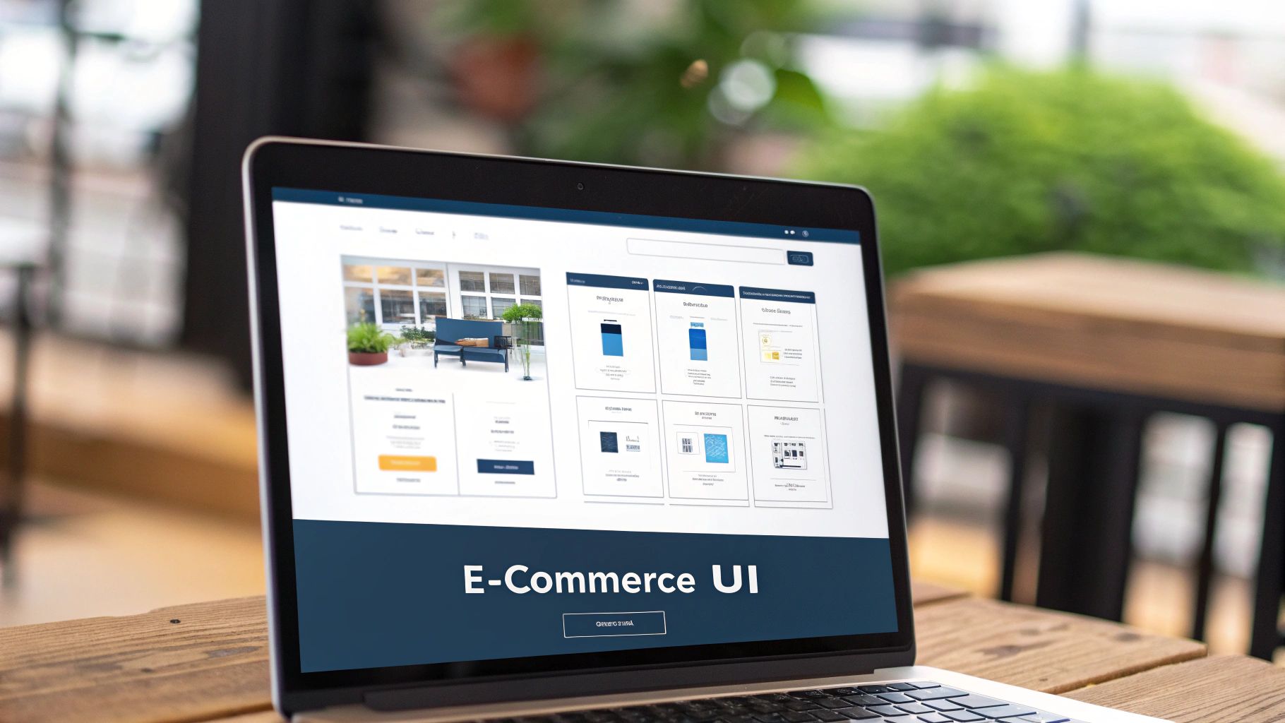
3. Shopify Polaris
Shopify Polaris is a robust design system, serving as a prime website style guide example, created to ensure consistency and a cohesive customer experience across all Shopify products. It provides a comprehensive set of guidelines, reusable components, and helpful tools empowering teams to build high-quality, consistent interfaces for both web and mobile. Polaris emphasizes creating interfaces for merchants that are not only functional but also visually appealing. This approach makes it a valuable resource for anyone involved in e-commerce development, offering a streamlined workflow and a polished final product.

Polaris earns its place on this list of website style guide examples because it moves beyond basic styling. It delves into the user experience, providing detailed interaction guidelines and design patterns specifically for e-commerce workflows. This makes it incredibly practical for developers and designers working within the Shopify ecosystem or building e-commerce platforms. Its focus on a cohesive user experience contributes significantly to a brand's identity and customer satisfaction.
Key features of Shopify Polaris include a comprehensive component library with ready-to-use React implementations, detailed UX and interaction guidelines, a content style guide covering voice and tone principles, visual design tokens for consistent styling, accessibility requirements for all components, and design patterns tailored for common merchant workflows.
Pros:
- Practical focus on e-commerce use cases: Polaris shines in its dedicated approach to e-commerce, making it highly relevant for online businesses.
- Ready-to-use React components: This accelerates development and ensures consistency across the platform.
- Strong documentation with usage examples: Clear documentation makes it easy to understand and implement Polaris components and guidelines.
- Includes both UX patterns and implementation details: This holistic approach bridges the gap between design and development.
- Integrated design tokens for easy theming: This facilitates consistent branding and visual styling.
Cons:
- Some components are specific to Shopify's ecosystem: This limits its applicability outside of the Shopify platform.
- Less applicable to consumer-facing websites: While excellent for merchant interfaces, it's not ideally suited for typical consumer-facing websites.
- Requires React knowledge for implementation: Developers need to be familiar with React to effectively utilize the component library.
Examples of Shopify Polaris in action:
- Shopify's merchant admin interface
- Shopify apps developed by third-party developers
- Shopify's internal tools and platforms
Tips for using Shopify Polaris:
- Utilize the React component library for faster development.
- Adhere to the content guidelines to maintain the Shopify voice and tone.
- Leverage design tokens to ensure consistent visual styling across your application.
- Apply the UX patterns for common e-commerce workflows to improve user experience.
Popularized By: Shopify design team, Shopify developer community, and e-commerce UX practitioners.
Shopify Polaris
When and why should you use this approach? If you're working within the Shopify ecosystem or building a merchant-focused interface for an e-commerce platform, Shopify Polaris is an invaluable resource. Its pre-built components, detailed guidelines, and focus on e-commerce workflows can significantly streamline your development process and ensure a consistent, high-quality user experience. While it's not ideal for every website project, its targeted approach makes it a powerful tool for the specific niche it serves.
4. IBM Carbon Design System
The IBM Carbon Design System is a robust, open-source design system created by IBM for building digital products and experiences. It serves as an excellent website style guide example because it provides a comprehensive set of reusable components, guidelines, and resources that enable teams to create consistent, accessible, and efficient interfaces. Carbon isn't just a collection of UI elements; it embodies IBM's Design Language, ensuring a cohesive experience across all IBM products and allowing other organizations to leverage its principles for their own projects. It's especially well-suited for complex applications and enterprise-level design challenges.
Carbon’s strength lies in its comprehensive offering. It features cross-framework component libraries for popular JavaScript frameworks like React, Angular, Vue, and Svelte, making integration into existing projects easier. It also provides enterprise-focused UI patterns and templates, addressing common design challenges in business applications. Furthermore, accessibility is deeply integrated at the component level, ensuring compliance with WCAG guidelines. Carbon goes beyond basic UI elements by offering data visualization guidelines and components, empowering developers and designers to present complex information effectively. Finally, its robust grid system ensures responsive layouts that adapt seamlessly to different screen sizes. This system deserves its place in this list of website style guide examples due to its comprehensive nature and enterprise-grade focus, showcasing best practices in building and maintaining consistent digital experiences.
Features and Benefits:
- Cross-framework component libraries: Use Carbon components in your preferred JavaScript framework.
- Enterprise-focused UI patterns: Leverage pre-built solutions for common enterprise design challenges.
- Comprehensive accessibility compliance: Build inclusive interfaces that meet accessibility standards.
- Data visualization guidelines and components: Present complex data in clear and engaging ways.
- Robust grid system: Create responsive and adaptable layouts.
- Design kits for various tools: Work seamlessly with Sketch, Figma, and Adobe XD.
Pros:
- Enterprise-grade: Designed for complex, large-scale applications.
- Multi-framework support: Integrates with various JavaScript frameworks.
- Deep accessibility integration: Ensures compliance from the ground up.
- Advanced data visualization: Facilitates effective communication of complex information.
- Active open-source community: Benefit from continuous development and support.
Cons:
- Business-oriented aesthetics: The design language may not be suitable for all brands.
- Complexity: Can be more challenging to learn and implement compared to simpler systems.
- Learning curve: Requires time investment for full mastery.
Examples of Successful Implementation:
- IBM Cloud platform interfaces
- Watson products and services
- IBM internal applications and tools
- Third-party enterprise applications built on IBM technologies
Tips for Using Carbon:
- Choose the design kit that matches your design tool.
- Utilize the data visualization components for displaying complex data.
- Follow the grid system for responsive enterprise layouts.
- Implement the accessibility features to ensure compliance.
Popularized By:
- IBM Design team
- Enterprise UX community
- Data visualization specialists
Website: https://www.carbondesignsystem.com/
When you need a robust, enterprise-ready website style guide example, especially for complex applications or data-heavy interfaces, the IBM Carbon Design System is an excellent choice. Its focus on accessibility, data visualization, and enterprise-specific patterns sets it apart. While there's a learning curve involved, the benefits of consistency, efficiency, and accessibility make it a valuable resource for any design team working on complex projects.
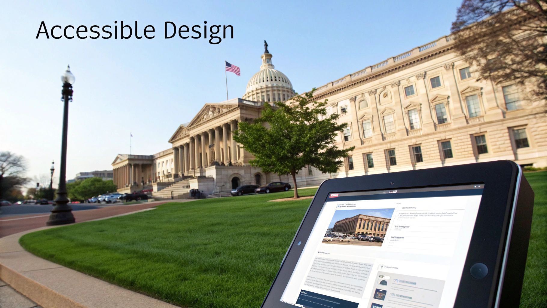
5. U.S. Web Design System (USWDS)
The U.S. Web Design System (USWDS) stands as a prime example of a website style guide, specifically tailored for government websites. It offers a comprehensive collection of open-source UI components, design principles, and content guidelines, empowering government developers and designers to create consistent, accessible, and mobile-friendly online experiences for citizens. If you're looking for website style guide examples, particularly in the public sector, USWDS offers a robust and well-tested model.
USWDS prioritizes accessibility, usability, and maintaining public trust through consistent design patterns. It achieves this by providing clear specifications for everything from color palettes and typography to complex interactive elements like forms and data tables. This structured approach ensures a unified user experience across diverse government websites, making it easier for citizens to find and understand the information they need.
Key Features and Benefits:
- Section 508 and WCAG 2.0 Accessibility Compliance: USWDS is built with accessibility at its core, ensuring websites are usable by people with disabilities. This is a crucial feature for government websites, which are legally obligated to provide equal access to information.
- Government-Specific Patterns and Templates: Provides pre-built components and templates specifically designed for government use cases, streamlining the development process.
- Mobile-First Responsive Components: All components are designed to be responsive, ensuring a consistent experience across different devices, from desktops to smartphones.
- Plain Language Content Guidelines: Promotes clear and concise language, making government information more accessible to all citizens, regardless of their reading level.
- Implementation Guidance for Government Agencies: Offers detailed documentation and support for agencies adopting the design system.
- Common Form Patterns Optimized for Accessibility: Provides accessible form elements and patterns, ensuring users can easily submit information.
Pros:
- Specifically Designed for Government Needs: Addresses the unique requirements and considerations of government websites, including accessibility, security, and public trust.
- Thoroughly Tested for Accessibility: Rigorous testing ensures compliance with accessibility standards.
- Built with Security Considerations: Incorporates security best practices.
- Open-Source with Active Community: Fosters collaboration and continuous improvement through an active community of contributors.
- Designed for Citizens of Varying Technical Abilities: Prioritizes usability for all citizens, regardless of their technical skills.
Cons:
- Aesthetic is Specifically Government-Focused: The design aesthetic might feel too utilitarian or formal for commercial applications.
- Less Suitable for Commercial Applications: Its focus on government-specific needs makes it less adaptable for businesses.
- Design Choices Prioritize Function over Creative Expression: While ensuring consistency and accessibility, the design system may limit creative freedom.
Examples of Successful Implementation:
- USA.gov
- Centers for Medicare & Medicaid Services (CMS)
- Department of Veterans Affairs (VA) websites
- Numerous other federal agency websites
Actionable Tips for Implementation:
- Implement the banner components for official government identification: This helps establish trust and credibility.
- Use the form patterns for accessibility compliance: Ensure all users can easily interact with forms.
- Follow the plain language guidelines for citizen-friendly content: Make information clear and easy to understand.
- Leverage the identity system to maintain government trust: Consistent branding reinforces public confidence.
Why USWDS Deserves Its Place in This List:
USWDS exemplifies a well-structured and comprehensive website style guide. It demonstrates how a design system can be used to create a cohesive online presence, enhance accessibility, and build public trust. Its focus on user-centered design, rigorous accessibility testing, and open-source nature make it a valuable resource and a strong example for other organizations seeking to create effective website style guides. For government agencies and those working on public-facing websites, exploring USWDS is essential. You can find more information and resources on the official USWDS website: designsystem.digital.gov.
Popularized By:
- U.S. Digital Service
- 18F (technology and design consultancy within GSA)
- Federal government web developers and designers
6. Atlassian Design System
The Atlassian Design System (ADS) stands out as a robust example of a product-focused style guide, offering a comprehensive resource for building consistent and user-friendly interfaces, especially for complex software applications. While not a traditional marketing website style guide example, its inclusion in this list highlights its value for anyone designing intricate digital products. It provides a practical demonstration of how to achieve cohesive design at scale within a large product ecosystem, making it relevant to web designers, UI/UX designers, creative professionals, product designers, and developers alike. You can explore the Atlassian Design System here.
ADS goes beyond basic styling; it encompasses a complete system of guidelines, reusable components, and established patterns. This allows teams to create attractive, cohesive, and accessible experiences across various platforms and products. Its strength lies in simplifying the design process for complex product interfaces, collaboration tools, and enterprise software by offering pre-built solutions and clear guidelines.
How It Works:
The Atlassian Design System operates on the principle of modularity and reusability. It provides a library of pre-designed UI components (buttons, menus, forms, etc.) and established interaction patterns that designers can implement directly into their projects. This ensures consistency across different Atlassian products and streamlines the development process. The system also includes extensive UX writing guidelines, helping maintain a clear and consistent voice throughout the user interface.
Features and Benefits:
- Product-focused UI components and patterns: Ready-made building blocks for application design, accelerating development and ensuring visual consistency.
- Extensive UX writing guidelines: Helps craft clear and concise interface copy, improving user comprehension.
- Interaction patterns for complex workflows: Provides solutions for designing intuitive user flows within intricate applications.
- Collaborative interface design principles: Promotes teamwork and facilitates a shared understanding of design principles.
- Brand expression through product design: Enables consistent brand representation across all product interfaces.
- Cross-platform implementation guidelines: Ensures a unified experience regardless of the user's operating system or device.
Pros:
- Optimized for product and application interfaces: Specifically designed for the challenges of software product design.
- Strong focus on user experience and interactions: Prioritizes usability and efficient workflows.
- Comprehensive documentation with examples: Provides clear guidance and practical demonstrations.
- Regular updates based on user research: Continuously evolves to meet user needs and industry best practices.
- Detailed guidance for complex UI challenges: Offers solutions for navigation, information architecture, and interaction design in complex applications.
Cons:
- Primarily designed for Atlassian-like products: The specific styling might not be suitable for all projects.
- More complex than marketing website style guides: The depth and breadth of the system can be overwhelming for smaller projects.
- Best suited for software products rather than content sites: Less applicable to websites focused primarily on delivering content.
Examples of Successful Implementation:
- Implemented across Jira, Confluence, and Trello.
- Used in Bitbucket and other Atlassian developer tools.
- Applied to Atlassian Marketplace products.
- Adopted by integration partners for a consistent experience.
Actionable Tips:
- Use the component library for building enterprise applications.
- Apply the content guidelines for clear interface instructions.
- Follow the navigation patterns for complex application flows.
- Implement the accessibility guidelines for inclusive design.
When and Why to Use this Approach:
Consider adopting a system like ADS if you’re developing a complex software application, particularly if you need to maintain consistency across multiple platforms or products. It provides a scalable solution for design and development, saving time and resources while ensuring a high-quality user experience. If your project is a simple marketing website or content-focused platform, a less comprehensive style guide might be more appropriate. However, the principles of modularity, consistency, and user-centered design showcased in ADS are valuable takeaways for any design project.
Style Guide Comparison Matrix
| Style Guide | Implementation Complexity 🔄 | Resource Requirements ⚡ | Expected Outcomes 📊 | Ideal Use Cases 💡 | Key Advantages ⭐ |
|---|
| Mailchimp Style Guide | Medium - Detailed editorial rules, less visual | Moderate - Focus on writing expertise | Consistent brand voice and tone across content channels | Marketing content, brand communication | Thorough, well-organized writing guidelines, publically available |
| Google Material Design | High - Extensive visual, interaction, and motion | High - Design and development resources | Unified cross-platform UI with accessibility compliance | Multi-platform apps, complex UI systems | Comprehensive specs, accessible, strong tooling support |
| Shopify Polaris | Medium - Component-driven with React knowledge | Moderate to High - Requires React dev skills | Cohesive e-commerce merchant interfaces | E-commerce admin and retail platforms | Practical e-commerce focus, React components, strong UX patterns |
| IBM Carbon Design System | High - Supports multiple frameworks and complex UI | High - Multi-framework and design toolkits | Enterprise-ready, accessible, and data-rich interfaces | Enterprise apps, complex data visualization | Enterprise-grade, multi-framework, strong accessibility |
| U.S. Web Design System (USWDS) | Medium - Focus on accessibility and gov patterns | Moderate - Open source, accessibility experts | Accessible, mobile-friendly, and trust-worthy government sites | Government websites and public services | Accessibility tested, security-focused, plain language content |
| Atlassian Design System | Medium-High - Complex product and interaction focused | Moderate to High - Design and UX expertise | Consistent, efficient, and user-friendly complex interfaces | Enterprise software, collaboration tools | Strong UX focus, detailed for complex workflows, user research based |
Building Your Brand with Brilliant Style Guides
From Mailchimp's playful voice to Google's Material Design's focus on intuitive user experiences, the website style guide examples we've explored demonstrate the power of a well-defined design system. Key takeaways include the importance of clear typography guidelines, consistent color palettes, and establishing a distinct brand voice across all platforms. Mastering these elements allows you to create a cohesive online presence, fostering brand recognition and trust among your audience. A robust style guide not only streamlines the design process but also ensures a consistent user experience, ultimately contributing to higher engagement and conversion rates. This is crucial for any business or organization aiming for a strong digital footprint.
By studying these diverse approaches, you can glean inspiration and best practices for crafting your own unique website style guide. Remember, a strong style guide isn't just a set of rules—it's the foundation upon which you build a memorable and impactful online presence. It's the DNA of your digital brand.
Looking for a smart way to organize all these inspiring website style guide examples? Bookmarkify helps you curate and manage your research, keeping all your web finds in one easily accessible place. Start building your design inspiration library today with Bookmarkify!