We’ve all been there. You have dozens of tabs open, a desktop cluttered with screenshots, and a vague memory of a brilliant website you saw last week. This digital chaos is a common hurdle for creatives, turning a sea of inspiration into a source of frustration. The ideas are there, but they get lost before you can even use them.
The solution isn't just better organization, it's a shift from passive browsing to active analysis. A professional website design evaluation is a skill you can learn. It involves systematically breaking down a site into its core components: typography, color, layout, and user experience. Instead of just thinking "I like this," you start understanding *why* it works.
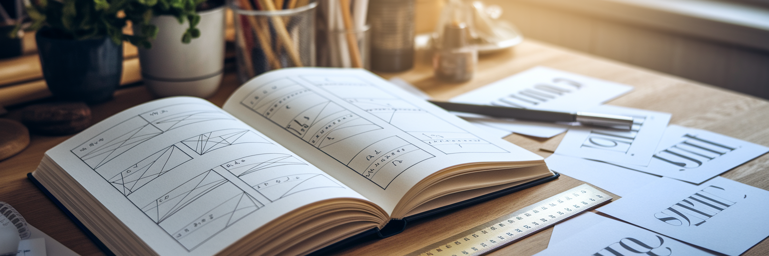
This structured approach transforms random inspiration into a powerful, searchable library of ideas. It’s about building a system that helps you deconstruct great designs so you can build your own. A tool designed for this exact purpose can make all the difference.
Deconstructing Typography and Readability
Great typography is often invisible, guiding the reader without calling attention to itself. To analyze website designs effectively, you need to look beyond just the font choice and examine its strategic role. It’s about creating a clear path for the user’s eye to follow.
Establishing Visual Hierarchy
Think of typography as the voice of the website. Headings (H1, H2, H3) are the loud, attention-grabbing statements, while body text is the conversational tone. A strong visual hierarchy ensures users can scan the page and instantly understand what’s most important. When you critique a site, check if the heading sizes and weights create a logical flow.
The Art of Font Pairing
Font pairing is where personality comes in. A simple but effective rule is to pair a serif font (like Times New Roman) with a sans-serif font (like Arial). This creates contrast and visual interest without clashing. The goal is to find two fonts that complement each other, one for headlines and one for body text, to create a balanced and professional look.
Technical Keys to Readability
A beautiful font is useless if it’s hard to read. Here are a few technical details to check for:
- Line Length: For comfortable reading, lines of text should ideally be between 50 and 75 characters long. Anything longer can cause eye strain as the reader struggles to find the next line.
- Line Height (Leading): The space between lines of text is crucial. A good rule of thumb is a line height that is 1.4x to 1.6x the font size. This gives the text room to breathe.
- Font Size: For body text, a base font size of 16px to 18px is standard for desktop viewing, ensuring it’s accessible to most users without needing to zoom.
You can manually inspect these elements using your browser's developer tools, but that can be slow. A more efficient workflow is to use a tool built for this. For example, our Design Analyse feature instantly extracts all fonts, sizes, and weights from any site you save, letting you see the entire typographic system at a glance.
Decoding Color Psychology and Accessibility
Color does more than just make a website look good; it communicates a brand's personality and directly impacts usability. A professional analysis looks at both of these aspects. You need to understand the "what" and the "why" behind a color palette.
Crafting a Brand's Personality with Color
Colors evoke emotion. Blues often convey trust and stability (think banks and tech companies), while yellows suggest optimism and energy. When you how to critique a website, check for consistency. Does the color palette align with the brand's message? Is it used consistently across all pages and elements?
Applying the 60-30-10 Rule
A balanced color scheme is key to a harmonious design. The 60-30-10 rule is a timeless framework that helps achieve this balance. It provides a simple structure for distributing color throughout a design to create a clean and organized feel.
| Role | Percentage | Typical Elements | Purpose |
|---|
| Dominant Hue | 60% | Backgrounds, main content areas | Sets the overall tone and mood of the site. |
| Secondary Color | 30% | Secondary info blocks, cards, active menu items | Creates contrast and visual interest. |
| Accent Color | 10% | Call-to-action buttons, links, icons, highlights | Draws attention to key interactive elements. |
This table provides a practical breakdown of the 60-30-10 rule, a balanced framework used by designers to create harmonious and effective color palettes. The percentages are guidelines, not strict rules.
Prioritizing Accessibility with Contrast
A beautiful design fails if not everyone can use it. Color contrast—the difference in brightness between text and its background—is non-negotiable for users with visual impairments. According to the Web Content Accessibility Guidelines (WCAG), text and background colors should have a specific contrast ratio to be considered readable. Your eyes can be deceiving, so using a tool is essential. A great resource for this is the WebAIM Contrast Checker, which is an industry standard. Save sites with compelling color schemes from places like our inspiration page, then use a tool to check if their palettes are accessible.
Mastering Layout, Spacing, and Composition
Layout is the skeleton that holds a design together. It brings order to the content and guides the user through the page. A great layout feels intuitive and effortless, but it’s the result of very intentional decisions about structure, spacing, and hierarchy.
The Invisible Skeleton: Grid Systems
Most well-designed websites are built on a grid system, often a 12-column grid. This invisible structure ensures that elements are aligned and spaced consistently, creating a sense of order and professionalism. When analyzing a site, try to identify the underlying grid. Are elements aligned neatly within columns?
The Power of Whitespace
Whitespace, or negative space, isn't just "empty" space. It's an active design element that gives content room to breathe. Good use of whitespace reduces cognitive load, improves readability, and creates a feeling of sophistication. When you see a design that feels clean and uncluttered, it’s usually because of masterful whitespace management.
Guiding the Eye with Visual Hierarchy
Layout works with typography and color to create a clear visual hierarchy. Designers often use common reading patterns, like the Z-pattern or F-pattern, to place important elements where users are most likely to look. Ask yourself: where does my eye go first? Is it the most important element on the page, like a headline or a call-to-action button?
A great practical exercise is to analyze how a site’s layout adapts to different screen sizes. You can save a site and then use a tool like Bookmarkify to instantly preview it in desktop, tablet, and mobile modes. Save both good website layout examples and poor ones to learn from both. When you analyze a layout, ask yourself:
- Is there a clear grid system in place?
- Does the whitespace feel intentional and balanced?
- Where does my eye go first, and is it the most important element?
- How does the layout change on smaller screens?
The Right Tools for Efficient Design Analysis

A pro-level analysis requires the right toolkit. Having a set of go-to web design analysis tools can dramatically speed up your workflow and provide more accurate insights than just relying on your eye alone. These tools can be grouped into a few key categories.
First, you have browser-native tools like Chrome DevTools. They are powerful for inspecting code, checking responsiveness, and identifying specific assets. Second, there are specialized browser extensions designed to quickly identify fonts and color palettes. Finally, you have inspiration management platforms that act as your central hub.
For exploring font pairings, a resource like Google Fonts is invaluable. A designer's toolkit often extends from analysis to creation, including powerful web-building tools that help bring a vision to life. However, the real magic happens when you connect these different stages. Bookmarkify acts as the central hub for your entire workflow, allowing you to save inspiration, analyze it with built-in features, and organize it for future projects.
To round out your analysis, consider performance. A beautiful design is incomplete if it’s slow to load. Tools like Google Lighthouse can analyze a site’s performance, accessibility, and SEO, giving you a complete picture of its quality. For more guides and tips on improving your creative workflow, check out more articles on our blog.
Bringing It All Together for a Cohesive Review
A professional website design evaluation isn't about judging elements in isolation. It’s about understanding how typography, color, and layout work together to create a cohesive user experience that supports the site's goals. Each choice should reinforce the others to tell a consistent story.
The best way to develop this skill is through practice. Start building your own "swipe file" or inspiration library. As you save websites, don't just collect them—critique them. Use a tagging system to organize your findings. For instance, in Bookmarkify, you can tag examples with "great typography," "clever layout," or "bold color use." This turns your library into a searchable database of solutions and ideas.
The ultimate goal is to develop a "designer's eye" that can quickly deconstruct what makes a design successful. This deliberate practice is what separates a novice from a pro. So, why not start today? Find a website you admire, save it, and begin your first analysis. Turn passive inspiration into active learning.
Ready to build your own inspiration library? Explore our free and pro plans to find the perfect fit for your workflow.