From Creative Chaos to a Cohesive Vision
We have all been there. Your screen is a mosaic of 42 open tabs, your desktop is cluttered with screenshots, and that one perfect link you know you saved is... somewhere. This creative chaos is a familiar part of the design process, but it slows down the actual creating. The strategic antidote, especially for the complex challenge of responsive design, is the moodboard.
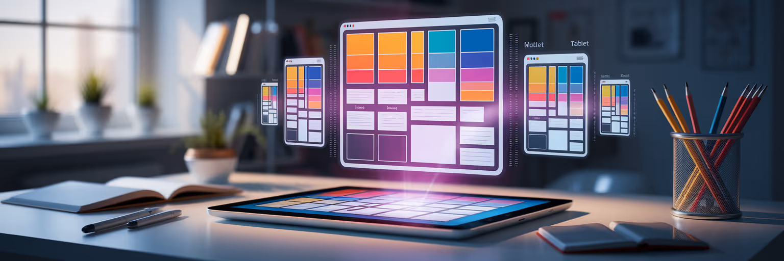
In 2025, a moodboard for web design is not just a pretty collage. It is a vital tool for visualizing a project’s look, feel, and function across every device. Digital tools have transformed moodboards into dynamic, interactive spaces that streamline your entire visual design workflow. Instead of wrestling with messy folders, you can build an organized system that serves your creativity.
This guide will show you exactly how to create a moodboard that is built for the modern web. A dedicated tool like Bookmarkify can become the perfect central hub for this new, more efficient process, turning scattered ideas into a clear vision.
Why Static Moodboards Don't Work for Responsive Design
The traditional moodboard, a simple grid of images, has a fundamental flaw in the context of modern web development. It captures a fixed aesthetic but completely fails to represent the fluid, interactive nature of a responsive experience. It gives you a snapshot when what you really need is the whole film.
These static visuals fall short in several key areas:
- The Responsiveness Gap: A static image cannot show how a layout should gracefully break at different viewport sizes. It misses how navigation transforms from a wide menu to a hamburger icon, or how typography scales to remain readable on a phone.
- The Missing Interactivity: Static visuals do not capture essential user experience elements like hover effects, button-press animations, or smooth page transitions. It’s like trying to understand a song by only looking at the sheet music; you see the notes, but you miss the music.
- The Failure to Communicate Motion: Motion design is integral to modern UI, guiding the user's eye and providing feedback. A static moodboard for web design simply cannot convey this crucial dimension.
This establishes the need for a "living" or dynamic moodboard, one that breathes and adapts just like the final product will. For more insights on modern design practices, you can find a wealth of articles on the Bookmarkify blog.
Building Your Dynamic Responsive Design Moodboard
Creating a dynamic moodboard is about shifting your collection habits. It is a step-by-step process that turns a folder of images into a powerful, searchable library of responsive design inspiration.
Collect More Than Just Static Images
Your first step is to capture inspiration in multiple formats. Go beyond static screenshots and save short videos or GIFs of smooth animations, interactive menus, and engaging micro-interactions. This is about capturing the "verb" of the design, not just the "noun." You need to see how a design feels to use, not just how it looks at a single moment.
Visualize Across All Key Breakpoints
Gather examples for desktop, tablet, and mobile views simultaneously. Look for designs that handle transitions gracefully. This is where UI design inspiration tools with different view modes, like Bookmarkify's desktop and mobile previews, make side-by-side comparison effortless. To get started, you can explore a curated library of examples in our inspiration gallery.
Create a Searchable System with Tags
A modern moodboard is a database, not a digital shoebox. Use a robust tagging system to organize design inspiration. This turns your collection into a powerful, searchable resource, making it easy to find specific responsive design patterns when you need them. A well-organized system not only saves time but can also help automate your creative workflow. For those looking to streamline even further, tools exist to help automate your content scheduling and keep projects on track.
A Tagging System for Your Responsive Moodboard
| UI Component |
Example Tags |
Why It's Crucial for Responsiveness |
| Navigation |
nav-desktop, nav-mobile, nav-animation |
Tracks how menus adapt from full bars to hamburger icons. |
| Hero Section |
hero-layout, hero-typography, hero-cta-mobile |
Focuses on how the most valuable screen real estate changes. |
| Grid System |
grid-fluid, grid-2-col, grid-card-stack |
Helps visualize how content reflows and stacks on smaller screens. |
| Typography |
type-scale, font-pairing, readability-mobile |
Ensures text is legible and maintains hierarchy on all devices. |
| Forms & CTAs |
form-input-size, cta-button-mobile, form-validation |
Focuses on usability, especially for touch-based interactions. |
Actionable Tip: Start your next project by creating a collection in Bookmarkify and adding at least one inspiration example for each key component (header, hero, grid) in both mobile and desktop views. This simple habit will force you to think responsively from day one.
Curating Adaptive Aesthetics and UI Patterns
Once you have a system for collecting, the next step is to develop a designer's eye for quality. This is about curating for specific design principles that ensure your project looks and feels great everywhere.
Here is what to look for:
- Flexible Grids and Layouts: Collect examples of fluid grids, CSS Grid layouts, and Flexbox-based components that reflow elegantly. Look for how spacing, columns, and visual hierarchy adapt, not just shrink.
- Typography That Scales Beautifully: Curate font pairings and typographic scales that maintain readability and aesthetic appeal on all screen sizes. Save examples where the type feels just as impactful on mobile as it does on desktop.
- Motion and Micro-interactions: Reiterate the importance of motion in modern UI. Moodboard for subtle hover states, satisfying button feedback, and smooth page transitions to capture the "feel" of a site.
This detailed collection becomes a powerful reference library for future projects. To stay on top of emerging UI patterns, designers can draw from curated sources. For instance, a recent GoDaddy report on digital design trends highlights the move towards "bold minimalism," an aesthetic that thrives in responsive environments. For fresh examples delivered every day, check out the Bookmarkify Daily Inspiration feed.
Weaving Accessibility into Your Visuals

A truly responsive design is one that is usable by everyone, on any device. Accessibility should not be a final checkbox but a foundational element of your creative vision. Integrating this mindset into your inspiration-gathering phase is key.
Here is how to do it:
- Moodboarding for Color and High Contrast: Collect color palettes that are not only beautiful but also meet WCAG contrast guidelines. Use browser extensions or built-in tools to check contrast on your inspiration sites before saving them. Tools that let you analyze a site's design elements are invaluable here, and you can explore how with features like our Design Analyse page.
- Considering Touch Targets and Readability: Collect examples of mobile-first design with generous touch targets for buttons and links. Also, save examples of legible font sizes and line heights for long-form content on small screens.
An accessible moodboard is the first step toward an accessible product. This practice helps you create more robust, professional, and user-centric designs from the very beginning.
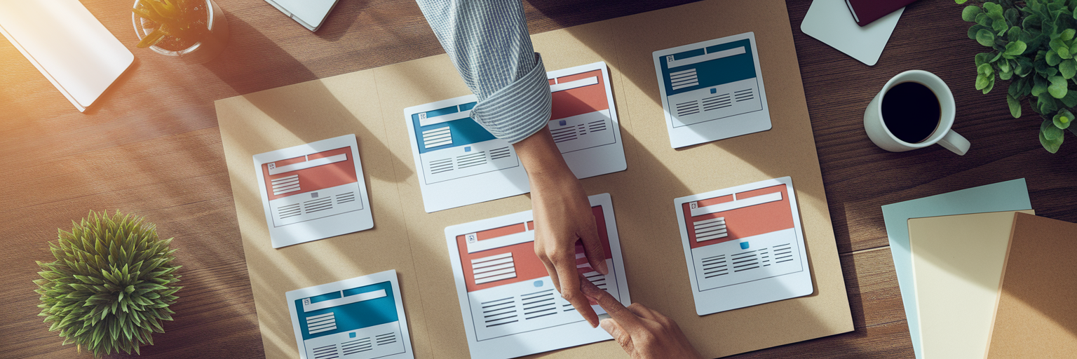
Sharing Your Vision for Seamless Collaboration
A well-organized moodboard is more than a personal tool; it is a powerful asset for team communication. It creates a shared visual language that bridges the gap between designers, developers, and clients, preventing misunderstandings down the line.
First, you can present the moodboard as an actionable brief to get buy-in on the visual direction before a single line of code is written. This proactive step saves countless hours of revisions later. Second, modern tools that allow sharing an entire collection via a single URL make feedback effortless. Stakeholders can view the responsive design inspiration in context and provide clear, consolidated feedback. This transforms a moodboard from a simple collection of images into a truly strategic asset in any design workflow.
Start Building Your Responsive Inspiration Library
Let's recap. Modern responsive moodboards are dynamic, organized by device, tagged for searchability, and built for collaboration. This systematic approach transforms a messy folder of screenshots into a powerful, searchable asset for every project.
Stop juggling tabs and start building your own streamlined inspiration library today. Experience the clarity of an organized visual design workflow by trying Bookmarkify for free and saving your first few responsive examples.