How to Design Empty States for Web Apps
Design useful empty states for first use, no results, and loading failures, with practical copy examples, source analysis, and a handoff checklist.
Last updated:
November 3, 2026
Design useful empty states for first use, no results, and loading failures, with practical copy examples, source analysis, and a handoff checklist.
Last updated:
November 3, 2026
“Nothing here” can describe an untouched workspace, an unsuccessful search, or content that failed to load. Those situations need different explanations and different next steps. Designing one empty screen and reusing it everywhere leaves the most useful part of the message undecided: what can this person do now?
This guide shows how to design empty states for a web app by starting with the cause, then choosing the copy, action, and layout. The worked example is a fictional project library, so you can adapt the method without mistaking it for a tested product flow.
Before drawing an illustration, write a condition that someone could verify. For example: “The request succeeded, but the selected filters returned no matches.” That is more precise than “Show empty state.”
IBM Carbon’s empty-state guidance distinguishes first-use, user-action, and error-management situations. Its examples include search results, permissions, and configuration problems. The practical lesson is to classify the cause before choosing the treatment.
For your own interface, use this suggested checklist:
Keep “still loading” separate from “finished with nothing to show.” In the design brief, specify which confirmed outcome permits the empty message to appear. If the cause is unknown, do not write copy that confidently says the user has no content.
The Stack Overflow design system publishes two useful contrasting examples. Its actionable search example includes a “Clear filters” button. Its non-actionable example explains that user trends are not ready and asks the reader to return later, without a recovery button.
These are documented component examples, not evidence that either treatment improves a business metric. What you can borrow is the decision rule: provide an action when the person can change the situation; set expectations when they cannot. Adding a button simply to fill the layout can promise control that does not exist.
Carbon’s first-use guidance takes a different starting point: tell people what the space will contain and show the relevant way to populate it. A new library needs orientation; an unsuccessful search needs a narrower recovery step. Using the same welcome message for both would obscure that distinction.
Draft the heading, supporting sentence, and action as one unit. Then name the destination or result of activating the action. A button label alone is not a complete interaction specification.
For a fictional client-project library, consider these original copy proposals:
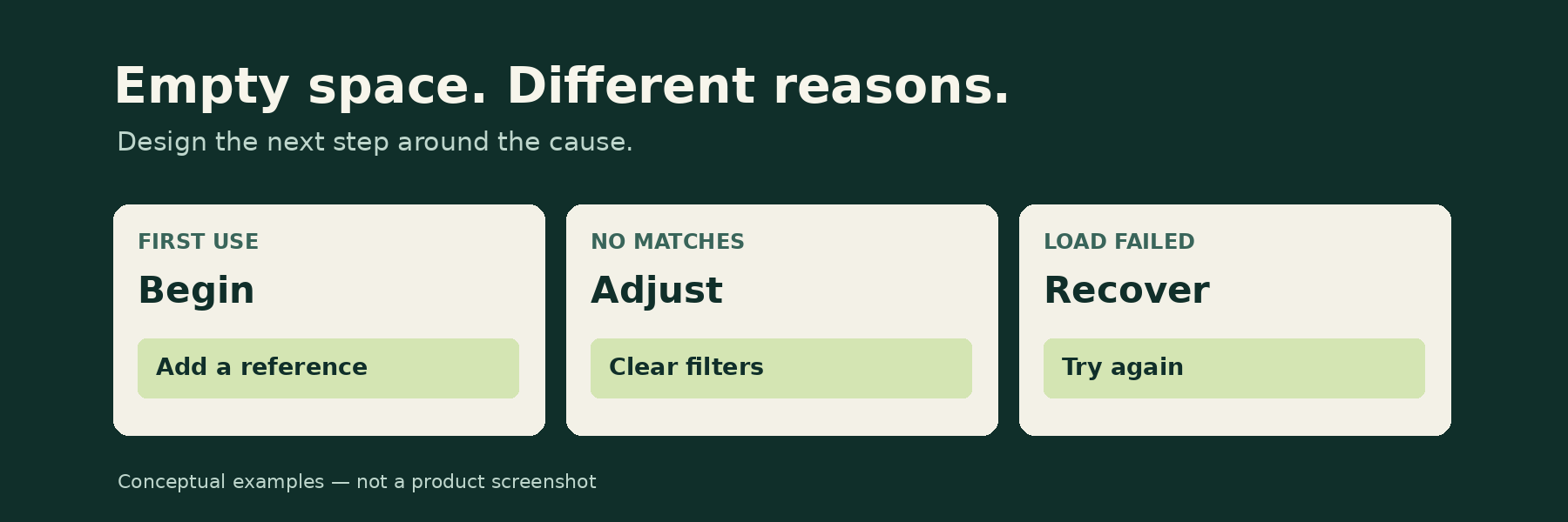
Heading: Start your project library
Message: Add a reference you want to discuss with the team.
Action: Add a reference
The action should open the actual reference-creation flow. If that flow is elsewhere, point to it clearly rather than drawing a second control that behaves differently.
Heading: No references match these filters
Message: Remove a filter or try another search.
Action: Clear filters
Specify what remains after that action. In this proposal, clearing filters preserves the search text; it does not reset everything. If the query itself is the problem, the interface still needs a visible way to edit it. Review whether a different label would describe your real behavior more accurately.
Heading: We couldn’t load your references
Message: Try loading the library again.
Action: Try again
This proposal fits only a recoverable loading failure. Do not claim the references are safe or unchanged unless the system can establish that. For a permission problem, replace the retry with the actual access-request route, if one exists. Repeated retries cannot grant access.
A full-page first-use state and an empty sidebar should not automatically receive the same composition. Carbon recommends using text alone when space is limited and warns that repeated illustrations can lose impact across multiple empty widgets.
For your layout review, place the message inside the smallest and largest containers it must support. Try the longest realistic heading and translated copy if localization is in scope. Check whether the action still sits beside the explanation that gives it meaning.
Use an illustration only when it contributes something the text does not already say. If an essential instruction appears inside an image, provide that instruction as readable text too. Keep the recovery path understandable without relying on color or a decorative symbol.
Save one first-use example, one no-results example, and one unavailable-content example. Beside each source, note the triggering condition, message, action, and destination. Mark any behavior you could not inspect as unverified.
To compare these references visually, use Bookmarkify’s infinite canvas, which supports arranging bookmarks alongside sticky notes and rich text pages. Place each source beside a short note explaining the decision you want to adapt. For a team-wide collection, our guide to a shared design inspiration library covers keeping the research useful beyond one review.
The useful outcome is a specification, not a larger collection: one condition, one truthful message, and a next step that the product actually supports.
Walk through the fictional library as a sequence: first visit, first saved item, filtered search with no matches, and a failed request. These are suggested review scenarios, not test results.
Resolve those questions before polishing the illustration. The empty state is part of the task flow, and its design is complete only when the next state makes sense.
Sources checked November 3, 2026. Prepared with AI assistance using the linked primary sources. The library scenarios and copy are original illustrative proposals, not reports of product testing.

Ivan S
Lead Marketing Designer @Scribe, Founder @bookmarkify

Effortlessly Save time and stay Inspired: Streamline your workflow with Bookmarkify. No more juggling 10 tabs and screenshots.