How to Build a Website Motion Reference Board
Build a website motion reference board with clear triggers, state changes, reduced-motion alternatives, and a practical brief your team can use.
Last updated:
November 2, 2026
Build a website motion reference board with clear triggers, state changes, reduced-motion alternatives, and a practical brief your team can use.
Last updated:
November 2, 2026
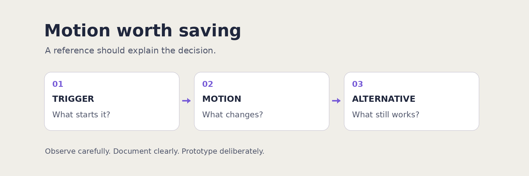
A screenshot can preserve a layout while losing the reason an interaction works. It cannot tell your teammate what triggered a transition, what changed, or what should happen when someone prefers less movement. A website motion reference board should capture those decisions alongside the source.
This guide proposes a small, reusable reference format for web and UI designers. The aim is to leave your research session with a motion brief you can discuss and prototype, rather than a collection of effects you still need to interpret.
Choose a task before collecting examples. For a pricing page, the question might be: how should a visitor reveal the details of a plan without losing their place? For a portfolio, it might be: how can the transition between projects preserve a sense of orientation?
Write down the intended outcome and one constraint. “Make plan details easier to compare while keeping the price visible” gives you something concrete to evaluate. “Find impressive animation” leaves the decision open.
Begin with three references that address the same question. Include a restrained example as well as an expressive one. Comparing different answers to one task is more useful than comparing unrelated effects.
Visit the original page and reproduce the interaction yourself. Save the URL, the date, the relevant page section, and the device or viewport you used. If an interaction cannot be reproduced, mark it as unverified instead of filling in the gaps from memory.
Use the following card beside each reference. These fields are a suggested research method, not a claim about how every design team works.
Keep observation and interpretation separate. “The details expand beneath the selected plan” is an observation. “This may help preserve context” is a hypothesis. Neither establishes that a pattern improves conversion or usability.
WCAG 2.2 Success Criterion 2.3.3, Animation from Interactions, is Level AAA. It calls for a way to disable interaction-triggered motion animation unless it is essential. W3C distinguishes this from automatically initiated animation, which is addressed separately by its Pause, Stop, Hide criterion. A reference board is a place to record these questions; it is not an accessibility audit.
The prefers-reduced-motion media feature lets a site detect a user's device-level preference for reduced motion. The site still needs an appropriate implementation. Do not assume that enabling the preference automatically changes every animation on every website.
For each reference, record whether you checked its reduced-motion behavior. If you have not checked, write “not tested.” Then describe the alternative you want for your own design: perhaps the content appears immediately, while the selected state and reading order remain clear.
The design question is whether the task still makes sense with that alternative. Review navigation, focus behavior, content visibility, and essential feedback alongside the movement. For broader review areas, use our website accessibility checklist as a starting point.
Imagine a pricing-page prototype where selecting a plan reveals its feature details. The following is an illustrative design brief, not a report of a tested website.
This card exposes a tradeoff you can investigate. A smooth expansion may look coherent, but the amount of content and resulting page movement still need attention. A useful reference should help you ask that question before you choose an animation curve.
Group your references into three areas: useful patterns, patterns to adapt, and patterns to avoid. Under each group, explain the reason for the decision in the language of your project. “Good feedback after a selection” is more reusable than “nice animation.”
Bookmarkify's infinite canvas supports arranging bookmarks with sticky notes and rich text pages. One practical setup is to place each source bookmark beside its motion card, then keep a short decision brief nearby. This uses the board to preserve context; it does not require an automatic motion-recording or timing-analysis feature.
Keep the original URL even if you also have a permitted recording or screenshot. Revisit the source when a detail matters, and note when a reference has changed. If you share visual captures publicly, check the relevant rights and permissions; a source link alone does not grant reuse rights.
End the research session by choosing one interaction to prototype. Write its trigger, state change, purpose, reduced-motion alternative, and unresolved question. Link the references that informed the choice, and say which part you are adapting.
Your first experiment can be small: one design question, three reference cards, and one prototype comparison. The useful result is a decision that another designer can understand and challenge without replaying your entire research session.
Sources checked November 2, 2026. Prepared with AI assistance using the linked sources. The reference-card method and pricing-page brief are suggested workflows, not claims of hands-on product testing.

Ivan S
Lead Marketing Designer @Scribe, Founder @bookmarkify

Effortlessly Save time and stay Inspired: Streamline your workflow with Bookmarkify. No more juggling 10 tabs and screenshots.