D&D Forest Battle Map: A Designer's How-To Guide
Learn how to design a D&D forest battle map from start to finish. This guide covers planning, layout, assets, and VTT integration for immersive encounters.
Last updated:
April 22, 2026
Learn how to design a D&D forest battle map from start to finish. This guide covers planning, layout, assets, and VTT integration for immersive encounters.
Last updated:
April 22, 2026
SEO Title: D&D Forest Battle Map Guide for Designers and DMs
Meta Description: Learn how to design a better d&d forest battle map with a practical workflow for composition, terrain, assets, lighting, and VTT-ready exports.
A lot of forest fights fall apart before initiative is even rolled. The map looks fine at a glance, but once minis hit the table, it becomes a patch of green with a few scattered trees and no real decisions to make.
That’s a key problem with a weak d&d forest battle map. It doesn’t just look bland. It flattens the encounter. Players stop reading the environment, enemies stop using space in interesting ways, and the forest stops feeling like a place.
Good forest maps do the opposite. They create uncertainty, shape movement, and tell players what kind of danger lives here before a single token moves. If you treat map-making like design work instead of decoration, the whole encounter gets sharper.
A forest encounter becomes memorable when the map creates pressure and possibility at the same time. That’s why I don’t think of battle maps as prep filler. I treat them like small environment design projects.
The biggest shift is mental. Stop asking, “Where do I place some trees?” Start asking, “How do I make this space produce choices?” That one change improves almost everything that follows, from composition to asset selection.
A strong forest map needs to do several jobs at once:
The core visual mistake is usually overexposure. Designers show too much of the forest from an overhead view and forget what the scene feels like at ground level. The core element of any forest map is trees, and they work best in thick stands that block vision and make the bird’s-eye view feel different from character perspective, which increases tactical depth through realistic visibility challenges, as noted in The Fateful Force’s forest map guidance.
<video
autoplay
muted
loop
playsinline
preload="auto"
style="width:100%; height:auto; border-radius: 6px;"
When a forest map works, it usually has a readable structure under the surface. There’s a route that looks safe but isn’t. There’s a flank path that costs movement but offers surprise. There’s a clearing that invites spellcasting but leaves someone exposed.
Those choices don’t happen by accident. They come from deliberate composition.
Practical rule: If the map still feels static after you remove the textures and color, the structure is weak.
A lot of digital artists entering TTRPG mapping over-render too early. They polish moss, bark, and foliage before they’ve solved the encounter geometry. That’s backwards.
Start with function. Then add atmosphere. The best battle maps feel cinematic because the underlying decisions are clean.
Before you build anything, define what the forest is doing in the scene. “Forest” isn’t a concept. It’s a container. You need a situation inside it.
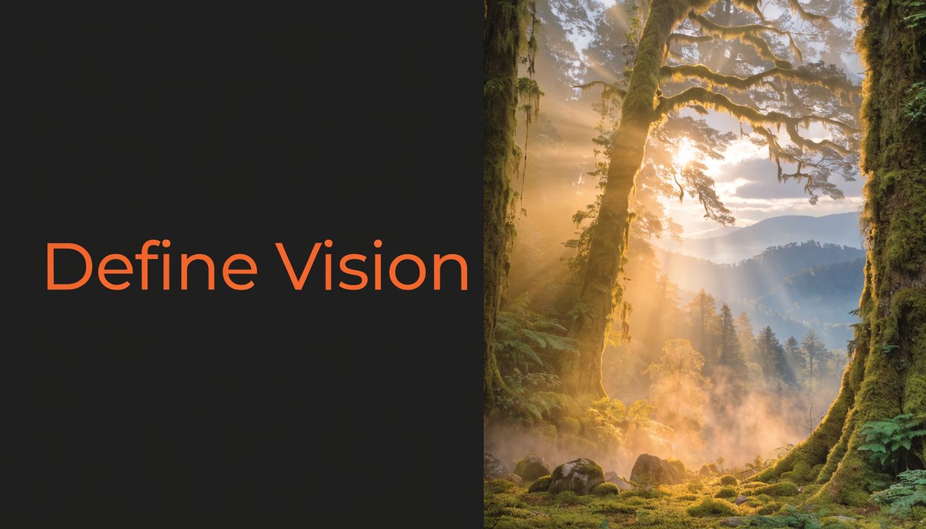
A map for a bandit ambush should feel different from a sacred druid grove or a predator’s hunting ground. The same tree assets can serve all three, but the composition, density, palette, and points of interest should change.
I keep this simple. A useful brief usually fits in a few lines:
This keeps the map from drifting into generic fantasy wallpaper.
The visual references you collect should support that brief, not distract from it. Real forest photography helps with canopy density, root shapes, undergrowth behavior, and how paths break through terrain. Fantasy illustrations help with exaggeration and mood. Other battle maps help with practical readability.
If you collect inspiration loosely, you’ll get a muddy result. Gather references by category so each image solves a specific design question.
A good reference set often includes:
| Reference type | What it helps you decide |
|---|---|
| Real forest photos | Tree spacing, foliage density, path logic |
| Landscape art | Mood, light direction, palette |
| Existing battle maps | Grid readability, cover language, encounter flow |
| Texture examples | Ground treatment, mud, moss, leaf litter |
| Creature context | Nesting signs, trails, territorial markers |
For teams, this is the point where organized research matters. A shared library like design inspiration collections is useful when you want to sort references by mood, terrain, and encounter type instead of losing them across tabs, screenshots, and desktop folders.
Don’t collect “cool forest stuff.” Collect references that answer specific visual problems.
Later, when you’re choosing how dense the tree line should feel, a compact reference board saves time because you’re comparing options instead of guessing.
A quick visual walkthrough can also help reset your eye before sketching:
Scale is not an afterthought. For most D&D maps, the standard is a 1-inch grid where each square represents a 5-foot space. That single constraint affects tree trunks, path width, cover placement, and whether a map feels spacious or cramped.
If you decide scale late, your details will fight the game. A root cluster that looks dramatic in concept art can become unusable if it obscures where a creature can stand.
Once the brief is solid, reduce the map to shape language. Ignore bark texture. Ignore leaf brushes. Work in blobs, lines, and movement channels.
At this point, many maps either come alive or die.
A useful framework is to build 2-3 viable paths, 1-2 advantageous points, and hazards into the layout. That multi-route structure creates multi-front engagements and raised encounter dynamism by 60-75% in player feedback according to 2-Minute Tabletop’s battle map design guidance.
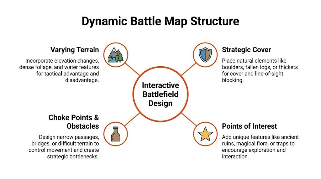
A scattered arrangement of trees isn’t tactical design. It’s visual noise. Players need options they can evaluate.
I usually think in route types:
These should feel different in play, not just in appearance.
Forest maps get stronger when they combine vertical hints, physical cover, and negative space. This is the difference between a decorative scene and an encounter surface.
Here’s a practical reading of that triad:
A forest should feel dense, but it shouldn’t feel airless.
If you’re designing the combat at the same time, it helps to sanity-check the terrain against encounter pressure. A tool like TerraClash’s D&D 5e encounter builder is useful when you want to balance enemy composition with the map’s actual movement and sightline constraints.
A quick comparison helps here:
| Works | Usually fails |
|---|---|
| Partial sightline breaks | Full visual blockage everywhere |
| Distinct route identities | One central funnel |
| Cover near conflict points | Random cover on empty edges |
| Open pockets inside dense terrain | Even spacing across the whole map |
| Clear terrain language | Ambiguous textures that need constant explanation |
The most common bad forest layout is one chokepoint with decorative trees around it. That doesn’t create tactics. It forces repetition.
A better layout gives every side a reason to move. The fighter can hold a path, the rogue can disappear into undergrowth, the druid can control a clearing, and the enemies can reposition without every turn becoming “I guess I move five feet and attack.”
Digital execution gets easier when the layout is already doing its job. At that point, your task is less about invention and more about disciplined layering.
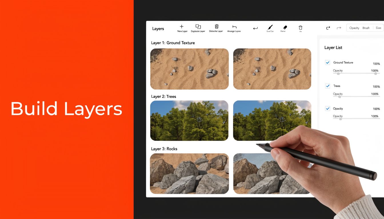
Whether you’re working in Photoshop, Procreate, Dungeondraft, or another map tool, the build order matters. I like a stack that starts with terrain logic and ends with finishing detail.
A clean layer order often looks like this:
This sounds basic, but it prevents a lot of repair work later.
If you work with modular assets, variation is everything. Pros mass-populate maps by copying assets, rotating them in 15-45° increments, and flipping them to avoid repetition. To add depth, they duplicate layers, apply slight Gaussian blur and hue adjustment, and add a shadow layer on multiply at 20-40% opacity to simulate elevation, as shown in the Dungeon Wright Photoshop workflow.
Not every tree should have equal visual weight. If every canopy is the same scale and tone, the map turns flat. Use larger trunks and darker crowns to anchor sightline blocks, then support them with lighter secondary foliage.
A few practical choices make a big difference:
Ground treatment isn’t decoration. It should reinforce movement. If the flank route matters, let the soil, leaves, roots, or grass patterns help point toward it. If a patch is dangerous or slow, its surface language should warn the table before the DM has to explain it.
Fine texture is never more important than passability.
That’s especially true when you’re collaborating or building a reusable asset library. If your team works across multiple maps, a clear internal system for storing foliage brushes, shadows, rocks, and export-ready objects prevents duplicate work. A practical overview of that problem lives in this guide to digital asset management for small design teams.
The last pass should add mood, not confusion. A touch of fog, cooler shadows in dense woods, warmer highlights in clearings, and subtle leaf scatter can make the map feel lived in. Just keep the line of play visible.
If your prettiest layer makes the terrain harder to read, it isn’t polish. It’s damage.
The final version of a map isn’t one file. It’s usually a small family of exports, each made for a different use case.
A printed battle mat needs crisp detail at physical scale. A VTT version needs clarity, sane file size, and easy alignment. If you export one master file and force it into every context, something will suffer.
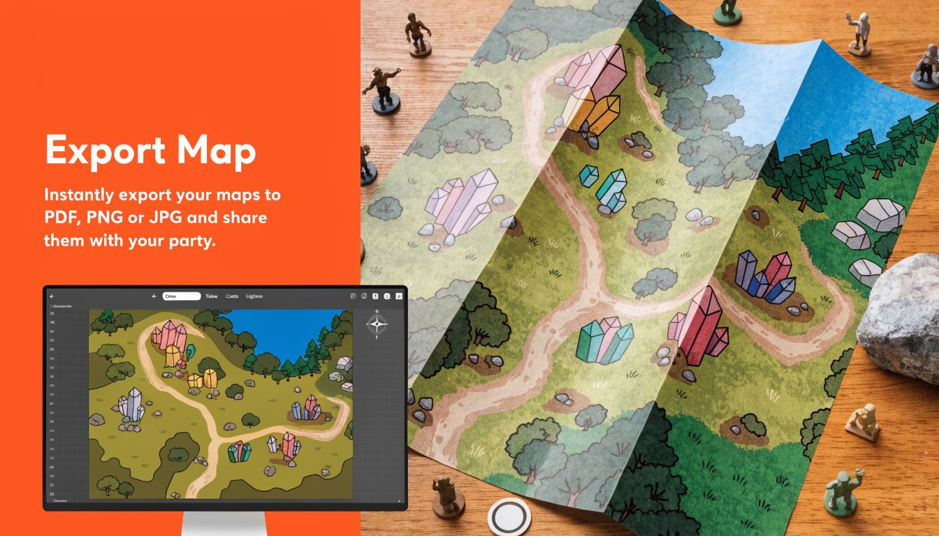
For print, crispness matters most. Export at high resolution so bark edges, roots, and grid lines don’t blur when enlarged. For VTTs like Foundry VTT, Roll20, and Owlbear Rodeo, responsiveness matters more. Players need maps that load quickly and stay legible on different screens.
The broader shift toward digital play is real. A 2023 tutorial on improving forest maps reached 8.8K views, and related content around animated assets for Foundry VTT reached 136K views, reflecting stronger demand for immersive digital maps in VTT workflows, as seen in this YouTube reference on forest map design and VTT demand.
Use a simple decision table before you export:
| Use case | Prioritize | Typical format choice |
|---|---|---|
| Home print | Sharp detail, readable grid | PNG or high-quality JPG |
| VTT with built-in grid | Fast loading, clean alignment | JPG, PNG, or WebP depending on platform |
| GM-only version | Notes, hidden markers, labels | Separate private export |
| Player version | Clarity, atmosphere, no spoilers | Clean flattened export |
Keep at least two scene variants when possible. One with the grid baked in, one without. Different tables prefer different setups.
If you’re exporting from Photoshop or Procreate instead of a dedicated map tool, test your grid before session night. Open the file in your target platform and check whether squares line up without stretching. Tiny alignment errors become annoying fast once tokens start moving.
For broader planning, it also helps to lay out encounter variants, export versions, and alternate scenes visually before you ship them. A workspace like an infinite canvas for visual planning is handy when you want to compare print, player, GM, and VTT versions side by side without losing context.
The best d&d forest battle map isn’t the one with the most assets. It’s the one that gives players something worth solving.
That usually comes from a small set of disciplined habits. Start with a clear encounter idea. Build routes before decoration. Use tree density to control visibility. Add detail only after the battlefield already works in grayscale and silhouette.
Before you open Photoshop, Procreate, or Dungeondraft, write one sentence:
What happened here just before the party arrived?
That question sharpens everything. It helps you decide whether the forest should show broken branches, ritual traces, animal trails, abandoned camps, scorched undergrowth, or unnatural silence. It turns asset placement into storytelling.
If you want to keep improving your process, it’s also worth studying adjacent craft. Resource collections like Lost Boy Entertainment’s other how-to guides can be useful when you want more practical making references from nearby creative disciplines.
Dense sightline breaks, multiple routes, meaningful cover, and at least one location that changes how players value movement or positioning.
Enough to shape vision and route choice. Not so many that movement becomes constant negotiation. Dense clusters usually read better than even spacing.
Export both versions if you can. Some tables want the grid visible, while many VTT users prefer handling it in-platform.
They decorate before they structure. If the map isn’t interesting in rough sketch form, more texture won’t save it.
A strong map library gets better when your references, exports, and visual notes stay organized. Bookmarkify is useful for saving forest map inspiration, sorting references by mood or encounter type, and sharing curated visual research with teammates or clients without turning your workflow into a pile of tabs and screenshots.
Powered by Outrank app

Ivan S
Lead Marketing Designer @Scribe, Founder @bookmarkify
Effortlessly Save time and stay Inspired: Streamline your workflow with Bookmarkify. No more juggling 10 tabs and screenshots.