From Inspiration Overload to Actionable Insight
We've all been there. You have a folder overflowing with screenshots and bookmarks of beautiful websites, yet when it's time to start a new project, that collection feels more like a museum than a toolbox. This is the gap between passive collecting and active analysis. The key is to move from a subjective "I like this" to an objective "This is effective because..." A proper web design inspiration analysis gives you a repeatable method for deconstructing any design into its core pillars: typography, color, and layout.
This guide provides a practical framework to turn that inspiration folder into your most powerful strategic asset. By learning not just what looks good, but why it works, you can build a systematic workflow that informs every creative decision you make. Let's get started.
Assembling Your Web Design Analysis Toolkit
Before you can deconstruct a design, you need the right tools. Think of this as your digital utility belt. The most fundamental tool is already at your fingertips: your browser's built-in Developer Tools. This is the ground truth for inspecting HTML structure and CSS properties. As Google's extensive guides show, it's an essential skill for any web professional.
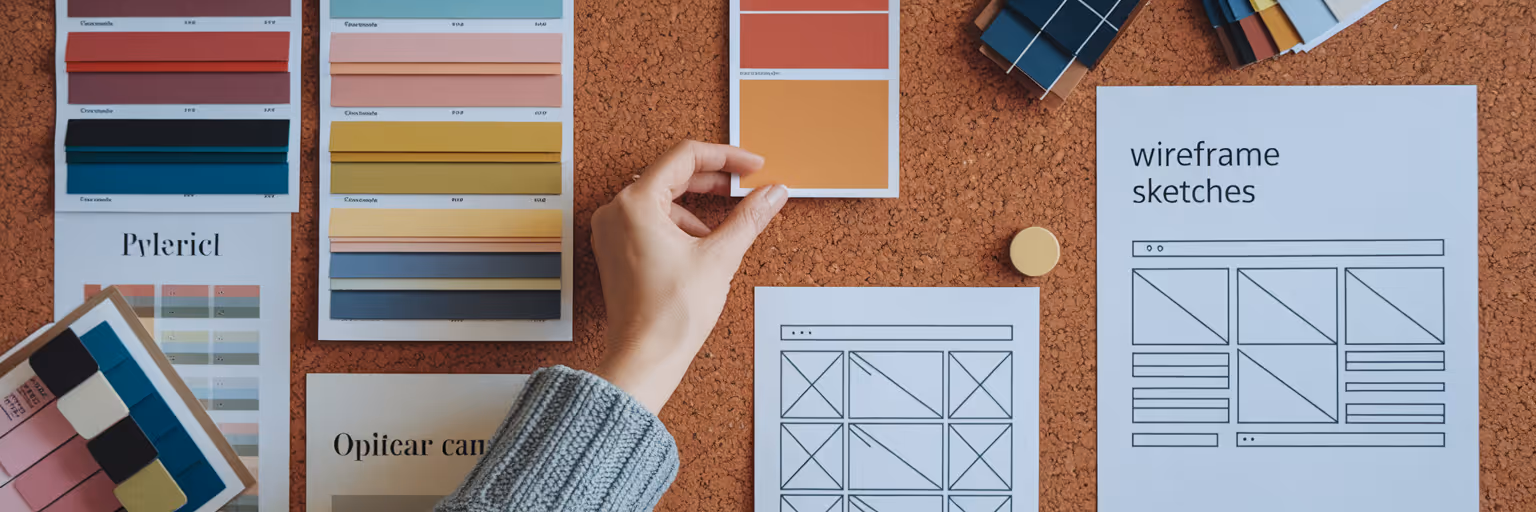
For a faster workflow, browser extensions are your best friends. A tool like WhatFont lets you identify typography with a simple hover, while ColorZilla provides an eyedropper to grab any color's hex code instantly. But extracting this information is only half the battle. The final step is organizing it. Instead of scattering notes across different apps, you can organize your findings alongside the original screenshot with a dedicated tool like our platform at Bookmarkify. This transforms a simple bookmark into a rich, annotated reference for future projects.
Your Web Design Analysis Toolkit
| Tool |
Primary Use |
Best For... |
| Browser Developer Tools |
Inspecting HTML & CSS |
Getting the ground truth on layout structure, spacing, and all applied styles. |
| WhatFont Extension |
Font Identification |
Quickly identifying font family, size, weight, and line height on any live website. |
| ColorZilla Extension |
Color Picking |
Grabbing the exact hex code for any color on a page with a simple click. |
| Bookmarkify |
Organizing Insights |
Saving inspiration along with your analysis notes, color codes, and font details. |
Deconstructing Typography for Readability and Hierarchy

Great typography is invisible. It guides the user without calling attention to itself. To understand how it achieves this, you need a clear process. Here’s a simple checklist to analyze any site's typography:
- Identification: Start by using a website font identifier like the WhatFont extension or the 'Computed' tab in your browser's DevTools. Document the font family, size, weight, and line height for all key text elements: H1s, H2s, body copy, and captions. This gives you the basic ingredients.
- Hierarchy Analysis: Now, look at how those ingredients are combined. How does the design use variations in size, weight, and style to create a visual path for the user? Map out the typographic scale. Is there a clear distinction between a main headline and a subheading? This hierarchy tells users what to read first and establishes a sense of order and priority on the page.
- Functional Assessment: Finally, evaluate the text for its core function: readability. Check the line length; is it comfortable to read, or are lines too long? Assess the letter spacing (tracking) and color contrast. A beautiful font is useless if it fails accessibility standards. Use an online contrast checker to ensure your text meets WCAG guidelines, making the design inclusive for everyone.
Mastering these steps gives you a repeatable method for every design you study. For more deep dives into design principles, check out the other articles on our Bookmarkify blog.
Decoding the Language of Color Schemes
Color is more than just decoration; it's a form of communication that evokes emotion and guides user actions. A systematic website color scheme analysis helps you understand the strategy behind a palette. First, use an eyedropper tool to identify the primary, secondary, accent, and neutral colors. Create a small palette with these hex codes.
But don't stop there. The real insight comes from asking strategic questions. Why were these specific colors chosen? A calming blue might be perfect for a financial app, while an energetic orange suits a creative startup. How does the color scheme support the brand's message and connect with its target audience? Look at how color is used functionally. Notice how a single accent color is often reserved for key calls to action, like "Sign Up" or "Add to Cart," making them impossible to miss. This intentional use of color is what separates professional design from amateur guesswork. To explore how your extracted colors can form new palettes, you can use a tool like Adobe Color to generate complementary or analogous schemes. To see great examples in action, browse through the curated sites on our inspiration page.
Analyzing Layouts and Spatial Structure

A great layout provides the invisible skeleton that holds a design together. To see this structure, use your browser's built-in grid and flexbox inspectors. These tools overlay visual guides on the page, revealing the alignment, spacing, and containers that create order. When you learn how to analyze website layout, you start to recognize the underlying patterns that guide a user's eye.
Look for common scanning patterns like the Z-pattern, where the eye moves from top-left to top-right, then diagonally down to the bottom-left before scanning across again. Or identify the F-pattern on text-heavy pages, where users scan headlines and the first few words of paragraphs. Is the site built on a modular grid? This is common for content-heavy sites like news portals or portfolios, as it allows for flexible and organized content blocks. Most importantly, your analysis isn't complete until you've checked it on different screens. Use the responsive mode in DevTools to see how the layout adapts, stacks, or reflows on tablet and mobile. A design that breaks on smaller screens is a failed design, no matter how beautiful it looks on a desktop. For a great example of a well-structured, responsive layout, take a look at this page we designed.
Turning Your Analysis into a Creative Workflow
You now have a systematic process to deconstruct any design into its three pillars: typography, color, and layout. This approach moves you beyond simple intuition and backs up your creative choices with objective data. By making this a regular habit, you'll build a powerful mental library of what works and why.
Here’s how to put it all together in a simple, repeatable workflow:
- Save inspiring designs as you browse the web.
- Use the techniques in this guide to analyze web designs and add detailed notes about fonts, colors, and layouts.
- Refer to your annotated library when starting a new project to make informed, strategic decisions from day one.
Ready to stop collecting and start analyzing? Pick one design from your inspiration folder today and apply this framework. To build your own powerful, annotated library, give Bookmarkify a try and turn your inspiration into your greatest asset.