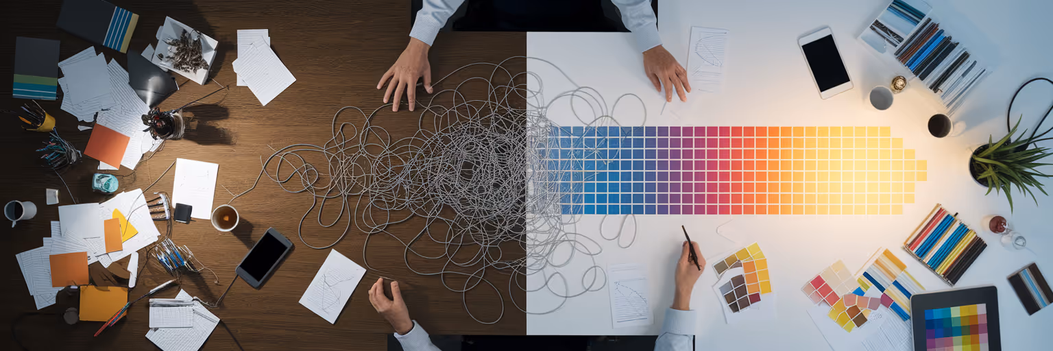
The Hidden Costs of Creative Chaos
We've all been there. Your desktop is a mosaic of screenshots, you have dozens of tabs open, and that perfect button design you saw last week is lost somewhere in a forgotten Slack channel. This digital mess isn't just a personal quirk; it's a systemic problem that quietly drains your team's creative energy and budget. This scattered approach to inspiration is a major drag on any creative team workflow.
The consequences are tangible. Designers unknowingly reinvent the wheel, spending hours creating components that a teammate already built. When it's time for developer handoff, the friction is immediate. Missing assets and inconsistent styles lead to a back-and-forth that slows everything down. The result is a product suite that feels disjointed, with slightly different shades of blue and varying button styles that erode user trust.
The antidote to this chaos is a centralized UI pattern library. Think of it as the single source of truth for every reusable design element your team uses, from simple form fields to complex navigation bars. It’s a shared, organized space where every approved component lives. This article will outline a clear path from that state of creative disarray to a streamlined, collaborative system.
Benefits of a Unified UI Pattern Library

Moving from scattered files to a unified library does more than just tidy up your digital workspace. The UI pattern library benefits translate directly into faster production cycles, a stronger brand presence, and a more collaborative team environment. It’s about creating a foundation for consistent, high-quality work.
Boost Efficiency and Speed
When your team isn't hunting for assets or rebuilding existing components, they can focus on solving new problems. According to a 2025 analysis by Clay of over 200 product teams, those using a centralized library shipped features 22% faster. By eliminating redundant work, you give your team back its most valuable resource: time.
Ensure Unwavering Design Consistency
A cohesive user experience is built on consistency. When every designer and developer pulls from the same set of approved components, your product naturally maintains a professional and predictable feel across all platforms. This consistency strengthens brand identity and makes the user journey feel seamless and trustworthy.
Foster Cross-Functional Alignment
A pattern library acts as a shared visual language that bridges the gap between design, development, and product management. It reduces misunderstandings because everyone is referencing the same playbook. This alignment frees up mental energy for genuine innovation, letting creativity flourish in an organized space. To see what a well-organized collection looks like, you can browse our library of top-tier design inspiration.
Workflow Comparison: Scattered vs. Centralized Inspiration
| Task |
Scattered Inspiration Workflow |
Centralized UI Pattern Library Workflow |
| Finding a UI Component |
15-30 minutes searching Slack, Figma files, old projects |
<1 minute searching a tagged, centralized library |
| Design Consistency |
High variance; depends on individual memory |
High consistency; components are standardized |
| Developer Handoff |
Frequent questions, requests for missing assets |
Clear, with direct links to approved components and code |
| Onboarding New Members |
Slow; requires tribal knowledge transfer |
Fast; new members can self-serve from the library |
Finding What You Need With Smart Tagging
A library full of beautiful components is only useful if you can find what you need quickly. Without smart tagging strategies for designers, your library is just a prettier folder. Tagging is the organizational layer that transforms a collection of assets into a searchable, functional database. It’s what makes retrieval effortless.
To build a robust system, your team needs a consistent tagging taxonomy. A multi-faceted approach works best:
- By Component Type:
button, modal, form-field, card
- By Interaction State:
hover, disabled, active, error
- By Platform:
web, iOS, Android
- By Project or Feature:
onboarding-flow, user-profile, checkout
Documenting these tags is just as important as creating them. As the 18F design guide stresses, including notes on constraints and variations alongside each tag avoids ambiguity. A visual bookmarking tool like Bookmarkify, with its powerful tagging and filtering, is the perfect place to start building a personal or team library by saving and organizing UI patterns from across the web.
Ensuring Consistency Across All Devices
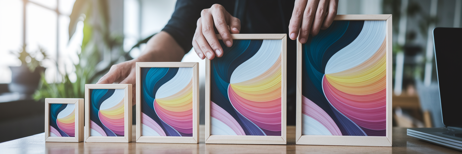
In an era of responsive design, static screenshots of UI patterns are no longer enough. A button that looks great on a desktop can break on a mobile screen. Your library must account for how components adapt across different viewports. This is where including mobile and desktop previews becomes essential.
Embedding device previews directly within your pattern library eliminates guesswork for both designers and developers. It allows your team to verify visual fidelity and functionality on a smartphone, tablet, and large monitor before writing a single line of code. This simple step prevents last-minute bugs and visual inconsistencies when a design goes live. Tools with built-in device previews, like those available on our Design Analyse page, are invaluable for capturing and analyzing responsive examples for your own library.
Building Your Library as a Team
A successful UI pattern library is not a static document created by one person. It's a living product that thrives on team collaboration. Effective design system collaboration requires tools and processes that encourage shared ownership and prevent team members from using outdated components. Features like multi-user access, version history, and the ability to comment on assets are crucial.
A simple collaborative process can make all the difference:
- Establish clear contribution guidelines for submitting new patterns.
- Set up a lightweight review process with designated approvers.
- Use a shared space for feedback to create a culture of ownership.
You can start small. Sharing a curated collection of inspiration via a simple URL, a core feature in Bookmarkify, allows for effortless feedback from teammates or clients before committing to a design direction. For more guides on improving your team's creative process, check out the Bookmarkify blog.
Maintaining a Living Design System

The most common reason pattern libraries fail is neglect. A library is not a "set it and forget it" project. It requires ongoing maintenance to remain a valuable resource. Without a clear governance model, it can quickly become a bloated, contradictory digital graveyard, undoing all its initial benefits.
Here’s a simple framework for keeping your library healthy:
- Conduct quarterly audits to identify and remove obsolete patterns.
- Maintain a clear process for submitting, reviewing, and adding new components.
- Designate a "steward" or a small committee to oversee the library's health.
This discipline is key to knowing how to organize design assets for the long term. You can start today by building your own personal inspiration library. This is the first step toward championing a centralized system for your entire team. Start building your personal inspiration library today by trying Bookmarkify for free and begin your journey toward organized creativity.