From Desktop Dream to Mobile Mess
Picture this: you lean back, admiring a stunning website layout on your large desktop monitor. The spacing is perfect, the typography is crisp, and every element aligns flawlessly. Then, you grab your phone to check it, and the dream collapses. The beautiful design has become a jumbled mess of overlapping text, broken grids, and images spilling out of their containers.
We’ve all felt that sinking feeling. This common frustration highlights a critical reality: mobile web traffic has long surpassed desktop, making a flawless mobile experience completely non-negotiable. A great design is only great if it works for everyone, on every screen.
This is where device previews enter the picture. They are the professional’s answer to this chaos, acting as simulators that let you see how your design will look on different screens before it ever goes live. Using them is not just a technical step, it is the foundation of a smart creative design workflow that catches errors early and keeps your vision intact, no matter the device.
The Building Blocks of a Truly Responsive Layout
Before we explore how to use device previews, it helps to understand what makes a design responsive in the first place. It all comes down to a few core principles that allow your layout to adapt gracefully to any screen size. Think of it as building with flexible materials instead of rigid ones.
Fluid Grids: The Elastic Foundation
Imagine building a structure with elastic blocks instead of rigid bricks. That’s the idea behind fluid grids. Instead of defining layout widths with fixed pixels (px), you use relative units like percentages (%). This allows your containers to stretch and shrink proportionally, maintaining the layout’s integrity as the screen size changes.
Responsive Images: Scaling with Grace
An oversized image is one of the quickest ways to break a mobile layout. The fix is surprisingly simple. By adding the CSS rule max-width: 100%; to your images, you tell the browser that an image can shrink to fit its container but should never grow larger than its original size. It’s a small piece of code with a huge impact.
CSS Media Queries: The Brains of the Operation
Media queries are the conditional logic that powers responsive design. Think of them as ‘if/then’ rules for your CSS. For example, you can write a rule that says, “If the screen is wider than 768 pixels, display the content in three columns. If not, stack it into a single column.” This is how you create fundamentally different layouts for different devices. For these rules to work, you must include the viewport meta tag, <meta name="viewport" content="width=device-width, initial-scale=1.0">, in your HTML head. As resources like W3Schools document, this tag is the crucial instruction that tells browsers how to control the page's dimensions. You can find a deeper dive into these concepts in their HTML responsive web design guide.
| Component |
Primary Role |
Actionable Tip |
| Fluid Grid |
Allows the layout to stretch or shrink based on screen size. |
Use percentages (%) for container widths instead of fixed pixels (px). |
| Responsive Images |
Ensures images scale down correctly without overflowing. |
Apply max-width: 100%; and height: auto; to your image CSS. |
| Media Queries |
Applies different CSS rules for specific screen sizes (breakpoints). |
Start with a base style for mobile and use min-width queries to add styles for larger screens. |
| Viewport Meta Tag |
Tells the browser how to control the page's dimensions and scaling. |
Always include <meta name="viewport" content="width=device-width, initial-scale=1.0"> in your HTML <head>. |
Why Device Previews Are a Creative's Best Friend

Device previews, whether they are found in browser developer tools or integrated into software, are more than just a technical checklist. They are a creative asset that empowers you to design with confidence. Instead of guessing how things will look, you can see it for yourself, instantly.
This proactive approach transforms responsive web design testing from a dreaded final step into an integrated part of your creative process. Here’s why they are so valuable:
- Spotting Errors Instantly: Previews help you catch layout breaks, overlapping elements, and awkward font scaling in seconds. This saves hours of debugging later and keeps the project moving forward.
- Testing Interactivity, Not Just Visuals: A design might look good, but is it usable? Device previews let you check if buttons and links are large enough for fingers (known as touch targets) and see how hover effects translate to touch-only devices.
- Streamlining Collaboration: Vague feedback like "it looks broken on my phone" is a project killer. By taking quick screenshots of different device views, you can show clients or developers exactly what you mean, providing clear, visual proof that eliminates confusion.
By integrating these checks into your daily work, you improve not just the final product but your entire creative process. For more ideas on refining your methods, you can explore the articles on our blog.
Your Action Plan for Flawless Responsive Testing
Ready to make responsive testing a core part of your workflow? Here is a practical, step-by-step guide to get you started. This is the "doing" part of the process that will ensure your designs look great everywhere.
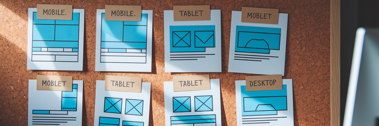
- Start with Your Browser's Built-in Tools: The most accessible tools are already in your browser. In Chrome or Firefox, press F12 or right-click and select "Inspect" to open Developer Tools. From there, activate the device toolbar (often an icon of a phone and tablet) to get an instant preview. You can select presets for different devices like an iPhone, iPad, or Galaxy to see how your layout adapts.
- Adopt a 'Mobile-First' Design Workflow: This is a crucial mindset shift. Instead of designing for a large desktop and then trying to shrink everything down, a mobile-first design workflow means you design for the smallest screen first. You then use media queries to progressively add complexity and enhance the layout for larger screens. This approach often leads to cleaner code and a better user experience on mobile.
- Test Actively, Not Passively: Don't just look at the preview; interact with it. Can you easily tap the menu button? Is filling out a form on a small screen a frustrating experience? This active testing evaluates the entire user journey, not just the static visuals.
- Expand Your Reach with a Responsive Design Checker: Browser tools are great, but they have limits. For more comprehensive website device compatibility, use a dedicated online responsive design checker. As highlighted by services like BrowserStack, their free Responsive Checker lets you test a URL across a much wider range of real device configurations, helping you catch obscure bugs you might otherwise miss.
Organize Your Responsive Workflow with Bookmarkify
A solid testing process generates a lot of information: inspiring examples, broken layouts to fix, and competitor designs to analyze. This is where your organizational tools become just as important as your design tools. Bookmarkify is built to streamline this exact part of the creative design workflow.
When you find a website with an interesting responsive solution, save it to Bookmarkify. You can immediately use our built-in mobile and desktop view modes to analyze its structure without leaving your inspiration library. This keeps your research focused and efficient.
Here’s a practical workflow: create a dedicated collection in Bookmarkify called "Responsive QA." As you browse the web and find sites with great (or terrible) responsive implementations, save and tag them in this collection. This builds a personal, visual swipe file you can reference anytime. For collaboration, you can share this entire collection with developers or clients via a single URL, giving them precise visual examples to discuss.
When you find a site that truly nails its responsive design, you can go deeper. With our Pro plan, the Design Analyse feature lets you inspect fonts, colors, and assets directly. This turns passive inspiration into a practical lesson you can apply to your own work. You can get started with Bookmarkify today and bring order to your creative chaos.
Avoiding Common Responsive Design Pitfalls
Even with the right tools, a few common mistakes can trip up the most experienced designers. Keep these practical warnings in mind to ensure true website device compatibility.
- Forgetting Landscape Mode: It’s easy to focus only on portrait orientation, but users turn their devices sideways all the time. Use your preview tool's rotation feature to check if your layout holds up. A design that works in portrait can easily break in landscape.
- Tiny Touch Targets & Illegible Text: Usability is paramount. Ensure your font sizes are readable on small screens without pinching to zoom. More importantly, make sure buttons and links have enough padding to be easily and accurately tapped by a finger.
- Ignoring Performance: A beautiful design is useless if it takes too long to load. Mobile users are often on slower data connections, so optimizing images and other assets for fast load times is not just a good practice, it’s essential for a positive user experience.
- Relying Solely on Simulators: Device previews are fantastic for rapid iteration, but they are not a substitute for the real thing. Always test on a few physical devices, like an iPhone and an Android phone, before launch. This is the only way to catch subtle rendering issues or performance quirks that simulators can't replicate.
Final Checks for a Future-Proof Design

Perfecting responsive design is a continuous process, not a one-time task. The core workflow is simple and memorable: build with a fluid foundation, test constantly with device previews, and organize your findings to collaborate effectively. By making these steps a habit, you ensure your work looks and feels great for every user.
We encourage you to apply these previewing techniques to your projects today. And when you're ready to bring structure to your entire creative and responsive design process, give Bookmarkify a try. You can see great responsive designs in action on our daily inspiration feed.
With new devices like foldables constantly emerging, a solid responsive design process is the best way to future-proof your skills and deliver exceptional work that stands the test of time.