Bridging the Gap Between Creative Vision and Client Understanding
Picture this: you’ve spent hours curating the perfect mood board. The colours are harmonious, the typography is spot on, and the imagery captures the exact feeling you’re aiming for. You present it with pride, only to be met with a polite smile and the dreaded question, "So... it's just a collage of pictures?" We’ve all felt that sting of misunderstanding.
The problem is rarely the visuals themselves. It’s the communication gap between your creative vision and the client's business perspective. A successful mood board presentation for clients is less about showing pretty pictures and more about translating abstract feelings into a concrete, strategic direction. It’s your first and best chance to get everyone on the same page.
This guide will show you how to explain a mood board in a way that builds excitement and confidence. The key is to frame it as a collaborative tool for alignment, not just a design deliverable. With the right approach and a flexible digital space for organization, you can turn a potential point of confusion into a moment of shared clarity.
Setting the Stage for a Successful Presentation

A winning presentation begins long before you enter the meeting room. Strong preparation turns your mood board from a collection of images into a strategic argument. By grounding your creative choices in the client's own words, you build a foundation that’s difficult to dispute.
Translate the Brief into Emotional Keywords
Before you even think about visuals, revisit the project brief and your initial client conversations. Pull out the core goals and distill them into a list of evocative keywords. Are they aiming for a brand that feels "premium," "playful," "serene," or "energetic"? This list becomes your strategic compass, ensuring every element you choose has a purpose.
Curate with Intent, Not Just Aesthetics
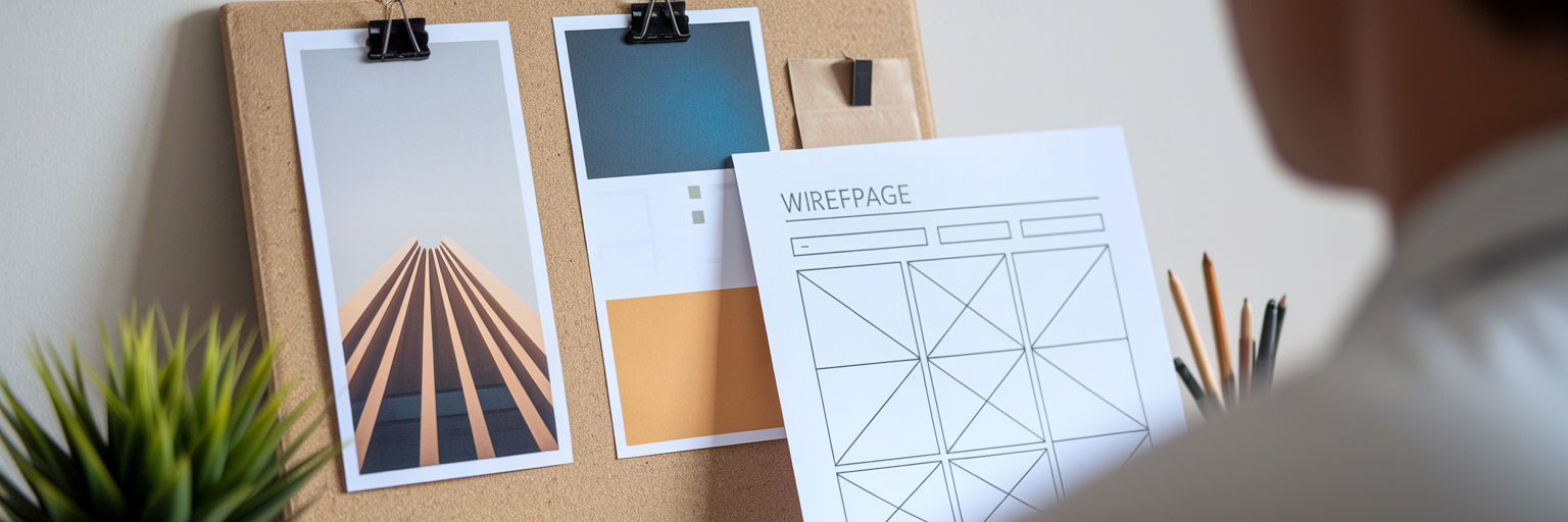
With your keywords in hand, start gathering assets. This is where you connect abstract words to tangible visuals. "Trustworthy" might translate to images of solid architecture, classic serif fonts, and a deep navy colour palette. "Playful" could be represented by organic shapes, bright colours, and a friendly sans-serif font. Gathering high-quality visuals is crucial, and drawing from a daily feed of curated design inspiration can ensure your concepts feel fresh and relevant.
Create Focused Concepts
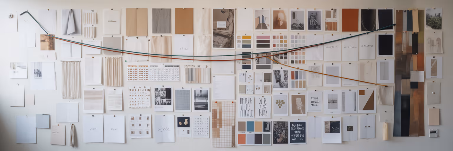
Avoid overwhelming your client with a single, sprawling board. Instead, create two or three distinct concepts, each with a clear theme like "Direction A: Modern & Minimal" or "Direction B: Warm & Artisanal." This simple act empowers the client by giving them a choice, making them an active participant in the creative process. Organize each board with a clear visual hierarchy, using a "hero" image as a focal point to anchor the concept. A digital tool like Bookmarkify makes it easy to resize and rearrange elements, helping you perfect this visual concept presentation before the big reveal.
Telling a Compelling Story with Your Mood Board
When it’s time to present, your role shifts from curator to storyteller. The goal is not just to show your work but to walk the client through your thought process, connecting every choice back to their business objectives. This narrative approach transforms your mood board from a static image into a dynamic vision for their brand's future.
Start by revisiting the "why." Before revealing any visuals, briefly restate the project goals and the emotional keywords you established. This reminds everyone of the shared mission. Then, introduce your first mood board and begin your guided tour. Don't just point at things; explain their purpose. Say, "To capture that 'premium' feeling we discussed, I chose this deep colour palette and these images of clean, architectural lines."
Demystifying design jargon is essential for building trust. Instead of using technical terms, use relatable analogies. The table below offers simple ways to explain common concepts, ensuring your client feels included, not intimidated.
| Design Term |
Client-Friendly Explanation |
Why It Matters for Their Brand |
| Negative Space |
'Breathing room' around elements |
Creates a calm, focused, and premium feel. |
| Serif Font |
A classic font with small 'feet' |
Feels established, traditional, and trustworthy. |
| Sans-Serif Font |
A modern, clean font without 'feet' |
Feels approachable, direct, and contemporary. |
| Visual Hierarchy |
Guiding the eye to what's most important |
Ensures the main message is seen and understood first. |
| Color Palette |
The brand's emotional toolkit |
Evokes specific feelings that attract the target audience. |
Note: This table provides simple, relatable language to help bridge the communication gap during a mood board presentation, ensuring clients understand the strategic value behind each design choice.
By mastering this storytelling skill, you make the design process transparent and collaborative. Mastering this storytelling skill is just one part of a streamlined creative process. For more guides on improving your design workflow, you can explore other articles on our blog.
Guiding Client Feedback for Productive Conversations
The presentation is over, and now it’s time for feedback. This moment can either derail a project or solidify your partnership. The key is to guide the conversation away from subjective opinions and toward constructive dialogue. Instead of asking the vague and dangerous question, "So, do you like it?", steer the conversation with specific, open-ended questions.
Try asking questions that prompt emotional and strategic responses:
- "How does this collection of images make you feel?"
- "Which of these elements feels most aligned with your company's values?"
- "If this direction were a person, how would you describe them?"
When you receive negative client design feedback, don't get defensive. Probe for the "why." If a client says, "I don't like that colour," ask, "What does that colour make you feel? What feeling were you hoping for instead?" This reframes the mood board as a flexible starting point, not a final design. This approach of presenting multiple concepts is a widely recognized best practice. As noted in Adobe's guide on the topic, creating several mood boards increases the likelihood of finding a direction the client connects with.
Demonstrate active listening by making real-time adjustments. Using a tool with advanced design analysis features allows you to quickly pull up a competitor's site they mentioned and add it to the board for discussion. Dragging a disliked image off the board or swapping a font during the meeting visually confirms that you’re hearing their feedback and working together toward the solution.
Your Blueprint for Lasting Client Alignment
A well-presented mood board does more than just get a design approved. It saves countless hours of rework, prevents costly miscommunications, and builds a foundation of trust with your client. It proves that your creative decisions are rooted in strategy and a deep understanding of their goals.
Remember, the primary purpose of a mood board in a client presentation is to achieve creative project alignment. It is a communication tool first and a design asset second. When you treat it as such, you transform the entire dynamic of your client relationships from a service provider to a strategic partner.
Ready to transform your client presentations? Apply these techniques in your next project and see the difference it makes. Start building your next mood board with Bookmarkify and turn confusion into collaboration.