3 Pricing Page Patterns Designers Can Learn From
Study Linear, Vercel, and Webflow pricing pages to clarify plans, usage, and scope, then turn the examples into a practical design brief.
Last updated:
November 4, 2026
Study Linear, Vercel, and Webflow pricing pages to clarify plans, usage, and scope, then turn the examples into a practical design brief.
Last updated:
November 4, 2026
A pricing page has to explain what someone is buying, how the bill works, and which option fits their situation. A row of attractive cards can still leave those questions unanswered.
Linear, Vercel, and Webflow offer three useful references for web and product designers. Their pages organize different purchasing decisions: a plan for a team, a platform with usage considerations, and plans with different scopes. Here is what to study in each, followed by a practical way to turn the observations into your own pricing-page brief.
These are observations from the pages inspected on November 4, 2026, with design recommendations clearly identified below. They are not a software buying guide, a full billing explanation, or evidence of conversion performance. Check the original pages for current terms.
On Linear’s pricing page, four plan columns introduce Free, Basic, Business, and Enterprise. The paid self-service columns put the per-user monthly unit beside the price and show a yearly-billing control. Below the summaries, a feature matrix repeats the plan names and organizes capabilities into groups.
The summary columns use short feature lists, while the matrix supports a more detailed comparison. The Business column also offers both a self-service route and a sales-contact route; Enterprise directs visitors to sales.
What to adapt: decide which few differences help someone shortlist a plan, then give the detailed comparison a separate role. Keep the unit and billing commitment attached to the price, so they remain part of the decision when someone scans across columns.
Tradeoff to review: a long matrix adds another place where labels and plan information must stay consistent. In your prototype, ask whether someone can move from a summary claim to the corresponding detail without losing track of the plan.
Vercel’s pricing page begins with Hobby, Pro, and Enterprise columns. In the inspected desktop layout, Pro has a prominent colored trial button. Its summary mentions included usage credit and spend-management features. Farther down, a searchable comparison presents categories such as the delivery network, firewall, and compute.
The page also links to spend-management information. Those elements make usage and cost control part of the pricing content rather than leaving the page as a list of plan names.
What to adapt: if your product combines a plan with variable consumption, make the relationship visible near the initial choice. A visitor should be able to identify what is included and where to investigate additional usage before committing.
Tradeoff to review: a strong trial CTA can dominate a quieter explanation of usage. Test whether a prospective customer can describe the charging model after reviewing your prototype. A visually prominent plan price alone does not establish their total cost.
In the desktop view of Webflow’s pricing page, a billing-period switch sits above groups labeled Site plans and Platform plans. The Site group contains Starter, Basic, and Premium; the Platform group introduces Team. The Team summary includes an annual-contract note and a conversation-based CTA.
The grouping is a useful detail to inspect: a visitor encounters the scope labels as well as individual plan names. The page is not simply presenting every option as an interchangeable step on one ladder.
What to adapt: when your offers serve different scopes, explain that distinction before asking people to compare feature lists. A site-level purchase and a broader organizational package may require different questions.
Tradeoff to review: multiple groups can still leave a visitor unsure whether they need one purchase or several. Use a concrete scenario in your review: can someone identify which group applies to their project and what remains outside it? The presence of headings does not prove that the model is understood.
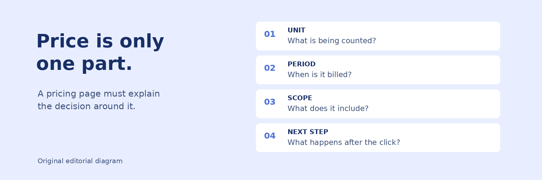
Use the following original exercise before copying any card layout. Imagine a fictional scheduling product sold to small studios. Its team is deciding whether to charge by workspace, by member, or by bookings processed. This scenario is illustrative; it is not a tested pricing recommendation.
These patterns can be combined, but each should answer a specific question. Adding every treatment from every reference can create a more complicated page than your offer requires.
Use Bookmarkify’s infinite canvas to arrange the three source bookmarks beside sticky notes or rich text pages. Label the notes with the decision you are studying: summary versus detail, included usage, or purchase scope. Keep the source URL and inspection date with your observation, since pricing pages change.
Write one proposed adaptation and one unresolved question beside each reference. For example: “Keep the billing commitment beside the price. Does the label remain visible in our mobile layout?” For more on keeping this work useful to colleagues, see our guide to a shared design inspiration library.
Give a colleague a realistic customer scenario and the prototype. Ask them to explain what is being purchased, the billing period, what changes the bill, and what the primary action will do. Record the explanation rather than treating a button click as proof of understanding.
Repeat the review in a narrow layout, where plan details may stack instead of sitting beside one another. The result you want is a clear account of the offer. The references provide ways to organize that account; your own research must establish whether the design works for your audience.
Sources checked November 4, 2026. Prepared with AI assistance. Page observations come from the linked official pricing pages; the scheduling-product exercise and review method are suggested workflows, not claims of hands-on product testing.

Ivan S
Lead Marketing Designer @Scribe, Founder @bookmarkify

Effortlessly Save time and stay Inspired: Streamline your workflow with Bookmarkify. No more juggling 10 tabs and screenshots.