The Problem With Screenshot Mood Boards
Every designer has been here: you find a website with a navigation pattern you love, a scroll animation that feels perfect, or a responsive layout that handles the mobile breakpoint beautifully. So you screenshot it, paste it into your mood board, and move on. A week later, you open that mood board and see a flat image that tells you almost nothing about what you actually liked.
The screenshot captured a single frame of a medium that was designed to move, scroll, respond, and interact. The hover state you loved? Gone. The way the navigation collapsed on mobile? Can't see it. The micro-interaction on the CTA button? Frozen. You're left reverse-engineering your own inspiration from a static image, or hunting through your browser history to find the original URL.
This guide shows a different approach: building mood boards where every website reference stays fully interactive, so you can study the design decisions that actually matter.
What a Live Website Mood Board Actually Looks Like
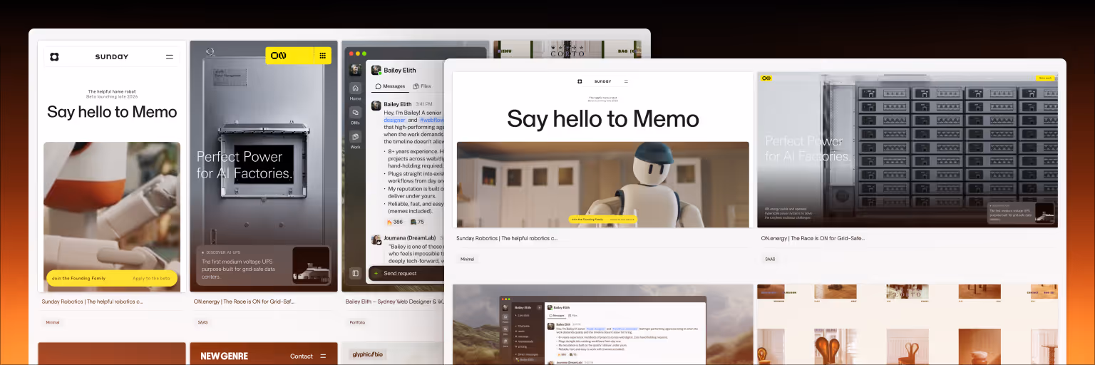
A live website mood board is an infinite canvas where saved websites remain fully functional inside their frames. Instead of pasting screenshots, you save the actual website — and it loads as an interactive preview you can scroll through, click on, hover over, and resize. The websites sit on the canvas alongside your notes, images, videos, and connections between references.
This is what Bookmarkify's canvas mode was built for. When you save a website through the Chrome extension, it loads inside an iframe that preserves full interactivity. You can then drag it onto your canvas, resize it, arrange it next to other references, add notes explaining what you like about it, and draw connections between sites that share design patterns.
The result is a mood board that works more like a design research environment than a static collage.
Step 1: Collect Websites With Intention
Before opening the canvas, spend focused time collecting references. The quality of your mood board depends entirely on the quality of what you save. Here's a practical framework for collecting web design references that actually serve a project:
Define what you're looking for before you browse. Are you researching navigation patterns? Color palette approaches? Hero section layouts? Typography pairings? Having a specific focus prevents the "save everything that looks nice" trap that produces mood boards with no clear direction.
Save 10–15 references per project. This is enough to establish a clear direction without overwhelming the board. Fewer than 8 and you might not have enough variety to identify patterns. More than 20 and the board becomes noise.
Tag as you save. In Bookmarkify, add tags like the client name, the design element you're studying ("navigation," "typography," "hero"), or the visual style ("minimal," "bold," "editorial"). This makes your references searchable later and helps when you build mood boards for multiple clients simultaneously.
Save the full page, not a cropped screenshot. The whole point of a live mood board is seeing how the entire page works together. A hero section in isolation tells you less than a hero section in context with the navigation above it and the content section below.
Step 2: Arrange References on the Canvas
Once you have your references saved, switch to canvas mode and start arranging them spatially. The layout of your mood board communicates meaning — use it intentionally.
Group by theme, not by when you saved them. Cluster references that share a visual approach or solve the same design problem. Put all the minimal navigation examples in one area, all the bold typography treatments in another. This spatial grouping makes patterns visible that you'd miss in a linear list.
Size cards to match importance. Make your strongest references large and central. Make secondary references smaller and peripheral. This creates a visual hierarchy on the mood board itself, guiding anyone who views it toward the most important direction-setting references.
Leave space for notes. Don't fill every inch of canvas. Leave breathing room between clusters so you can add annotation notes explaining your thinking. The notes are what transform a collection of websites into a design argument.
Step 3: Study Designs Interactively
This is where live mood boards fundamentally change the workflow. With your references arranged on the canvas, you can now study them in ways that screenshots don't allow.
Scroll through each saved site. Check how the layout unfolds below the fold. See how section transitions work. Notice how the designer handled the rhythm between content-heavy and breathing-space sections. This vertical flow is invisible in a cropped screenshot.
Test hover states and interactions. Hover over navigation items, buttons, and interactive elements to see transition effects. Click through to see how internal page transitions work. These micro-interactions often define the personality of a design but are completely lost in static captures.
Switch to mobile preview. Bookmarkify's mobile view mode shows how any saved website renders on a phone screen. This is critical for responsive design projects — you can quickly audit how each reference handles the mobile breakpoint without opening developer tools or grabbing a phone. If you're building a responsive site, your mood board should reflect responsive behavior.
Use Design Analyse to extract specifics. When you find a reference with a color palette or typography pairing you want to study, Bookmarkify's Design Analyse feature extracts fonts, colors, gradients, and assets from the saved website. This turns "I like the blue on that site" into specific hex values and font families you can reference in your design file.
Step 4: Annotate Your Thinking
A mood board without annotations is a collection. A mood board with annotations is a design brief. Use the canvas note tool to add context that makes each reference useful.
For each key reference, note what specifically you're drawing from it. Not "I like this site" but "The way they handle the transition from hero to features section — the diagonal clip-path creates momentum without feeling aggressive. Consider this approach for the fold transition on the homepage."
Use the connect tool to draw relationships. Link two references that share a navigation pattern. Connect a reference to a note about why it's relevant to a specific section of the project. These visual connections make the mood board's logic explicit.
Add project context. Drop in the brief, the brand guidelines, or the key requirements at the edge of the canvas so anyone viewing the mood board understands the constraints the references were chosen within.
Step 5: Share and Present
A mood board that lives only on your screen isn't doing its full job. Sharing it with clients, stakeholders, or team members is where it drives alignment.
Share via URL. Bookmarkify lets you share collections via unique URLs. The recipient sees the same interactive references you do — they can scroll through the websites themselves rather than trying to interpret static images. This gives stakeholders a much clearer sense of the direction than a PDF ever could.
Use the canvas for live walkthroughs. In a client call, share your screen and walk through the canvas. Zoom into specific references, scroll through them live, point out the design decisions you're drawing from. This is more engaging and more persuasive than flipping through screenshot slides.
Collaborate with your team. If you're working with other designers, Bookmarkify's collaboration mode lets multiple people contribute to the same workspace. Everyone can save references, add notes, and build the mood board together — useful for the early alignment phase of a project where multiple perspectives improve the outcome.
When to Use This Approach vs Traditional Mood Boards
Live website mood boards are most valuable when you're working on web and UI design projects where responsive behavior, interaction patterns, and visual flow matter. If your mood board is about establishing a broad aesthetic direction using images from multiple sources — photography, illustration, texture, color — a traditional mood board tool like Milanote may be more appropriate.
But for projects where you're specifically studying how websites work — how they handle navigation, how they respond to different screen sizes, how they use animation and interaction — a live mood board captures information that no static tool can. The two approaches also work well together: use Bookmarkify for the interactive web references, and export key findings to a traditional mood board tool for the client-facing presentation.
Frequently Asked Questions
What is a live website mood board?
A live website mood board is a visual canvas where saved websites remain fully interactive rather than being captured as static screenshots. You can scroll through saved sites, click navigation elements, test hover states, and preview responsive behavior — all within the mood board itself. Bookmarkify is currently the only tool that offers this capability through its infinite canvas mode with interactive iframe-based website previews.
How many websites should I include in a mood board?
For a focused web design project, 10 to 15 references is the sweet spot. Fewer than 8 may not provide enough variety to identify patterns and establish a clear direction. More than 20 tends to dilute the board's message and make it harder for stakeholders to understand the intended direction. Quality and relevance matter more than quantity.
Can I build a mood board with live websites for free?
Yes. Bookmarkify offers a free plan that includes canvas mode access and up to 12 bookmarks — enough to build a focused mood board for a single project. The Pro plan unlocks unlimited bookmarks, all six view modes, tags, Design Analyse, and sharing features for designers managing multiple projects.
How is this different from just opening 15 browser tabs?
Browser tabs are linear and isolated — you can only view one at a time, there's no spatial arrangement, no annotations, and no connections between references. A canvas-based mood board lets you see all references simultaneously, arranged spatially to communicate relationships and patterns. You can also resize references, add notes, draw connections, and share the entire board via a single URL. It turns a chaotic collection of tabs into a structured design argument.
Can my client interact with the mood board too?
Yes. When you share a Bookmarkify collection via URL, the recipient can view and interact with the saved websites themselves. They can scroll through the references, see how the sites actually work, and understand the design direction in a way that static PDFs don't communicate. This often leads to more productive feedback conversations because clients are reacting to real website behavior, not their interpretation of a screenshot.