What Is an Online Mood Board? (And Why Every Designer Needs One)
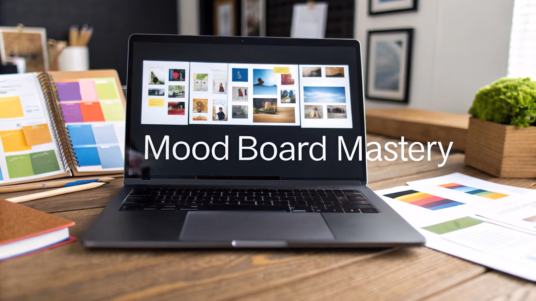
An online mood board is a digital collage of images, colors, typography samples, textures, and reference materials arranged to communicate the visual direction of a creative project. Designers use mood boards to align teams and clients on aesthetic intent before production begins — establishing the feeling of a project rather than prescribing specific design decisions.
Mood boards originated as physical cork boards covered in magazine clippings and fabric swatches. Today, digital mood boards have almost entirely replaced their physical predecessors because they're shareable, collaborative, and infinitely expandable. According to research published in Fashion Practice (Cassidy, 2011), the mood board process involves three fundamental stages — inquiry, development, and refinement — each requiring deep creative engagement to produce innovative design outcomes.
The Nielsen Norman Group recommends creating mood boards early in the design process, ideally during the Define or Ideate phases of the design-thinking cycle, to build consensus on visual direction before any prototyping begins. Creating multiple mood boards to experiment with different aesthetic directions, then narrowing down to a single direction, leads to stronger design outcomes than committing to one look prematurely.
For web and UI designers specifically, mood boards serve a dual purpose: they capture the visual language (colors, type, layout patterns) and the interactive feel (micro-interactions, scroll behaviors, transitions) that define how a digital product should work. This is where most mood board tools fall short — they capture static images well but lose the interactive qualities that make web references compelling.
How to Create a Mood Board Online: Step-by-Step
Building an effective mood board is more than dragging images onto a canvas. The process follows a deliberate sequence that transforms scattered inspiration into focused creative direction.
Step 1: Define Your Creative Direction With Mood Words
Before collecting a single image, write down 4–5 words that describe the feeling you want the project to communicate. Words like "minimal but warm," "technical yet approachable," or "bold and editorial" give your collection focus. Without mood words, you'll collect references you like personally rather than references that serve the project.
If you're working with a client, ask them to describe how they want their audience to feel when interacting with the final product. Their language often reveals aesthetic preferences they can't articulate visually. Document these words — they become your filter for every reference you evaluate.
Step 2: Collect References Broadly, Then Edit Ruthlessly
Start wide. Browse design galleries (Awwwards, Dribbble, Behance), competitor sites, adjacent industries, and even non-digital sources like photography, architecture, and print design. Save anything that resonates with your mood words — don't self-edit during collection.
Most designers aim for 10–20 references on a focused mood board. Fewer than 8 tends to feel sparse and ambiguous. More than 25 dilutes the message — when everything is inspiration, nothing is direction. The goal of editing is to create clarity, not comprehensiveness. A tight board with 12 carefully selected references communicates a vision far more effectively than a 50-image Pinterest dump.
Step 3: Organize References Into Visual Themes
Group your references by theme rather than just placing them randomly. Common groupings include color palette references, typography examples, layout and composition patterns, texture and photography style, and interaction or motion references. This structure helps clients and teammates read the board at a glance instead of trying to decode what you're communicating.
Spatial arrangement matters. Place the most important references larger and more centrally. Use proximity to show relationships — two sites next to each other implies they share something you want to highlight. Add brief text notes to explain why a reference is there, not just what it is.
Step 4: Add Context With Annotations and Design Data
A mood board without context is just a pretty collage. The best mood boards include specific observations: "Notice the 8px border radius on all interactive elements," "This site uses Inter for body and Fraunces for headings — similar warmth to what we discussed," or "The scroll-triggered animation on the hero section is the kind of motion we should explore."
For web design projects, extracting specific design details — fonts, color hex codes, spacing patterns — transforms a mood board from an abstract feeling into actionable direction. Tools that offer built-in design analysis (like Bookmarkify's Design Analyse feature, which extracts fonts, colors, gradients, and assets automatically) save significant time compared to manually inspecting each reference site in browser DevTools.
Step 5: Present the Board With a Narrative
Don't send a mood board as a link with no context. Walk the viewer through it — explain the mood words, point out the common threads connecting the references, and describe the specific elements that matter most. A two-minute narrated walkthrough (even a screen recording) dramatically increases the likelihood that your client or team reads the board the way you intended.
For client presentations specifically, limit the board to one clear direction per board. If you want to propose multiple directions, create separate boards for each. Mixing directions on a single board creates confusion rather than options.
8 Best Online Mood Board Creator Tools in 2026
The right mood board tool depends on two things: what kind of references you collect, and who you're sharing the board with. Every tool below has a specific strength — this comparison focuses on what each does better than the alternatives.
1. Bookmarkify — Best for Web Inspiration That Stays Interactive
Every other tool on this list saves images. Bookmarkify saves websites — and that distinction changes everything for web and UI designers who need to reference interaction patterns, not just visual layouts.
When you save a site to Bookmarkify, it lives inside the app as a fully working iframe. You can scroll through the page, click navigation elements, hover over interactive components, and resize to mobile view — all without leaving the app. When sharing a reference with a client or teammate, you're showing the actual interaction, not a frozen screenshot that loses the qualities that made the reference compelling.
For mood boarding specifically, the infinite canvas mode is where Bookmarkify sets itself apart. Pull saved websites, images, and videos onto a freeform board, resize them, arrange them spatially, add notes, and draw connections between references. It works like a collaborative whiteboard tool, except every element on the board remains live and interactive.
The Design Analyse feature is unique among mood board tools: point it at any saved site and it extracts the fonts, color palette, gradients, and layout structure automatically. For designers who normally spend time inspecting reference sites in DevTools, this is a meaningful workflow improvement.
Collaboration is built in — teams can create shared libraries, tag references by project or theme, and search across everything. Six view modes (2x grid, triple grid, long mode, fullscreen, mobile, and list view) let you present the same collection differently depending on context.
Best for: Web and UI designers who need interactive references, not just screenshots.
Free plan: Yes — includes canvas mode and core features.
Standout feature: Live, interactive website previews on an infinite canvas with built-in design analysis.
2. Milanote — Best for Client-Facing Mood Board Presentations
Milanote is the most polished dedicated mood board tool for creative professionals who need to share work with clients. The canvas is flexible and clean, sharing options are thoughtful (password-protected links, read-only views, no account required for viewers), and boards look professional without much effort.
The web clipper saves images and links from any site with a single click. Built-in access to the Pexels photo library means you can supplement your own references with stock imagery without switching apps. Nested boards allow complex, multi-layered reference structures for larger projects.
The free plan limits you to 100 elements — a real ceiling that serious projects hit quickly. Paid plans start around $12.50/month. Milanote is image-first, so if your inspiration includes web interactions or motion references, it won't capture those qualities.
Best for: Designers who present mood boards directly to clients.
Free plan: Yes — limited to 100 elements.
Standout feature: Password-protected shareable links that don't require viewer sign-up.
3. Miro — Best for Collaborative Mood Boarding With Teams
Miro's infinite canvas isn't designed specifically for mood boards, but it handles the job well — especially for teams already using Miro for brainstorming and design sprints. The advantage is continuity: mood boards, user flows, and project planning all live in the same workspace.
For mood boarding you can drag in images, add sticky notes, use voting features to gather team input on references, and organize everything with frames and color coding. Real-time multi-user editing and async comments work well for distributed teams. The presentation mode turns any board into a walkthrough without exporting to separate software.
Miro recently added AI features that can suggest color palettes and organize uploaded images into themes — useful for getting past a blank canvas quickly. The mood board template in Miro's library provides a reasonable starting structure.
Best for: Teams already using Miro who want mood boards in the same workspace as other project work.
Free plan: Yes — limited to 3 boards.
Standout feature: Real-time collaboration with voting, comments, and integrated presentation mode.
4. Adobe Firefly Boards — Best for Teams in the Adobe Ecosystem
Adobe's Firefly Boards (still in beta as of 2026) is a mood board-focused canvas that integrates directly with Adobe Stock, Photoshop, and the rest of the Creative Cloud. The differentiator is generative AI: you can describe a visual direction and have Firefly generate images, suggest style references, and remix existing assets directly on the board.
For teams already paying for Creative Cloud, Firefly Boards adds mood boarding without an additional subscription. The connection between boards and Adobe's design tools means references flow directly into production files. Adobe has also committed to not using customer content for AI model training.
The tool is still maturing compared to dedicated mood board apps, and it's primarily oriented toward image-based mood boards rather than web design references.
Best for: Teams already embedded in Adobe Creative Cloud.
Free plan: Available with Adobe account (beta).
Standout feature: AI-powered image generation and style remixing integrated into the mood board canvas.
5. Canva — Best for Fast, Polished Mood Boards Without Design Experience
Canva is the fastest path from zero to a presentable mood board. The template library includes dozens of mood board layouts, the editor requires no learning curve, and the stock image library is enormous. For mood boards targeting non-design audiences — a marketing brief, brand presentation, or social post — Canva is the right call.
For professional designers, Canva's limitations surface quickly. The tool is image-based and template-constrained — no live web references, no freeform spatial arrangement outside canvas boundaries, and the aesthetic can feel generic when relying on templates. But for speed and accessibility, nothing else matches it.
Best for: Non-designers or situations where speed matters more than depth.
Free plan: Yes — generous with templates and stock images.
Standout feature: Largest template library and stock image collection of any mood board tool.
6. Pinterest — Best for Discovering Visual Inspiration
Pinterest is where mood boarding starts for most designers, even if it doesn't end there. The discovery engine is unmatched — finding references for a visual direction, color palette, or typography style is faster on Pinterest than anywhere else. Boards are simple to create and the visual browsing experience is designed around inspiration.
The limitations are real. Boards are public by default (private boards exist but add friction). Annotations and context can't be added to pins in a meaningful way. The algorithm surfacing shopping content into inspiration feeds has become more intrusive over time. And presenting a Pinterest board to a client doesn't convey the professionalism most designers want.
Pinterest works best as a top-of-funnel discovery tool, paired with a dedicated mood board app for curation and presentation.
Best for: Initial inspiration discovery and visual research.
Free plan: Entirely free.
Standout feature: The strongest visual discovery algorithm of any platform.
7. FigJam — Best for Mood Boards Inside the Figma Ecosystem
For teams designing in Figma, FigJam eliminates friction. Drop images, add sticky notes, annotate with reactions, vote on references — all in a workspace that connects directly to Figma design files. References collected in FigJam can flow into Figma components without any export step.
FigJam is not a dedicated mood board tool and it shows: no web clipper, no inspiration library, no design analysis features. But for internal alignment sessions where the mood board is a stepping stone to design rather than a client deliverable, it's the most efficient option for Figma teams.
Best for: Figma users who want mood boards connected to their design files.
Free plan: Yes.
Standout feature: Seamless connection between mood board references and Figma design components.
8. Niice — Best for Agencies Managing Multiple Client Projects
Niice occupies a specific niche: structured mood boarding for teams managing many projects simultaneously. It's less about freeform inspiration and more about organized reference systems — boards are structured, tagging is enforced, and the approval workflow is built for teams needing client sign-off before proceeding.
The pricing reflects its positioning as a team tool (starting at $83/month). For agencies or in-house brand teams with multiple concurrent projects and many stakeholders, the structure prevents the chaos of references saved in different formats and locations across the team.
Best for: Agencies managing multiple client projects with structured approval workflows.
Free plan: Limited trial available.
Standout feature: Built-in approval workflows and structured tagging across multiple projects.
Mood Board Tool Comparison Table
ToolBest ForLive Web ReferencesClient SharingFree PlanPaid FromBookmarkifyWeb & UI designers✓ Yes✓ Yes✓ Yes—MilanoteClient presentations✗ Images only✓ Excellent✓ (100 items)~$12.50/moMiroTeam collaboration✗ Images only✓ Good✓ (3 boards)$8/user/moAdobe Firefly BoardsAdobe ecosystem teams✗ Images only✓ Good✓ (beta)Creative CloudCanvaSpeed & templates✗ Images only✓ Good✓ Yes$13/moPinterestInspiration discovery✗ Images only✗ Not ideal✓ FreeFreeFigJamFigma teams✗ Images only✓ Basic✓ Yes$5/user/moNiiceAgencies & brand teams✗ Images only✓ YesLimited trial$83/mo
Digital Mood Boards vs. Physical Mood Boards
Physical mood boards — printed images, fabric swatches, and paint chips pinned to a cork board — still have a place in tactile design disciplines like interior design and fashion. The physical act of handling materials can trigger creative associations that screens sometimes don't.
For web and digital design, however, physical boards have significant practical limitations. They can't capture interactive references. They can't be shared remotely. They degrade over time. They limit the number of references to whatever fits on a physical surface. And they can't be searched, tagged, or reorganized without starting over.
Digital mood boards solve all of these problems while adding capabilities physical boards never had: real-time collaboration, automatic design analysis, responsive previews, and unlimited canvas space. Research from the University of Huddersfield found that the quality of mood board outcomes is directly affected by the depth of engagement with collected reference materials — a finding that favors digital tools, which make references instantly accessible, zoomable, and analyzable rather than static and fixed-size.
The practical recommendation: use digital for all web and UI projects. Consider physical boards only when tactile material quality is central to the project (textiles, packaging, physical product design) and even then, photograph and digitize the result for sharing and archival.
Mood Board Examples by Project Type
The best mood board structure varies by what you're designing. Here's how to approach different project types:
Web Design Mood Boards
Web design mood boards should capture both visual and interactive qualities. Include full-page references (not just cropped sections), navigation patterns you admire, micro-interaction examples, and responsive behavior across breakpoints. Saving actual websites rather than screenshots preserves the interactive context that makes web references valuable.
Organize by element: a section for overall layout direction, a section for typography and content hierarchy, a section for color and photography style, and a section for interactive patterns and motion. Add notes specifying exactly what to pay attention to in each reference.
Brand Identity Mood Boards
Brand mood boards tend to be broader, drawing from photography, illustration, physical environments, and cultural references — not just other brand designs. Include references for tone of voice alongside visual references. Show textures, materials, and environmental contexts that evoke the brand personality.
Create separate boards for different brand directions rather than combining options on one board. Each board should tell a coherent story about who the brand is and how it wants to be perceived.
UI/UX Mood Boards
UI mood boards focus on component-level patterns: how other products handle navigation, form design, data visualization, error states, and onboarding flows. Include references from both direct competitors and products outside your category that solve similar interaction problems well.
Add annotations about the specific interaction pattern you're referencing, not just the visual style. "This card component uses hover elevation to indicate interactivity" is more useful than "like the look of this."
Client Presentation Mood Boards
Mood boards created for client review need a different structure than working mood boards. Limit references to 10–15 carefully curated selections. Add clear annotations explaining your thinking. Use a consistent visual layout that looks polished even without a design template.
Include "anti-references" — examples of what the project should not look like. This prevents misunderstandings early. Many designers find that showing what to avoid is as clarifying for clients as showing what to aim for.
Common Mood Board Mistakes (and How to Avoid Them)
Even experienced designers make mood boarding mistakes that undermine the board's usefulness. These are the most common ones:
Collecting without direction. Starting with a vague "I'll know it when I see it" approach produces scattered boards that don't communicate a clear vision. Always define mood words before you start collecting.
Including too many references. More isn't better. A mood board with 40 images creates confusion, not clarity. Edit down to 10–20 references maximum, each selected for a specific reason you can articulate.
Using only screenshots for web references. Screenshots freeze a single moment and lose everything that makes web design dynamic: scroll behavior, transitions, hover states, responsive scaling. Where possible, use tools that preserve interactivity — or at minimum, annotate what the screenshot doesn't show.
No annotations or context. A board full of images without explanation forces viewers to guess what you're trying to communicate. Add brief notes explaining why each reference is there and what specifically to look at.
Mixing multiple directions on one board. If you want to propose three visual directions, create three separate boards. Combining them confuses the conversation and makes it harder for clients to give clear feedback.
Forgetting the audience. A working mood board for your own reference can be messy and exhaustive. A mood board for a client presentation needs to be curated, annotated, and visually coherent. Match the board's polish to its audience.
How to Present a Mood Board to Clients
The presentation matters as much as the board itself. A mood board sent as a link with no context often gets misread — clients may focus on literal elements ("I don't like that shade of blue") rather than understanding the overall direction you're proposing.
Walk through it live. Schedule a brief call or record a screen walkthrough. Explain the mood words first, then point out the common threads connecting references. Describe the feeling before discussing specific visual elements.
Frame it as a direction, not a specification. Make clear that the mood board represents a feeling and an approach, not a pixel-perfect preview of the final design. This prevents clients from expecting the final product to look exactly like a reference.
Ask focused questions. Instead of "what do you think?" ask specific questions: "Does this color temperature feel right for your brand?" or "Is this level of visual complexity what you had in mind?" Focused questions produce actionable feedback rather than vague reactions.
Share in a professional format. Use a tool with proper sharing features (clean URLs, password protection if needed, no account required to view). Don't send screenshots of your mood board — the irony of screenshotting a mood board undermines the effort you put into creating it.
Mood Board vs. Style Guide: What's the Difference?
A mood board is exploratory and directional — it establishes the feeling, aesthetic, and visual language of a project before design begins. A style guide is prescriptive and documented — it records the specific rules (exact colors, fonts, spacing values, component behavior) that govern a finished design system.
Mood boards come first and lead to style guides, not the other way around. A mood board asks "what should this feel like?" A style guide answers "here's exactly how to implement it." In the design process, the mood board sits in the discovery and ideation phase. The style guide lives in documentation and maintenance.
Some designers skip mood boards and jump straight to style guides, but this often results in design systems that are technically consistent but lack a cohesive emotional direction. The mood board step ensures that the style guide's specific decisions serve a bigger aesthetic purpose.
Using AI to Create Mood Boards in 2026
AI-powered mood board generation is one of the fastest-growing trends in design tooling. Tools like Adobe Firefly Boards and Miro's AI features can generate mood board starting points from text descriptions, suggest color palettes, and organize uploaded images into thematic clusters.
These tools are useful for overcoming blank-canvas paralysis and quickly exploring directions you might not have considered. However, AI-generated mood boards tend to cluster around popular aesthetic trends, producing boards that feel generic and lack the specificity that makes a mood board valuable as creative direction.
The most effective approach combines AI-generated starting points with manual curation: let AI suggest a broad direction, then replace generic references with specific, carefully chosen examples that communicate your actual vision. For web design specifically, no AI tool currently captures interactive references — you still need a tool like Bookmarkify that preserves the actual website experience rather than flattening it to a static image.
Think of AI mood boarding as a first draft, not a finished product. The creative value comes from the curation decisions a human designer makes — selecting, arranging, annotating, and presenting references with intention.
Frequently Asked Questions
What is the best free online mood board creator?
For web and UI designers, Bookmarkify's free plan is the most capable option — it saves interactive websites (not just screenshots), includes an infinite canvas for spatial arrangement, offers design analysis that extracts fonts and colors, and supports collaboration. For image-only mood boards, Canva's free plan has the most templates and stock imagery. Pinterest is entirely free and remains the best platform for discovering inspiration, though it's weak for presenting to clients. Miro and FigJam both have free plans that work well if your team already uses them for other work.
How many images should a mood board have?
Most designers aim for 10–20 references on a focused mood board. Fewer than 8 can feel sparse and ambiguous. More than 25 dilutes the message — if everything is inspiration, nothing is direction. A tight mood board with 12 carefully chosen references communicates a direction more effectively than a large collection without clear focus. Organize references into themes (color, typography, texture, layout) so the direction is readable at a glance.
What's the difference between a mood board and a style guide?
A mood board is exploratory — it establishes the visual feeling of a project before design begins. A style guide is prescriptive — it documents specific rules like exact colors, fonts, and spacing. Mood boards come first and inform the style guide. A mood board asks "what should this feel like?" while a style guide answers "here's exactly how to build it." Skipping the mood board step often results in design systems that are technically consistent but lack cohesive emotional direction.
Can I collaborate on a mood board with my team or client?
Yes — most modern mood board tools include collaboration features. Milanote offers the cleanest client sharing with password-protected read-only links (no account needed). Miro and FigJam excel at real-time team co-editing with comments and voting. Bookmarkify's team mode lets multiple designers build shared inspiration libraries and tag references together. For client feedback specifically, choose a tool that lets clients comment without creating an account — friction in the review process slows everything down.
Should I use AI to generate mood boards?
AI mood board generators are useful as starting points — they can suggest color palettes, organize images into themes, and help overcome blank-canvas paralysis. However, AI-generated boards tend to cluster around popular trends and lack the specificity that makes a mood board valuable. The best approach is to use AI for a first draft, then replace generic references with carefully curated selections that communicate your actual creative vision. For web design mood boards, AI tools can't capture interactive references, so you'll still need a dedicated tool for that.
What makes a mood board effective for client presentations?
Effective client mood boards are focused (10–15 references maximum), annotated (brief notes explaining each reference), and presented with context (a walkthrough explaining mood words and common threads). Share using tools with professional sharing features — password-protected links, no sign-up required for viewers. Ask specific questions rather than "what do you think?" to get actionable feedback. Include "anti-references" showing what the project should avoid to prevent misunderstandings.
Can I create mood boards on mobile?
Several tools offer mobile apps for capturing inspiration on the go — Milanote and Pinterest are the most polished mobile experiences. However, serious mood board composition (arranging, annotating, presenting) works better on desktop, where you have more screen space for spatial arrangement. Mobile works well for the collection phase; switch to desktop for the curation and presentation phases.
How do I organize mood boards across multiple projects?
Use a consistent naming convention (client name + project + direction, like "Acme_Rebrand_Direction-A"), tag references by theme (color, type, layout, interaction), and keep a single tool as your source of truth rather than scattering references across Pinterest, Figma, and your desktop. Tools like Bookmarkify and Niice are specifically built for managing large reference libraries across multiple concurrent projects with tagging, search, and folder structures.