How to Compare Website Fonts With a Type Specimen
Compare website fonts using real copy, interface labels, language samples, and fallback checks. Build a practical specimen before choosing.
Last updated:
November 5, 2026
Compare website fonts using real copy, interface labels, language samples, and fallback checks. Build a practical specimen before choosing.
Last updated:
November 5, 2026
A font can look convincing in a large specimen headline and become awkward in a checkout label, a dense paragraph, or a translated navigation item. Before choosing a website font, compare the candidates in the content and constraints they will actually face.
A type specimen for this purpose is a small review page containing your real text, a few interface components, and the character combinations that matter to the project. The workflow below is a suggested evaluation method, with an illustrative booking-site example. It is not a ranking of fonts or a report of hands-on testing.
Write one primary role for each candidate: long-form reading, compact interface text, or expressive headings, for example. A family that needs to handle all three roles should be reviewed in all three contexts.
Elliot Jay Stocks’ checklist for choosing type considers purpose, language coverage, styles, font-file reliability, and licensing. Use it to establish the requirements before narrowing the choice by appearance.
For your project, record the languages you must support, the weights and italics you need, and where the type will appear. Verify the actual files and license you intend to use. A feature shown in a family’s marketing material is a lead to investigate, not confirmation that every file or delivery method includes it.
Keep the copy, component dimensions, colors, and review viewport consistent for an initial comparison. Start with the same nominal sizes and spacing, and record them. This makes it easier to see which differences come from the typeface rather than an unrelated layout change.
Then allow a second, clearly labeled pass for sensible adjustments. Equal font-size values do not guarantee that two typefaces look equally large. A candidate should not be rejected solely because it needs a different size or line spacing; the question is whether those adjustments still serve the layout.
Include these five blocks:
Keep the specimen small enough to review repeatedly. A few relevant components are more useful for this decision than an alphabet displayed in dozens of sizes.
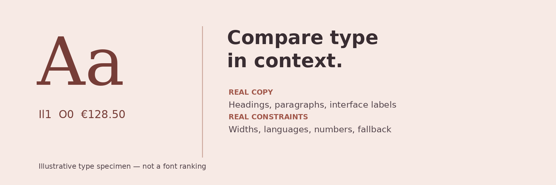
Read the small labels at their intended size. Check whether characters in your actual identifiers are distinguishable, whether punctuation sits comfortably, and whether the weights produce a clear hierarchy. A string such as “Il1 O0” can start the inspection, but it does not replace reviewing your real content.
The official Inter specimen provides concrete examples of why these details deserve attention: its feature demonstrations include tabular numbers, a slashed zero, and a disambiguation set. Study what changes in the examples before deciding whether an equivalent feature is useful in your own interface.
For example, a booking table might benefit from a deliberate numeric treatment, while a marketing heading has a different job. Check the candidate’s documentation and the implemented feature settings rather than assuming that a familiar font name guarantees the behavior.
Imagine a fictional small-hotel website. Its specimen might contain the following original sample copy:
Place that copy in the actual component widths proposed for the site. Inspect what wraps, whether the button still fits, and whether the room identifier remains clear. Then use the client’s real, approved content, including translations; these samples are simply a way to start the exercise.
Record observations separately from preferences. “The button label wraps at this width” describes the specimen. “The narrower candidate feels calmer” is a design interpretation. Neither establishes which option users will prefer.
A static design-file specimen is only part of the review. web.dev’s font guidance explains that replacing a fallback with a web font can cause layout shifts when the two occupy different amounts of space.
In a browser prototype, compare the intended font with the fallback that the implementation actually uses. Review heading wraps, button widths, paragraph height, and the position of nearby content. Ask a developer to help reproduce the fallback state if necessary, and record the browser, viewport, and conditions used.
This is a focused design check, not a measured performance result. If you have not inspected font loading or measured layout shift, leave those items marked as unverified. Our responsive-design guide offers broader layout review areas to consider alongside the specimen.
Use Bookmarkify’s infinite canvas to arrange source bookmarks beside notes about each candidate. The canvas supports bookmarks, sticky notes, and rich text pages. Save the official specimen, licensing information, and implementation reference, with a short explanation of why each matters.
Keep the working comparison in your design tool or browser prototype. In the reference board, record the chosen role, the adjustments required, and unresolved questions. That gives a teammate the evidence behind the choice without implying that a bookmark is a test result.
Finish with a concise recommendation: which candidate fits the brief, which constraints it satisfies, and what still needs validation. Choose the type and the conditions under which you expect it to work together.
Sources checked November 5, 2026. Prepared with AI assistance using the linked original sources. The hotel copy and specimen workflow are illustrative proposals, not claims of product testing.

Ivan S
Lead Marketing Designer @Scribe, Founder @bookmarkify

Effortlessly Save time and stay Inspired: Streamline your workflow with Bookmarkify. No more juggling 10 tabs and screenshots.