How to Create a Moodboard That Captures Your Vision
Learn how to build a moodboard that captures your design vision. Our step-by-step guide covers gathering inspiration, organizing visuals, and presenting to clients.
Last updated:
February 17, 2026
Learn how to build a moodboard that captures your design vision. Our step-by-step guide covers gathering inspiration, organizing visuals, and presenting to clients.
Last updated:
February 17, 2026
We’ve all been there. Your screen is a mosaic of 42 open tabs, your desktop is cluttered with random screenshots, and you’re desperately searching for that one perfect reference image you saved… somewhere. This isn’t a personal failing; it’s a universal struggle in the creative process. This guide will show you how to create a moodboard that transforms that chaos into clarity. Ready to build a better design workflow? Let's begin.
Think of a moodboard as a visual compass for your project. Its job is to translate abstract ideas, client goals, and fleeting thoughts into a tangible, shared direction. Before a single pixel is pushed in Figma or a line of code is written, a moodboard sets the tone, defines the aesthetic, and gets everyone on the same page.
A well-crafted moodboard is more than just a pretty collage. It’s a strategic tool that saves countless hours of revisions down the line. By aligning your team and client on a visual direction early on, you prevent the dreaded feedback: “This isn’t what I had in mind.” Instead, you build a foundation of mutual understanding that guides every subsequent design decision. This is your first step to effectively organize design inspiration and master an essential creative skill.
The most effective moodboards begin with words, not images. Before you even think about searching for visuals, you need to establish a clear strategic foundation. This means translating a client brief or a personal goal into a focused set of guiding principles. Without this step, you’re just collecting pretty pictures without purpose.
Start by asking yourself a few key questions to define the project's core. This process is crucial when creating a moodboard for brand identity.
Here’s a practical tip: create a simple text document with these keywords, a one-sentence project mission, and a list of "do's and don'ts." For example: DO use warm tones; DON'T use script fonts. This document becomes your filter, ensuring every image you gather serves the project's strategic goals.

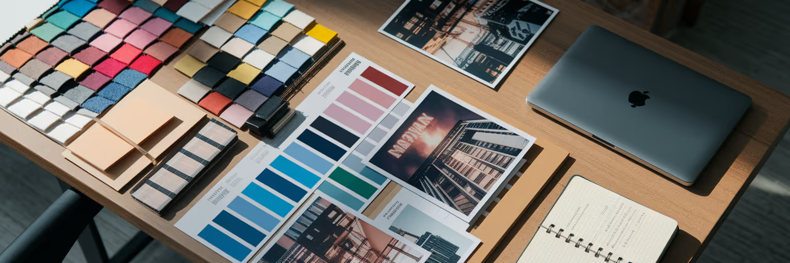
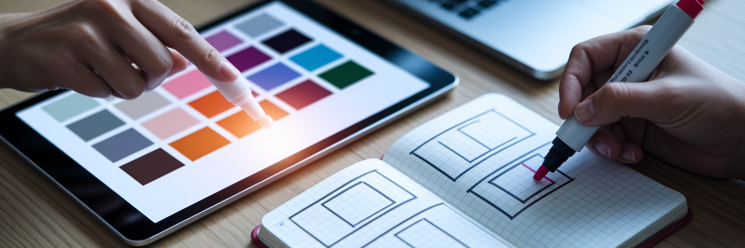
With your strategic direction defined, it’s time for the fun part: building a visual library for your project. At this stage, think like a chef gathering ingredients. You want to collect a wide variety of elements that capture the "feeling" you established in the previous step. Don't worry about curation just yet; the goal is exploration and abundance.
Look for different types of visual ingredients to create a rich palette:
While sites like Behance and Dribbble are great, expand your search to architecture blogs, fashion editorials, or even your own camera roll. As you gather, you'll need powerful design inspiration tools to keep everything organized. The Bookmarkify browser extension lets you instantly save any image, link, or video into one central hub, saving you from the chaos of desktop folders. For a fresh dose of ideas, check out the curated content on our Daily Inspiration feed.
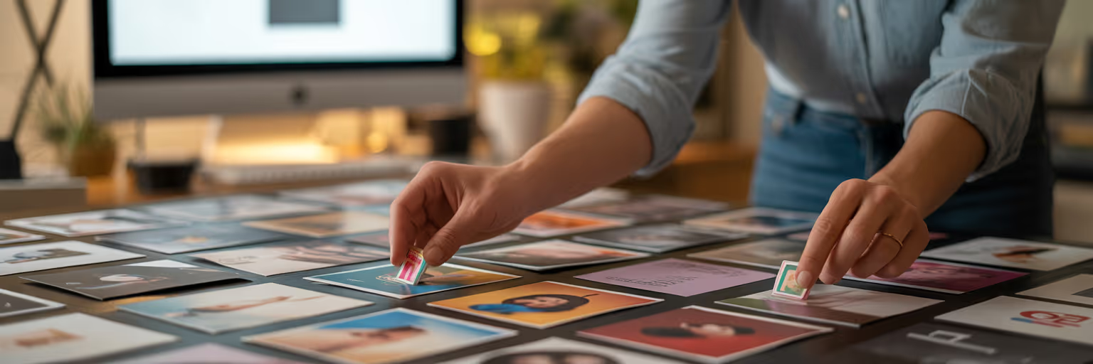
Now that you have a mountain of inspiration, it’s time to shift from gathering to refining. This is the critical step where you distill your large collection into a focused, cohesive story. The goal is to move from a broad "vibe" to a specific visual language.
Not all images are created equal. Start by identifying a visual hierarchy within your collection. Group your saved items into "hero" images that set the main tone, "supporting" images that provide color and texture, and "detail" elements like typography or UI examples. This helps you see the core of your visual direction emerge from the noise.
This is where a tool like Bookmarkify truly shines. As you review your collection, add descriptive tags like #typography, #color, or #layout to each item. This simple action allows you to instantly filter your library and compare all your font examples side-by-side, making it much easier to spot patterns and make decisive choices. This is how you truly organize design inspiration effectively. Create a new, dedicated collection for your "finalists" and move only the strongest 15-20 visuals into it. This forces you to be decisive and ensures your final board is impactful, not cluttered. For more ideas on what to collect, you can browse through our various inspiration collections.
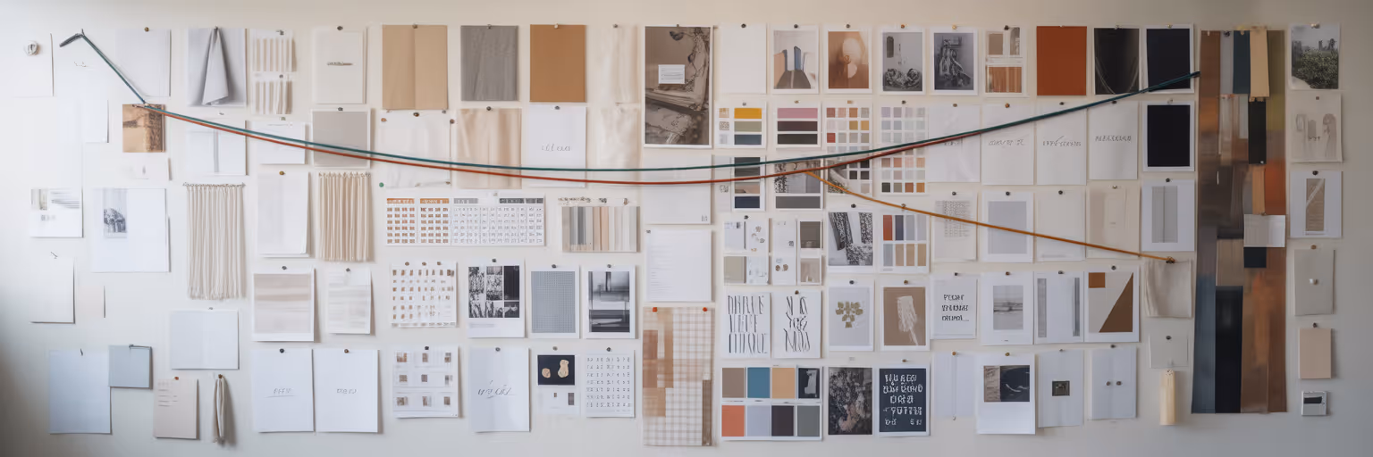
With your curated assets ready, the final step is to assemble them into a compelling narrative. The placement of each element matters. Think of it as composing a piece of music, where every note contributes to the overall harmony. Start with your "hero" image as the focal point and arrange supporting elements around it to create a natural visual flow.
While physical moodboards have their charm, digital tools offer unmatched flexibility. Here’s a quick comparison:
| Factor | Physical Moodboard | Digital Moodboard (e.g., with Bookmarkify) |
|---|---|---|
| Flexibility | Static; difficult to edit or rearrange | Highly flexible; easily edit, resize, and swap elements |
| Collaboration | Requires in-person meetings or sending photos | Shareable via a single link for instant remote feedback |
| Elements | Limited to physical items (printouts, swatches) | Supports images, videos, GIFs, and live website links |
| Presentation | Can be clunky to present professionally | Clean, professional interface ready for client presentations |
| Accessibility | Located in one physical space | Accessible from anywhere with an internet connection |
This table outlines the key trade-offs between traditional and digital moodboarding, showing how modern tools offer greater efficiency and flexibility for creative workflows.
Bookmarkify’s moodboard view acts as a powerful visual moodboard creator designed for this exact purpose. It gives you a freeform canvas to drag, drop, resize, and layer your curated items into a professional composition without ever leaving your inspiration library. Use white space to let elements breathe, group related items like colors and fonts together, and create visual interest by juxtaposing textures with clean graphics. Your final board should feel balanced, intentional, and emotionally resonant.
Remember, a moodboard is a conversation starter, not a final decree. Never just email it to a client without context. The presentation is your opportunity to tell the story behind your choices and build excitement for the project's direction. This is where good moodboard presentation tips make all the difference.
When presenting, walk your client through the board by connecting each visual choice back to the keywords and goals you defined together. Instead of saying, "Here are some images I liked," try a narrative approach: "To capture the 'Bold' personality we discussed, I've focused on high-contrast photography and strong, geometric typography, which you can see in these examples."
The goal is to gain alignment and gather feedback early, which is far more efficient than revising a nearly finished design. Bookmarkify’s sharing feature makes this process seamless. You can send a clean, professional-looking board via a unique URL, allowing clients and team members to review and comment from anywhere. For more articles on improving your design workflow, check out the other posts on our blog.
Once your moodboard is approved, it becomes the bridge to the actual design phase. The final step is to distill its abstract "mood" into a practical, mini style guide that ensures consistency across the entire project. This process turns your moodboard for brand identity into a set of concrete rules for you and your team.
Extract the key components into an actionable guide:
This is where Bookmarkify’s Design Analyse feature, available on the Pro plan, becomes incredibly useful. With a single click on any saved website from your moodboard, you can instantly inspect its fonts, colors, and image assets. This makes extracting those technical details for your style guide remarkably fast, ensuring the approved vision is executed faithfully. You can explore this and other powerful features by checking out the options on our pricing page and start building better moodboards today.

Ivan S
Lead Marketing Designer @Scribe, Founder @bookmarkify
Effortlessly Save time and stay Inspired: Streamline your workflow with Bookmarkify. No more juggling 10 tabs and screenshots.